Create an Easy Time Chart in Excel: Step-by-Step Guide

Introduction to Time Charts in Excel

Excel is an indispensable tool for data analysis and presentation, and one of its most valuable features for managing timelines is the Time Chart. Whether you're tracking project deadlines, analyzing time-series data, or planning schedules, a time chart can provide clarity and insight. This guide will take you through creating an easy time chart in Excel, from basic setup to customization, ensuring your timelines are not only informative but visually appealing.
Setting Up Your Excel Spreadsheet

Start with Data Preparation

Before diving into chart creation, preparing your data correctly is crucial:
- Create headers for your columns, such as 'Start Date', 'End Date', and 'Task Description'.
- List your tasks or events in chronological order under these headers.
Organize Your Data

Ensure that:
- Start and End dates are in a compatible date format in Excel (e.g., DD/MM/YYYY).
- The 'Task Description' column contains concise descriptions to fit in the chart.
Creating the Basic Time Chart

Select Your Data

Highlight the data range you've prepared for your time chart.
Insert the Chart

Now, let's insert the chart:
- Go to the 'Insert' tab on the Excel ribbon.
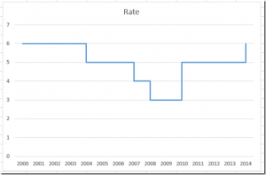
- Choose 'Insert Line or Area Chart' from the 'Charts' group.
- Select 'Line with Markers' or 'Stacked Area Chart' depending on your preference.
Customize the Chart's Axes

- Right-click on the horizontal axis and select 'Format Axis'.
- In the 'Axis Options' pane, set the minimum and maximum dates to match your data range.
- Adjust the axis unit to show weeks, months, or days, based on your chart’s scope.
Add Chart Title and Labels

Ensure your chart is easily interpretable:
- Click on the chart to select it, then use the 'Chart Elements' button to add or modify titles and labels.
- Give your chart a clear title that reflects the timeline content.
- Label the vertical axis with what the markers represent (e.g., 'Tasks', 'Milestones').
Enhancing Your Time Chart

Customize Colors and Styles

Make your time chart visually appealing:
- Select the chart and use the 'Chart Tools' Design tab to change chart colors or apply a style from the predefined options.
- Customize individual line styles or area fills if necessary, right-clicking on the element and selecting 'Format Data Series'.
Formatting Task Bars

For a clearer presentation:
- Click on a line or area segment to select it.
- In the 'Format Data Series' pane, you can:
- Adjust the line thickness for emphasis.
- Change fill colors to differentiate tasks or milestones.
Adding Data Labels

To make your chart more informative:
- Select your chart and click on the 'Chart Elements' button.
- Check 'Data Labels' to add labels on data points or next to them for better readability.
Time Chart Best Practices

Keep It Simple
Clarity over complexity:
- Avoid clutter by focusing on essential information.
- Ensure legibility by choosing contrasting colors or large enough fonts.
Use Consistent Dates
Maintain consistency:
- Use the same date format throughout your chart.
- Ensure that all start and end dates fall within the same timeframe for an accurate representation.
Label and Legend
Help readers understand your chart:
- Include clear axis labels and a legend if multiple series are represented.
- Explain any non-obvious markers or symbols used in the chart.
Wrapping Up Your Time Chart

Having completed your time chart, take a moment to:
- Review for any formatting inconsistencies or data entry errors.
- Ensure the chart effectively conveys the timeline it's intended to represent.
Now, with this comprehensive step-by-step guide, you're well-equipped to create easy and informative time charts in Excel. Whether for project management, personal scheduling, or data analysis, this visual representation will help convey complex temporal relationships with clarity and ease.
FAQ

How do I update the time chart if I have new data?
+To update your time chart, simply add the new data in your Excel sheet below the existing data range. The chart will automatically update to reflect the new entries.
Can I add milestones to the time chart?
+Yes, you can add milestones by inserting a line or scatter plot series to mark these events on your timeline.
What’s the difference between a stacked area chart and a line chart for a timeline?
+A stacked area chart can be used to show the cumulative effect of multiple tasks over time, whereas a line chart might focus on individual task timelines without emphasizing their cumulative impact.


