Create Excel Chart from Multiple Sheets Easily

Creating charts in Microsoft Excel is a straightforward process, but dealing with data from multiple sheets can become complex. This post will guide you through the steps to merge data from different sheets and create a comprehensive chart that helps visualize your data effectively. Whether you're analyzing financial data, tracking project progress, or conducting surveys, combining information from various Excel sheets can unlock powerful insights.
Understanding the Benefits of Multi-Sheet Data

Before diving into the technical steps, it’s important to understand why combining data from multiple sheets can be beneficial:
- Clarity: Organizes related data in separate sheets, reducing clutter.
- Efficiency: Streamlines data comparison and analysis.
- Accuracy: Decreases the chance of errors by compartmentalizing information.
By consolidating data from multiple sheets into one chart, you can present a holistic view of your datasets, making it easier to spot trends, outliers, and patterns.
Setting Up Your Data

To begin, ensure your data is organized correctly:
- Each sheet should have headers for clarity.
- Make sure the data structure is consistent across sheets to simplify merging.
Step-by-Step: Merging Data from Multiple Sheets

Follow these steps to bring your data together:
- Identify Sheets: Open the Excel workbook containing the sheets you wish to combine.
- Create a Master Sheet: Add a new sheet to your workbook named ‘Master Sheet’ or something similar.
- Consolidate Data:
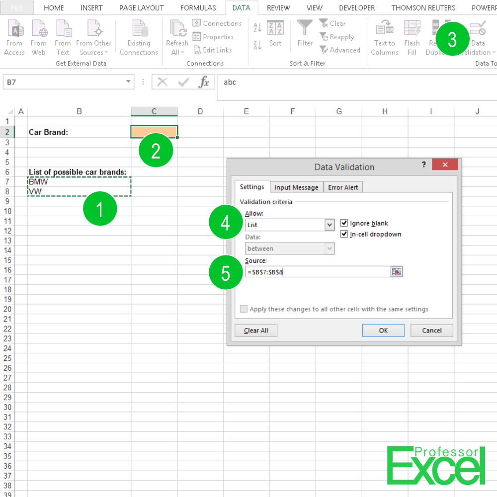
- Go to ‘Data’ > ‘Consolidate.’
- Choose ‘Sum’ or another relevant function.
- Add ranges from different sheets you want to combine.
- Ensure the ‘Use labels in’ options are checked.
- Click ‘OK’ to populate your Master Sheet with merged data.
Creating the Chart

Now that your data is consolidated:
- Select Data: Choose the data range from your Master Sheet.
- Insert Chart: Go to ‘Insert’ > ‘Chart’ and pick the chart type that best fits your data visualization needs.
- Adjust Chart Settings: Customize your chart with titles, labels, colors, and more for clarity and appeal.
Chart Customization Tips

- Use distinct colors for different data series to enhance readability.
- Add data labels if they provide context.
- Adjust the chart’s scale to appropriately represent your data.
Handling Dynamic Data

If your data updates frequently:
- Consider using PivotTables to dynamically update the chart.
- Link your chart data to named ranges for easy updates.
📌 Note: When setting up your master sheet, make sure it is formatted consistently with your source data to avoid complications during consolidation.
Conclusion

By mastering the process of combining data from multiple sheets into a single chart, you gain a powerful tool for data analysis and presentation. This approach not only simplifies your workflow but also ensures that your charts are comprehensive, accurate, and insightful. Remember, the key to effective data visualization is organization, and by following these steps, you can leverage Excel’s capabilities to tell a clear story with your data.
Can I create a chart from data on separate sheets without merging them?

+
Yes, you can create a chart from data on separate sheets without merging them by using external references in your chart data range. You would typically use a formula like =‘SheetName’!A1:B10 in your chart data source to include data from different sheets directly.
What if my sheets have different structures?

+
If your sheets have different structures, you might need to realign the data to a common format before merging or using Excel’s Query feature to pull and reformat the data into a uniform structure.
How can I update the chart automatically as I add new data?

+
To ensure automatic chart updates, use dynamic ranges or PivotTables. Excel’s PivotTables update charts automatically when the data source is modified. Named ranges can also dynamically include new data as it’s added.


