5 Simple Ways to Create an Excel Summary Sheet

Creating a summary sheet in Excel can significantly streamline your data analysis and reporting tasks. Whether you're managing business finances, tracking project milestones, or summarizing sales data, a well-structured summary sheet can provide quick insights and save time. In this guide, we'll explore five simple methods to create an efficient summary sheet in Microsoft Excel.
1. Using Basic Functions to Summarize Data

Starting with the basics, here's how to use standard Excel functions for data summarization:
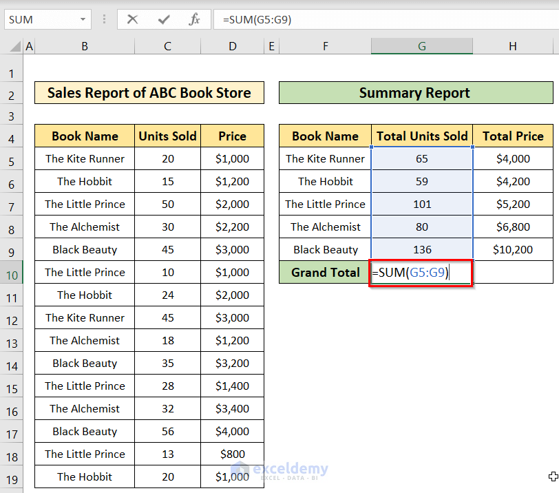
- SUM: Use this function to quickly add up values in a range. For example, to sum numbers from A1 to A10, use
=SUM(A1:A10). - AVERAGE: To calculate the average of a range, apply
=AVERAGE(A1:A10). - COUNT: This function counts the number of cells that contain numbers. Use
=COUNT(A1:A10)to see how many numbers are in your range.
These functions are fundamental for creating basic summaries. Here’s how to implement them:
- Open your Excel workbook and select the cell where you want your summary data to appear.
- Type or click into the formula bar and enter the appropriate function. For example, to find the sum of sales figures in column A, type
=SUM(A2:A100). - Press Enter. The result will populate in the cell where your cursor was placed.
2. Leveraging PivotTables for Dynamic Summaries

PivotTables are an incredibly powerful tool for summarizing, analyzing, and exploring data interactively. Here’s a step-by-step guide on creating a PivotTable:
- Select your data range or the entire table you want to summarize.
- Go to the 'Insert' tab and click on 'PivotTable.' Excel will automatically select your data range if it's already highlighted.
- Choose where you want the PivotTable to be placed (a new worksheet or existing worksheet).
- In the PivotTable Field List, drag fields to the Row Labels, Column Labels, Values, and Report Filter areas to organize your data. For example:
- Drag 'Product Category' to Rows.
- Drag 'Sales' to Values for summation.

PivotTables allow you to:
- Summarize data by any field or group of fields.
- Create dynamic reports with filters, slicers, and calculated fields.
- Analyze data trends over time with date or time fields.
🛠️ Note: Excel PivotTables are highly interactive. Users can refresh the data, sort results, and apply filters to see only the relevant data, making it perfect for ad-hoc reporting.
3. Creating a Dashboard with Data from Multiple Sheets

If you're working with data spread across multiple sheets or workbooks, a dashboard can be invaluable. Here's how to link different sheets into a dashboard:
- Create a new worksheet for your dashboard.
- Use cell references or formulas to pull data from other sheets. For example, if you have sales data on Sheet1 and inventory on Sheet2, you could use formulas like:
-
=Sheet1!A1to pull data from cell A1 in Sheet1. =SUM(Sheet2!B2:B100)to sum up inventory figures from Sheet2.
-
- Apply data validation or conditional formatting to make your dashboard interactive and visually intuitive.
A dashboard might include:
- Summary charts from PivotTables.
- Calculated metrics (like ROI or growth rates).
- Interactive filters or slicers for user customization.
| Component | Function |
|---|---|
| Charts | Visual representation of summary data |
| Conditional Formatting | Highlight important metrics or trends |
| Slicers | Filter pivot table data for dashboards |

🌐 Note: When dealing with external or sensitive data, consider using Excel's Power Query to import and refresh data from various sources securely.
4. Using Conditional Formatting for At-a-Glance Summary

Conditional formatting can transform your summary sheet by highlighting key data based on set conditions. Here's how to apply it:
- Select the cells or range you want to format.
- Go to 'Home' > 'Conditional Formatting' and choose your formatting rules:
- Highlight Cell Rules: Format cells if greater than, less than, etc.
- Data Bars, Color Scales, or Icon Sets: Add visual cues based on values.
- Set up rules to visualize trends or identify outliers quickly.
Examples of conditional formatting usage:
- Color cells with sales figures above a target value in green, and below in red.
- Apply data bars to represent the proportion of each category's contribution to total sales.
✅ Note: Always review your conditional formatting rules to ensure they align with your data's narrative or the summary's objectives.
5. Using VBA for Automated Summary Sheets

For more advanced users, Visual Basic for Applications (VBA) can automate complex tasks in Excel. Here's a basic example of creating a summary sheet with VBA:
Sub CreateSummarySheet()
    Dim ws As Worksheet
    Dim summarySheet As Worksheet
    Dim lastRow As Long

    'Create a new worksheet for summary
    Set summarySheet = ThisWorkbook.Sheets.Add
    summarySheet.Name = "Summary"

    'Loop through all sheets except the new summary sheet
    For Each ws In ThisWorkbook.Worksheets
        If ws.Name <> "Summary" Then
            lastRow = ws.Cells(ws.Rows.Count, 1).End(xlUp).Row

            'Insert headers in the summary sheet
            If ws.Name = "Sheet1" Then
                summarySheet.Cells(1, 1).Value = "Category"
                summarySheet.Cells(1, 2).Value = "Total Sales"
            End If

            'Insert data to summary sheet
            summarySheet.Cells(summarySheet.Rows.Count, 1).End(xlUp).Offset(1, 0).Value = ws.Name
            summarySheet.Cells(summarySheet.Rows.Count, 1).End(xlUp).Offset(0, 1).Value = Application.WorksheetFunction.Sum(ws.Range("B2:B" & lastRow))
        End If
    Next ws

    MsgBox "Summary Sheet Created!"
End Sub
This macro:
- Creates a new 'Summary' worksheet.
- Gathers data from other sheets, summing up specific columns.
- Automates the tedious process of manual data summarization.
By using these methods, you can create comprehensive, visually appealing, and dynamic summary sheets that provide valuable insights into your data.
Every method has its strengths, and combining them can give you a robust tool for data analysis:
- Basic Functions: Quick and easy for simple summaries.
- PivotTables: Ideal for interactive and detailed data exploration.
- Dashboards: Consolidate data from multiple sources into a single, manageable view.
- Conditional Formatting: Enhances understanding through visual cues.
- VBA: Automates repetitive tasks, making complex summaries efficient.
By mastering these techniques, you'll be equipped to handle various data analysis tasks, from simple reports to complex financial dashboards, ensuring your work in Excel is both efficient and insightful.
What is the difference between a PivotTable and a regular summary in Excel?

+
A PivotTable dynamically summarizes data, allowing users to rearrange fields, add filters, and slice data in multiple ways. Regular summaries, like those using basic functions, provide static results based on simple calculations and do not offer the same level of interactivity.
Can I combine different methods in one summary sheet?

+
Yes, you can combine multiple methods. For instance, you could use PivotTables for some data, basic functions for others, and apply conditional formatting throughout for visual enhancement.
Is there a way to protect the data on a summary sheet?

+
You can protect an Excel worksheet by going to the ‘Review’ tab and selecting ‘Protect Sheet.’ This prevents others from modifying the summary data or formulas without the password.


