5 Ways to Make Your Excel Sheets Vibrant

Microsoft Excel is not just a powerful tool for data analysis; it's also a canvas for creativity. Gone are the days when Excel sheets were strictly monochromatic or bland. Today, enhancing your spreadsheets with vibrant colors, engaging visual elements, and dynamic styles can significantly improve readability, usability, and even the aesthetic appeal of your data presentations. Here are five innovative ways to make your Excel sheets truly vibrant and dynamic.
1. Utilizing Conditional Formatting

Conditional formatting is a powerful feature in Excel that allows you cells in your sheet based on the cell’s value. Here’s how to make the most of it:
- Color Scales: Apply a color gradient across your data to visually represent ranges. For example, you might use a green-yellow-red scale for financial data to instantly show where performance stands against targets.
- Data Bars: Fill cells with horizontal bars proportional to their values. This visual cue helps in comparing quantities at a glance.
- Icon Sets: Use icons like arrows, flags, or traffic lights to indicate trends or statuses. This method can be especially useful for dashboards where space is limited.
📌 Note: Always ensure that the colors chosen have sufficient contrast for better visibility and accessibility.
2. Enhancing with Data Visualizations


Excel’s built-in charting tools provide numerous options for visualizing data:
- Sparklines: These are mini-charts in a single cell. They give a quick overview of data trends directly within your table or next to key metrics.
- Dynamic Charts: Use Excel’s ability to update charts in real-time as data changes. For instance, with PivotTables, you can set up dynamic charts that refresh automatically.
- Custom Charts: Combine different chart types or use VBA to create more complex visuals like bullet graphs or gauge charts for sophisticated reporting.
3. Theme Customization

Excel offers themes to change the look and feel of your worksheet instantly. Here’s what you can do:
- Change the Theme: Go to ‘Page Layout’ > ‘Themes’ and select from built-in themes or create your own.
- Customize Colors: Modify the theme colors to match your company branding or to highlight specific datasets.
- Font and Effects: Adjust the fonts and cell styles for headers, body text, or special data points to enhance readability and engagement.
4. Interactive Features

Interactive Excel sheets can keep users engaged:
- Hyperlinks: Create links to other sheets or even web pages directly from your spreadsheet for a seamless navigation experience.
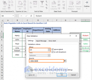
- Form Controls: Utilize sliders, checkboxes, or drop-down lists to make your sheet interactive. For instance, users can choose different data views using form controls.
- VBA Scripts: Write macros to automate tasks or build interactive dashboards that respond to user inputs.
5. Use of Animations and Animatics


While Excel does not natively support animations, you can simulate animations:
- Row by Row Animation: By using VBA to highlight cells in sequence, you can show progression over time or steps in a process.
- Dynamic Table Expansion: Use macros to show data being added in real-time, giving a sense of movement in an otherwise static medium.
- Data Visualization Animation: With Power Query or Power Pivot, you can set up data flows to dynamically update visualizations.
📌 Note: Be cautious with animations. They should enhance, not distract from, the data presentation.
Transforming your Excel sheets into vibrant, engaging data narratives not only makes them more appealing but also enhances their utility. By implementing these techniques, you can shift from mere data display to creating dynamic, interactive, and visually appealing documents. Whether you're reporting financial results, tracking project progress, or analyzing sales figures, these vibrant Excel sheets can help convey your message with greater impact. Remember, the key is to balance functionality with aesthetics to ensure your sheets are both informative and visually compelling.
How can I change the color scale in conditional formatting?

+
To change the color scale in conditional formatting, select the range of cells, go to ‘Home’ > ‘Conditional Formatting’ > ‘Color Scales’, and choose from the available options or create a custom color scale.
Are there any risks associated with using VBA in Excel?

+
Yes, VBA scripts can introduce security risks if they are sourced from untrusted places or if they manipulate data in unintended ways. Always ensure the VBA code comes from a reliable source and back up your data before running new scripts.
Can I create interactive dashboards in Excel without coding?

+
Yes, you can create interactive dashboards using features like PivotTables, slicers, and built-in form controls like checkboxes and dropdown lists, all without coding. However, for more complex interactions, some VBA might be necessary.
How can I make my Excel charts more readable?

+
Ensure your charts are readable by using contrast colors, clear labels, and appropriate scales. Also, minimize clutter by removing unnecessary gridlines and axis labels, and use data labels directly on data points where possible.


