5 Easy Steps to Create Charts with Multiple Sheets in Excel

Many professionals and businesses rely heavily on Microsoft Excel for data analysis, financial modeling, and reporting. One powerful feature of Excel is its ability to manage and visualize data across multiple sheets. This functionality allows for a more organized and detailed approach to handling large datasets, enabling users to create dynamic, insightful charts that can update automatically as the data changes. Here, we'll explore 5 easy steps to create charts that reference multiple sheets in Excel.
Step 1: Plan Your Data Structure

The first step in creating a multi-sheet chart is to organize your data effectively. Here’s how:
- Identify Data Ranges: Determine which data from each sheet you want to include in your chart.
- Set Up Sheets: Ensure each sheet is clearly labeled, making it easy to reference later.
- Naming Cells or Ranges: For easier management, name your data ranges or cells. To name a range, select the cells, go to the ‘Formulas’ tab, click ‘Define Name’, and enter a unique name.
💡 Note: Organizing data is crucial as it affects how your chart will function and update as you add or modify data.
Step 2: Consolidate Data

With your data structure planned, you now need to consolidate data from multiple sheets into one summary sheet:
- Open a new sheet for your consolidated data.
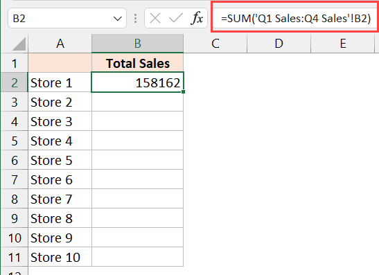
- Use formulas like
=SheetName!Rangeto pull data from other sheets. - Utilize Excel’s Consolidate function from the Data tab if you’re dealing with large datasets or need to sum or average values.
| Data Location | Formula |
|---|---|
| Sheet1!A1:A10 | =Sheet1!A1:A10 |
| Sheet2!B1:B10 | =Sheet2!B1:B10 |

🔄 Note: Keep your summary sheet updated regularly, especially if data in source sheets changes frequently.
Step 3: Choose Your Chart Type

Excel offers various chart types for visualizing your data:
- Column or Bar Charts: For comparing values across categories.
- Line Charts: To display trends over time.
- Pie Charts: For showing proportions.
- Scatter Plot: To explore the relationship between two numerical variables.
Select the chart type that best represents your data’s story.
Step 4: Create the Chart

With your consolidated data ready:
- Select your data in the summary sheet.
- Go to the ‘Insert’ tab, choose your chart type, and click to insert it.
- Excel will generate a chart based on your selected data. You can adjust this chart later for style and layout.
📊 Note: Always review the chart after initial creation to ensure that all intended data points are included and represented correctly.
Step 5: Customize and Finalize

Your chart might need some tweaks:
- Edit Titles: Provide clear titles for the chart and axes to give context.
- Color and Style: Adjust colors to match company branding or to differentiate data series.
- Data Labels: Add labels to clarify data points.
- Axis Settings: Adjust scale, format, and labels as needed.
Remember, customization not only makes your chart visually appealing but also ensures it communicates the intended message effectively.
By following these steps, you can harness Excel's capabilities to manage and present data in a way that's both efficient and visually compelling. This approach is particularly useful for those who deal with dynamic datasets where values change frequently or when you need to compile data from different sources for a comprehensive report.
The techniques described here simplify the process of creating charts from multiple sheets, allowing even those not deeply familiar with Excel to produce professional-grade visualizations. Understanding and utilizing Excel's multi-sheet chart functionality can streamline your workflow, enhance data analysis, and present your findings in a way that's easily digestible by stakeholders.
How can I ensure my chart updates when the source data changes?

+
Set up dynamic named ranges or use formulas like INDIRECT to reference source cells. This way, the chart will update automatically as the source data changes.
Can I use PivotTables to create multi-sheet charts?

+
Yes, by creating a PivotTable that consolidates data from multiple sheets, you can then chart from this PivotTable. This method provides additional data manipulation features like filtering and sorting.
What if I have data from different workbooks?

+
You can reference data from different workbooks in your chart, but ensure all source files remain open for the chart to update correctly. Use Excel’s linking feature to pull data from external files.
Is there a way to automate the data consolidation process?

+
Yes, you can use VBA (Visual Basic for Applications) scripting or Power Query to automate pulling and consolidating data from multiple sheets into a summary sheet.
Can I create multi-sheet charts in Excel Online?

+
Excel Online has limitations compared to the desktop version, but you can create charts using the same principles, though some advanced features might be unavailable.


