Creating Graphs in Excel: Quick and Simple Guide

Microsoft Excel is a powerful tool widely used in businesses and education for its robust data analysis capabilities. One of the key features that make Excel indispensable for many is its ability to create a wide variety of graphs and charts. These visualizations help in understanding complex data patterns, trends, and outliers at a glance. In this guide, we'll walk through the steps of creating graphs in Excel, from selecting data to customizing your charts for optimal presentation.
Starting with Data Selection

Before you can visualize your data, you need to prepare it:
- Ensure your data is well-organized in rows and columns. The first row typically contains headers, which will become labels in your chart.
- Avoid blank cells within your dataset as this can confuse Excel’s charting engine.
📌 Note: While Excel can infer headers, clear labeling enhances both accuracy and readability of your graphs.
Types of Graphs in Excel

Excel offers numerous graph types, but here are some of the most commonly used:
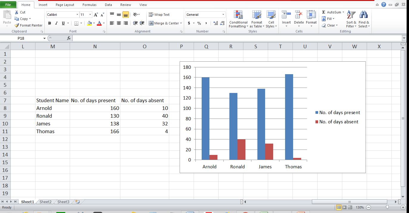
- Column Chart: Good for comparing values across categories.
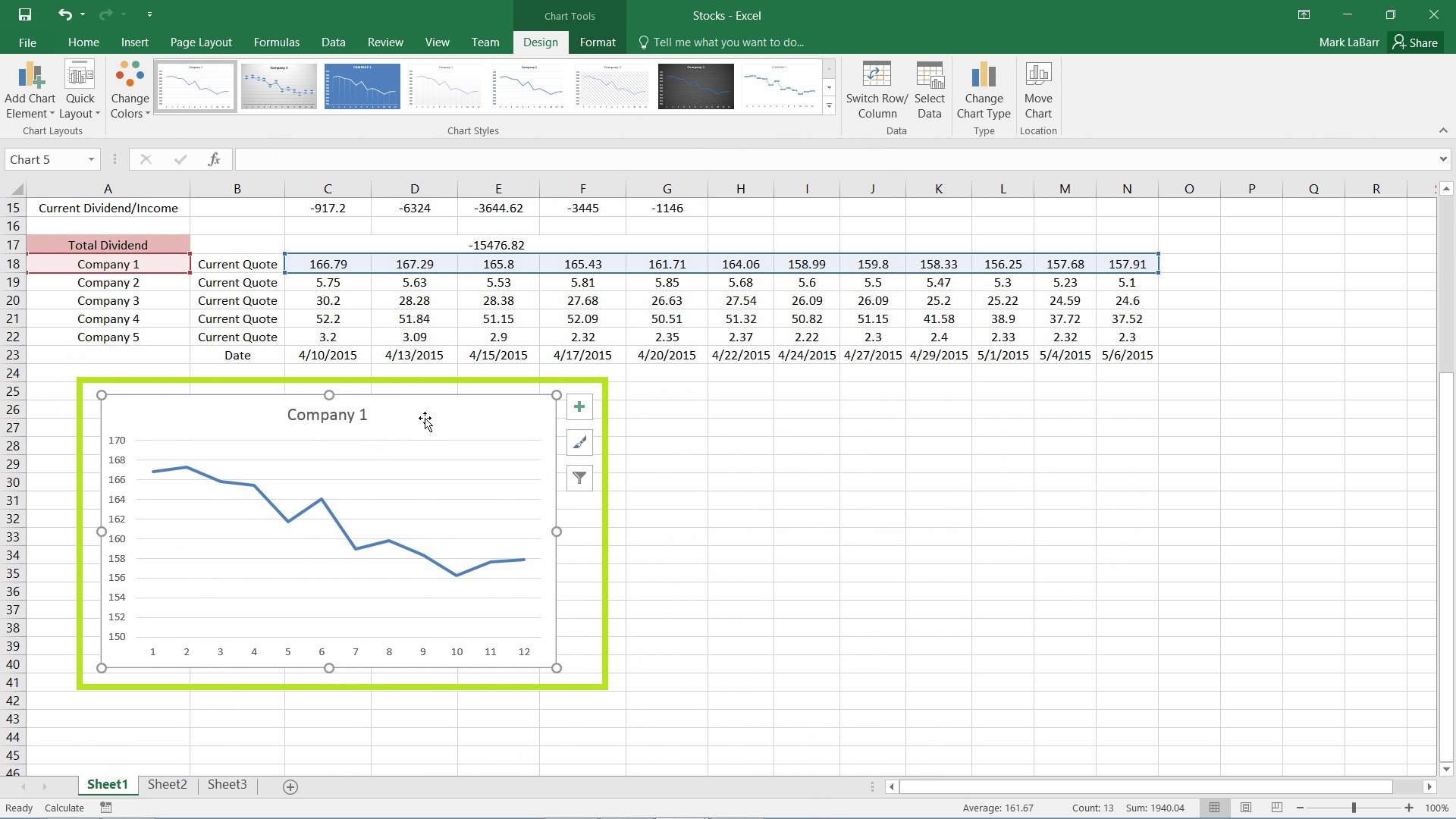
- Line Chart: Ideal for showing trends over time.
- Pie Chart: Useful when you want to show proportions of a whole.
- Bar Chart: Similar to column charts but better for text labels on the axis.
- Area Chart: Highlights the magnitude of change over time.
How to Create a Basic Graph in Excel

Here’s a simple step-by-step guide to creating your first graph:
- Select your data: Highlight the data range you want to plot.
- Go to the ‘Insert’ tab: This is where all charting options are located.
- Choose a chart type: Click on the chart icon in the toolbar to view different types.
- Select your chart: After choosing, a chart will automatically appear on your sheet.
Customizing Your Graph

After inserting a graph, you might want to customize it to better suit your presentation or analysis needs:
- Add or remove elements: Use the Chart Elements (+ button on the chart) to add titles, legends, data labels, etc.
- Change the style: Click on the ‘Chart Styles’ option to modify colors, layout, and chart style.
- Format individual parts: Right-click on the chart components to format them specifically.
Here’s how you can change the chart type after you’ve already inserted a graph:
Click on the chart, then go to the ‘Design’ tab under ‘Chart Tools’, and select ‘Change Chart Type’ to choose a different graph.
💡 Note: Regularly check for updates in Excel as Microsoft frequently enhances its charting capabilities with new features.
Advanced Graphing Features

If you’re looking to explore beyond the basics:
- Sparklines: Miniature charts embedded in single cells for immediate data insights.
- Combination Charts: Merge different chart types for a comprehensive view of different data series.
- Secondary Axis: When datasets have different scales, add a secondary axis for clarity.
- Dynamic Charts with PivotTables: Create interactive charts that update with pivot table changes.
Best Practices for Graph Creation

To make your graphs both accurate and visually appealing:
- Keep it simple: Only include necessary elements to avoid clutter.
- Use clear labels and legends to ensure your data is interpretable.
- Choose colors that are color-blind friendly and ensure contrast for better readability.
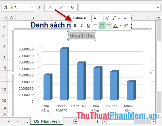
- Avoid 3D effects in charts as they can obscure data points.
Tips for Data Visualization

Here are some tips to improve your graph’s effectiveness:
- Select the right chart: Different charts are suited for different data presentations.
- Keep it focused: Ensure your graph conveys the message you intend to communicate.
- Consider your audience: Adapt the complexity and style of your graph for your viewers.
🌟 Note: Always remember, the goal of graphing in Excel is not just to make your data look good, but to make it understandable and useful for decision-making.
Creating graphs in Excel is not just about plotting data; it's about telling a story with your numbers. With the ability to swiftly generate, customize, and analyze graphs, Excel stands out as an essential tool for data visualization. Whether you're tracking sales figures, analyzing survey results, or presenting financial data, mastering graph creation in Excel will elevate your data presentation skills. Keep practicing, stay updated with new features, and use this guide as a reference to ensure your data speaks loud and clear.
How do I change the chart type after it’s already inserted?

+
Click on the chart, go to the ‘Design’ tab under ‘Chart Tools’, and select ‘Change Chart Type’ to choose a different graph.
Can I combine different chart types in Excel?

+
Yes, you can create combination charts where you can mix different chart types for a more comprehensive view of your data.
What are Sparklines and how do I use them?

+
Sparklines are miniature charts within a single cell. To insert them, select the cell(s) where you want the Sparklines, go to the ‘Insert’ tab, click ‘Sparklines’, and choose the type (Line, Column, or Win/Loss). Then, specify your data range.
How can I make my charts accessible for color-blind viewers?

+
Choose colors with high contrast, avoid using red and green together, and consider using patterns or labels to differentiate data series instead of just color variations.
What’s the best practice for labeling axes in Excel graphs?

+
Ensure axes are clearly labeled with descriptive titles, include units of measure if applicable, and use readable font sizes. Sometimes, adding axis titles can significantly improve chart readability.


