Create Chart Sheets in Excel Easily: Quick Guide

In the world of data management, organization, and analysis, Microsoft Excel stands out as a powerful tool for many professionals and students. One of its key features for presenting and comparing data visually is the use of charts. If you're looking to quickly create and customize charts in Excel, this guide will walk you through the process step by step.
Understanding Chart Basics

Before diving into the creation of charts, it's essential to understand some basic concepts:
- What is a Chart? A chart is a graphical representation of data, which makes information easier to understand.
- Types of Charts: Excel offers various chart types like line, pie, bar, area, scatter, and more, each suited for different kinds of data visualization.
Step-by-Step Guide to Creating Charts in Excel

1. Selecting Your Data

To create a chart, you first need to select the data you want to chart. Here’s how:
- Open your Excel workbook and go to the sheet with your data.
- Click and drag over the cells containing the data you wish to include in your chart. Ensure headers are included if you want them to appear on the chart.
2. Inserting a Chart

Once your data is selected:
- Go to the Insert tab on the Excel ribbon.
- Under the ‘Charts’ group, you’ll find icons for different chart types. Click on the chart type you need or click on the ‘Recommended Charts’ button to see Excel’s suggestions.
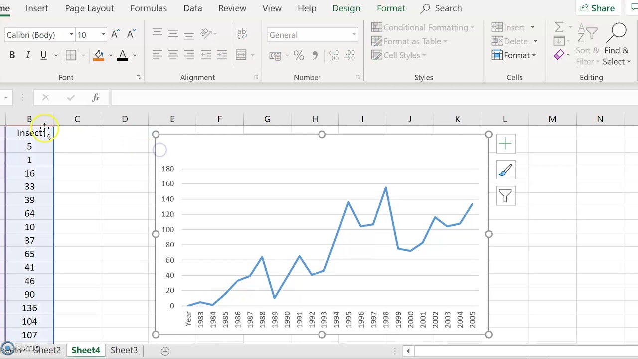
- Excel will show a preview of how your chart might look. Choose the chart and it will appear on your worksheet.
| Chart Type | Best For |
|---|---|
| Column | Comparing values across categories |
| Line | Showing trends over time |
| Pie | Displaying parts of a whole |

3. Customizing Your Chart

After inserting a chart, Excel provides numerous customization options:
- Chart Elements: Right-click on the chart or click the ‘+’ sign next to the chart to add or remove elements like titles, legends, gridlines, or axis labels.
- Styles and Colors: Use the ‘Chart Styles’ button (brush icon) to change the color scheme, layout, and design.
- Chart Filters: Filter the data shown in the chart by clicking on the funnel icon next to the chart.
- Data Labels: Add labels to individual data points for clarity.
4. Finalizing and Saving Your Chart

Once you’re satisfied with your chart:
- You can resize it by clicking and dragging from its corners.
- Move the chart by clicking on its edge and dragging it to a new location on your worksheet.
- To save your work, simply save your Excel file, or export the chart as an image if needed.
💡 Note: Remember to choose a chart type that best represents your data's story. Sometimes, the initial chart type selected might not be the most effective; experimenting with different styles can provide better insights.
Creating charts in Excel can significantly enhance the presentation of your data. By following these steps, you'll be able to produce professional-looking charts that not only convey information but do so in an aesthetically pleasing manner. Whether you're reporting to stakeholders, presenting in class, or just trying to visualize your own data, Excel's charting capabilities can be leveraged to make your work stand out. Understanding how to manipulate and customize these charts ensures that you can accurately communicate your findings, making data-driven decisions much easier and more intuitive.
How do I choose the right chart type for my data?

+
Choose a chart based on what you want to show: Use column charts for comparing categories, line charts for showing changes over time, and pie charts for parts of a whole. Consider data relationships and the story you want to tell.
Can I create custom chart templates?

+
Yes, you can save a customized chart as a template. Right-click on the chart, choose ‘Save as Template’, and name it. You can later apply this template to new charts through the ‘Change Chart Type’ dialog box.
What if my data updates frequently?

+
Excel charts automatically update when you change or refresh the underlying data. Ensure that your data source is in a range or table that can be easily updated, and the chart will reflect these changes in real-time.


