Excel Chart Sheets: Step-by-Step Guide
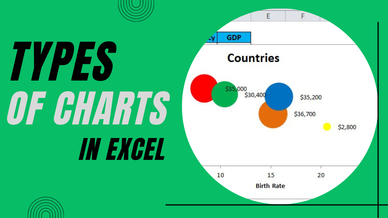
Let’s dive into the comprehensive guide on Excel chart sheets, an essential feature for anyone looking to visualize data effectively in Microsoft Excel. Excel chart sheets provide a unique way to display charts separate from your data, making it easier to analyze trends, patterns, and statistics. Whether you're a business analyst, a student, or someone keen on mastering data representation, this guide will walk you through the steps to create and customize Excel chart sheets.
Understanding Excel Chart Sheets

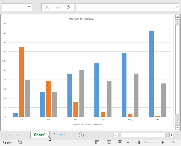
An Excel chart sheet is essentially a new tab in your workbook dedicated solely to a chart. Here are the primary benefits of using chart sheets:
- Improved Visibility: Charts stand out better when they’re not cluttered by adjacent data cells.
- Advanced Formatting Options: Chart sheets offer more formatting options than embedded charts.
- Interactivity: You can add interactive elements like buttons or links for dynamic reports.
Steps to Create a Chart Sheet
1. Select Your Data

Before creating a chart sheet, ensure your data is organized in an Excel worksheet:
- Check for headers to label your axes and legend correctly.
- Ensure the data is clean without empty cells or headers.
2. Create the Chart

Follow these steps to generate your chart:
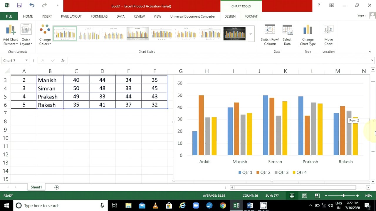
- Select the data range you want to chart.
- Navigate to the Insert tab and choose your desired chart type from the charts section.
- Once the chart is inserted into the worksheet, click anywhere inside the chart to activate the Chart Tools.
3. Move Chart to a New Sheet

With your chart selected:
- Go to the Design tab under Chart Tools.
- Click on Move Chart.
- In the dialog box, select New sheet and name your chart sheet.

4. Customize Your Chart Sheet
Once your chart is on its own sheet:
- Chart Elements: Use the + sign next to the chart to add or remove elements like titles, axis labels, and data labels.
- Chart Styles: Change colors and styles through the Chart Styles section.
- Format Chart Area: Right-click on any part of the chart for detailed formatting options.
Advanced Chart Sheet Features

Adding Interactivity
To make your chart sheet interactive:
- Insert Form Controls like scroll bars or drop-down lists to filter data or update the chart dynamically.
- Use Macros to automate chart updates or enhance chart functionality.
Using Named Ranges

Named ranges can simplify your charts:
- Create named ranges for data sets.
- Reference these ranges when creating charts for easier updates.
✅ Note: Named ranges provide an efficient way to manage data in Excel. They automatically update when new data is added, ensuring your charts reflect the latest information without manual intervention.
Creating Dynamic Charts

Here’s how to make your charts responsive:
- Use OFFSET and COUNTA functions to create dynamic ranges that expand or contract based on data changes.
| Function | Description |
|---|---|
| OFFSET | Returns a reference to a range that is a specified number of rows and columns from a cell or range of cells. |
| COUNTA | Counts the number of cells in a range that are not empty. |
Final Touches to Your Chart Sheet
Ensure your chart sheet looks professional and conveys the information clearly:
- Refine the legend to make it clear and readable.
- Adjust axis labels for clarity or to highlight specific data points.
- Add a title to your chart sheet for quick identification.
After mastering these steps, your Excel chart sheet will not only help you analyze data efficiently but also enhance your presentations or reports with dynamic, interactive visuals. While Excel offers a plethora of features, focusing on creating and customizing chart sheets can significantly improve your data visualization skills.
Chart sheets, with their ability to separate data from visual representation, provide a clean, professional way to showcase data trends and insights. Remember, the key to creating effective charts lies in understanding your data, knowing your audience, and applying the right Excel tools to tell the story behind your numbers.
Can I update the data in an Excel chart sheet automatically?

+
Yes, you can update data automatically by linking your chart to named ranges or using dynamic formulas like OFFSET with COUNTA. This ensures that as you add or remove data from your dataset, the chart adjusts accordingly without manual updates.
What is the difference between an embedded chart and a chart sheet?
+
An embedded chart is placed directly on a worksheet alongside the data, while a chart sheet is a dedicated tab in your workbook focused solely on the chart. Chart sheets provide more space for chart elements and enhanced interactivity features.
How can I print my Excel chart sheet?

+
To print an Excel chart sheet, navigate to the chart sheet tab, go to the ‘File’ menu, select ‘Print’, and choose the appropriate print settings. You can preview the chart’s layout before printing to ensure it looks as intended.
