5 Simple Steps to Create a Bar Chart in Excel

Introduction to Excel Bar Charts

Excel is not only one of the most powerful tools for data analysis but also excels in data visualization, particularly with its chart creation capabilities. One of the most common and straightforward ways to represent data visually is through a bar chart. This post will guide you through the five simple steps to create a bar chart in Excel, helping you to visually communicate your data effectively.
Step 1: Organize Your Data

Before you can create any chart in Excel, your data must be organized. Here’s how to prepare:
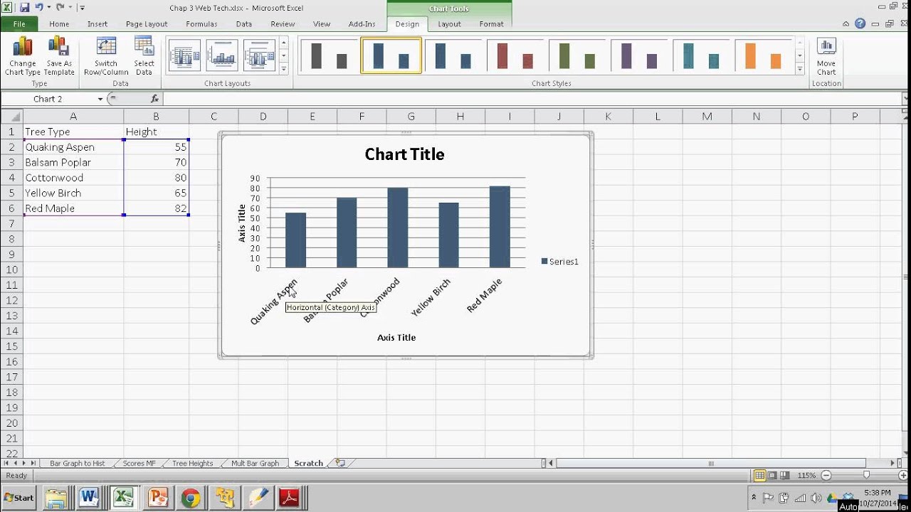
- Ensure your data is in a tabular format with categories in one column and corresponding values in another.
- Leave no blank cells within the data range you intend to use for your chart.
- If you want to add labels to your bars or customize your chart, include extra columns for that information.
Step 2: Select Your Data

With your data ready:
- Click and drag to select the data range including the headers if you wish to label your chart axes.
🚨 Note: Including headers is optional, but it can make your chart more readable.
Step 3: Insert the Bar Chart

Here’s how to insert your chart:
- Go to the Insert tab on the Ribbon.
- In the Charts group, click on the Bar or Column chart button.
- Choose the type of bar chart you want (e.g., 2-D, 3-D, Clustered, Stacked).
Step 4: Customize Your Chart

Excel offers numerous customization options:
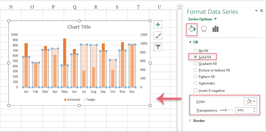
- Click on the chart to see additional options appear on the right-hand side. Here you can change colors, styles, and layout.
- Add chart elements like titles, labels, or a legend:
- Click on the “+” icon beside the chart to add elements.
- Select what you want to add or modify.
Step 5: Analyze and Present

Once your chart is created and customized:
- Review your chart for accuracy. Ensure the bars correctly represent the data.
- If you need to focus on specific data points or trends, consider adding data labels or lines to highlight these.
- Prepare to present your chart. Ensure it’s clear and can effectively communicate the information to your audience.
🔍 Note: Remember that clarity and simplicity are key when presenting data through charts.
In this guide, we've explored how to create a basic bar chart in Excel through five straightforward steps. This tool is essential for anyone who deals with data analysis or needs to present data in a visual format. By following these steps, you can efficiently turn raw data into insightful visuals, making your reports or presentations more engaging and informative. Understanding how to manipulate and customize charts can significantly enhance your data storytelling capabilities, allowing you to convey complex information in an accessible way.
What are the benefits of using a bar chart?

+
Bar charts are effective for comparing quantities or frequencies across different categories, making it easier to visualize patterns or trends in the data.
Can I change the type of chart after I’ve inserted a bar chart?

+
Yes, you can easily switch the chart type by selecting your chart, going to the “Design” tab, and choosing a different chart from the “Change Chart Type” option.
How do I add error bars to my bar chart?

+
To add error bars, click on your chart, go to the “Chart Tools” Design tab, and select “Add Chart Element.” Then, choose “Error Bars” and specify the type or enter custom values.


