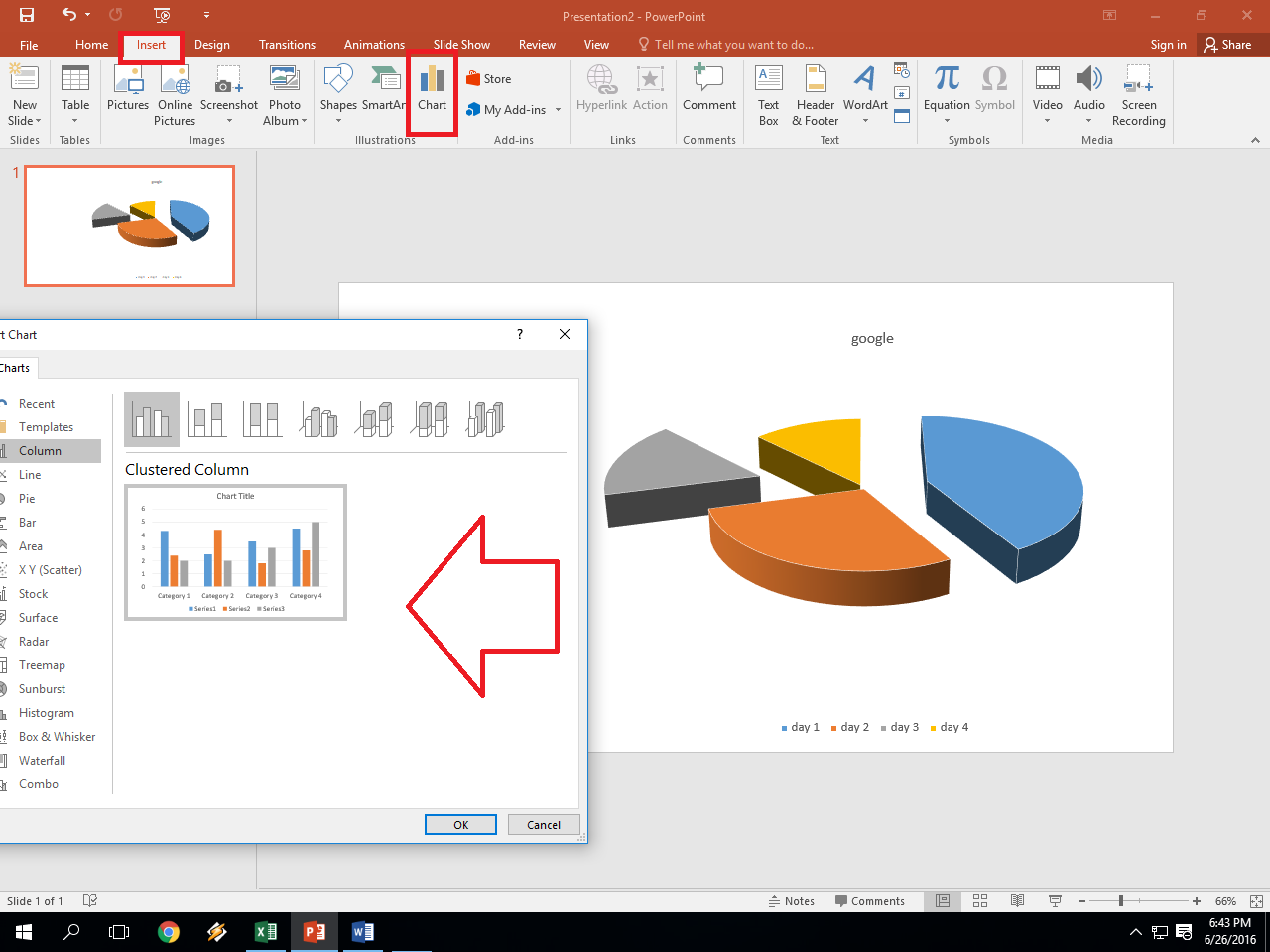
5 Easy Steps to Draw Graphs in Excel

Welcome to our comprehensive guide on how to effectively draw graphs in Excel! Whether you are compiling data for a business presentation, analyzing survey results, or just looking to visualize your personal finances, Excel provides robust tools for creating various types of graphs. Here, we will walk you through five straightforward steps to help you get started and make the most out of Microsoft Excel’s graphing capabilities.
Step 1: Preparing Your Data

The quality of your graph largely depends on how well you organize your data:
- Ensure that your data is clean - no blank rows or columns within the data set.
- Headers should be descriptive for clarity in graph legend creation.
- Align the data in a tabular format with rows as data points and columns as categories or time intervals.
🚧 Note: It's crucial to ensure data accuracy before you start graphing. Double-check your data entries for errors or outliers that might skew your graph.
Step 2: Selecting Your Graph Type

Excel offers a plethora of graph types, each suited for different kinds of data visualization:
- Line Graph: Ideal for displaying trends over time.
- Bar or Column Chart: Perfect for comparing values across different categories.
- Pie Chart: Useful for showing proportional data or parts of a whole.
- Scatter Plot: Great for showing correlation or distribution between two variables.
- Area Graph: Shows the change over time while highlighting the magnitude of the trend.
📊 Note: Consider the type of information you want to convey when choosing your graph. Sometimes, combining graph types (like a line and column graph) can provide a clearer picture.
Step 3: Creating the Graph

Once you’ve decided on your graph type, follow these steps:
- Highlight the data you want to plot, including headers.
- Go to the Insert tab on the Excel ribbon.
- Select your desired graph type from the ‘Charts’ group.
- Your graph will appear immediately on your worksheet. You can move or resize it as needed.
Step 4: Customizing Your Graph

After creating the basic graph, you can refine it:
- Right-click on various elements of the graph (like axis, title, legend) to modify them through the ‘Format’ options.
- Use the Chart Tools (Design, Layout, Format) to customize colors, add titles, change axis labels, and more.
- To adjust the scale or categories, go to the axis options where you can change the minimum and maximum values, add gridlines, etc.
Here's a quick guide to some common customizations:
| Element | Customization Options |
|---|---|
| Graph Title | Add or modify, change font, size, and color |
| Axis Labels | Edit names, change format (e.g., percentages), add labels |
| Legend | Change position, modify colors, add custom labels |
| Data Series | Change line or marker styles, color, add data labels |

✏️ Note: When customizing, ensure that your graph remains legible. Avoid cluttering it with too many details, which can distract from the primary information.
Step 5: Analyzing and Presenting Your Graph

Now that your graph is ready, use it effectively:
- Analyze: Look for trends, outliers, or patterns in the data. Use trend lines or data analysis tools for deeper insights.
- Formatting for Presentation: Make sure the graph is formatted consistently with the presentation theme for professional looks.
- Export or Print: If sharing or presenting the graph, consider exporting it as an image or copying it into presentation software like PowerPoint.
Key insights from data can be presented succinctly:
- Use graph titles, legends, and labels to tell a story or highlight the key finding.
- Employ data analysis features like moving averages, regression lines, or even sparklines within your main graph to provide context.
Having followed these steps, you are now equipped to draw, customize, and utilize graphs in Excel to your advantage. Whether you're reporting on financial data, visualizing scientific results, or tracking personal progress, these steps will guide you to create clear and compelling visual representations of your data. Remember, practice makes perfect, so keep experimenting with different types of data and graph customizations to find what works best for your needs. To wrap up, Excel's graphing capabilities are user-friendly yet versatile. By preparing your data meticulously, choosing the right graph type, customizing thoughtfully, and analyzing effectively, you can create graphs that not only look good but also communicate valuable insights. Keep these steps in mind, and you'll enhance your ability to present data in a visually appealing and informative way. Here's an FAQ section to help answer common questions related to creating graphs in Excel:
What is the easiest way to update data in an Excel graph?

+
The easiest way to update the data in an Excel graph is to modify the source data in the worksheet. The graph will automatically update to reflect these changes.
Can I make a graph from multiple data ranges?

+
Yes, Excel allows you to create graphs from multiple non-adjacent ranges. Hold the Ctrl key while selecting the ranges before inserting the graph.
How do I export a graph from Excel?

+
Right-click on the graph, select ‘Copy’, then paste it into another program like PowerPoint or an image editor. You can also save it as an image by choosing ‘Save as Picture’ from the context menu.
Can I add error bars to my graph?

+
Yes, you can add error bars to show the variability of the data. Use the ‘Add Chart Element’ button under ‘Chart Tools’ to include them.
How can I ensure my graph is accessible?

+
To make your graph accessible, add alternative text to describe the graph’s content and ensure colors used are distinguishable for those with color vision deficiencies.


