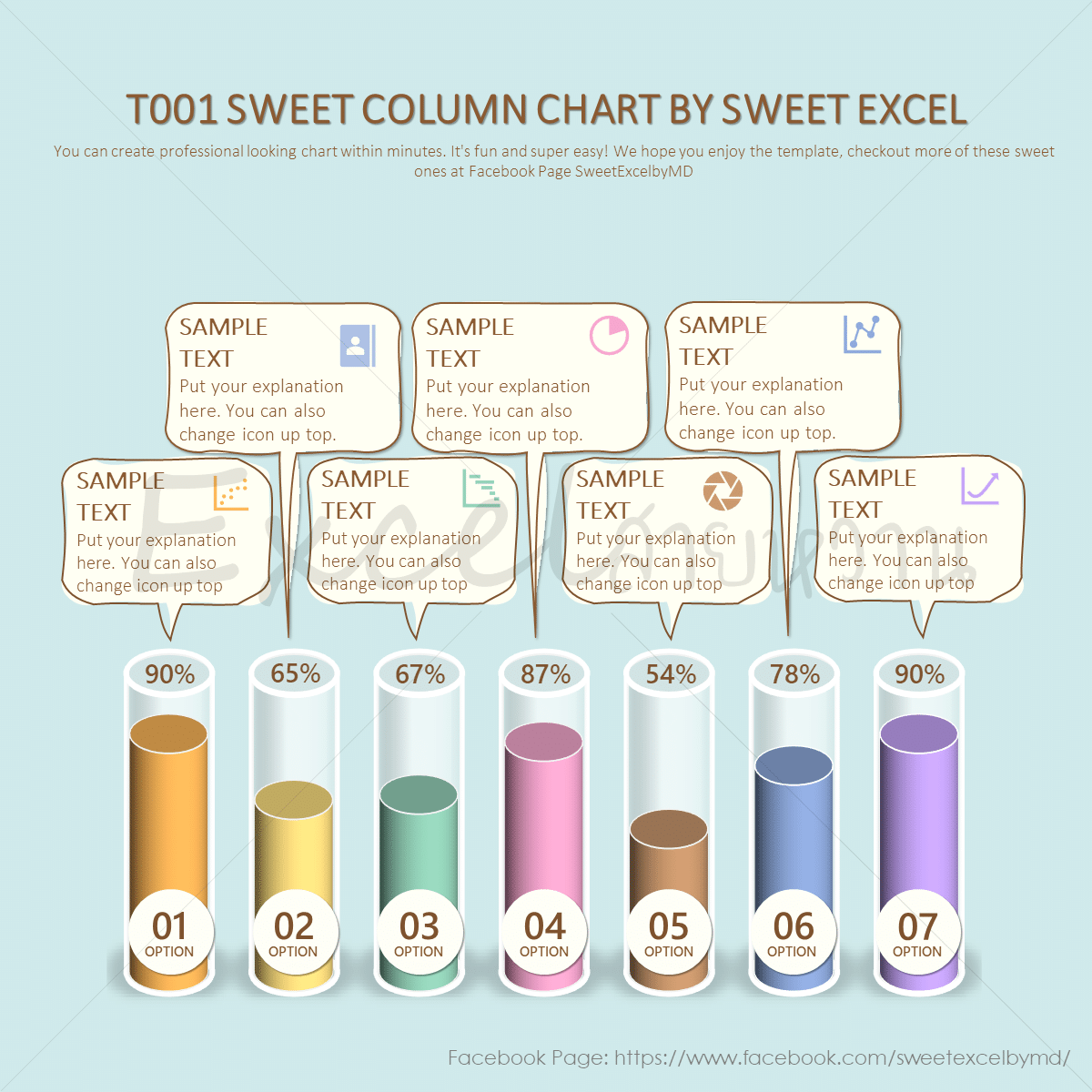
Master Graph Drawing in Excel: Quick & Easy Steps

Creating and interpreting graphs in Microsoft Excel is an essential skill for data analysis, reporting, and visual presentation of information. Whether you are a student, a professional, or just someone looking to enhance their data literacy, mastering graph drawing in Excel can significantly boost your efficiency and communication of complex data sets. Let's explore how you can quickly master this skill with ease.
Why Graphs in Excel?

- Data Visualization: Graphs transform complex datasets into digestible visuals.
- Enhanced Analysis: Visual data makes trend spotting, comparisons, and outliers more apparent.
- Effective Communication: Present your findings in a manner that's universally understandable.
- Professional Reporting: Elevate your reports and presentations with professional-quality graphs.
Types of Graphs in Excel

Excel offers a variety of graph types, each with its unique purpose:
- Line Graph: Ideal for showing changes over time.
- Bar/Column Graph: Best for comparing quantities across categories.
- Pie Chart: Perfect for displaying proportions of a whole.
- Scatter Plot: Useful for showing correlations between variables.
- Area Chart: Similar to line graphs but shows the area under the line to emphasize total volume.
Steps to Create a Graph in Excel

1. Prepare Your Data

Ensure your data is formatted correctly:
- Remove any blank rows or columns.
- Label your rows and columns clearly.
- Keep numeric data in a consistent format.
✅ Note: Consistency in data formatting helps Excel recognize your dataset accurately.
2. Select Your Data

Highlight the range of data you wish to graph:
- Include any labels or headers if you want them in your graph.
3. Insert the Graph

- Go to the ‘Insert’ tab in the ribbon.
- Choose the desired graph type from the ‘Charts’ section.
4. Customize Your Graph

Excel offers numerous customization options:
- Change the graph’s title, axes labels, and legend.
- Adjust colors, styles, and layout for better readability.
- Use the ‘Design’, ‘Layout’, and ‘Format’ tabs under ‘Chart Tools’ to tweak your graph.
🔄 Note: Customization enhances readability and professional look, so spend some time refining your graph.
5. Adding Trendlines or Data Labels

To enhance analysis:
- Right-click on a data series to add trendlines or data labels.
- Adjust these to fit your analysis needs.
6. Finalizing Your Graph

Once satisfied with the look:
- Save your work.
- If needed, copy the graph for use elsewhere (e.g., in presentations or reports).
By mastering these steps, you'll be well on your way to creating informative, visually appealing graphs in Excel. This skill not only helps in data analysis but also in communicating your findings effectively, making you a more valuable asset in any professional environment.
Advanced Graph Techniques

Here are some advanced features you might explore:
- Secondary Axis: When dealing with data sets of different scales, you can add a secondary axis.
- Combination Charts: Combine chart types for a more comprehensive view of your data.
- Sparklines: Miniature graphs within a cell for quick data overview.
Graphing in Excel is not just about creating visuals; it's about telling a story with your data, making trends clear, and enabling others to understand your findings swiftly. With the knowledge of different graph types and customization options, you're equipped to choose the best representation for your data. Remember, practice will make you proficient, so keep experimenting with real datasets to hone your skills.
How can I choose the right type of graph for my data?

+
Choose a line graph for trends over time, bar/column for comparisons, pie for proportions, scatter plots for correlations, and area charts for volume changes.
Can I include more than one data series in a graph?

+
Yes, Excel supports multiple data series in one graph. Simply select more columns or rows when you insert the graph.
How can I make my graph more readable?

+
Use clear labels, a well-defined color scheme, and adequate contrast. Adjust the legend and axes to make data interpretation straightforward.
What do I do if my graph looks cluttered?

+
Remove unnecessary elements like excessive gridlines or legend entries, consider splitting the graph into simpler charts, or use transparency for overlapping data.


