Easily Create Graphs in Excel on Windows 10

Easily Create Graphs in Excel on Windows 10
Welcome to a comprehensive guide on how to easily create graphs in Excel on Windows 10. Whether you're a student, professional, or hobbyist, mastering Excel's graphing features can significantly enhance your ability to present data visually in a compelling manner. In this guide, we'll cover everything from selecting data, choosing the right type of chart, to customizing your graphs for maximum impact. Let's dive in!
How to Create a Graph in Excel

Creating a graph in Excel is straightforward but understanding each step thoroughly will ensure your graphs are both accurate and visually appealing.
Step 1: Select Your Data

- Open your Excel spreadsheet.
- Click and drag to select the data range you wish to graph. Make sure to include headers if applicable.
Step 2: Choose the Graph Type

- Go to the Insert tab.
- In the Charts section, you’ll find various chart options like:
- Column
- Line
- Pie
- Bar
- Area
- Scatter
- Select the chart type that best represents your data. For example, pie charts work well for showing proportions, while bar charts are ideal for comparing quantities.
Step 3: Create the Graph

- Once you select a chart type, Excel will automatically create a graph from your selected data.
- If you need to adjust, simply click the graph to reveal the Chart Tools for further customization.
Step 4: Customize Your Graph

- Add Titles: Double-click where you want to add a title, then enter your text.
- Adjust Legend: Click on the legend, then use the Chart Elements button to format or reposition it.
- Change Colors: Use the Chart Styles or Format pane for a color scheme that enhances visibility and aesthetics.
- Axis Adjustments: Click on the axis, then adjust scale, labels, or format for clarity.
🛠️ Note: For precise adjustments, consider using the Format pane, accessible by right-clicking on chart elements and selecting “Format [Element]”.
Step 5: Enhance Graph Readability

- Add Gridlines: Click on the graph, go to Chart Elements, then check gridlines for better data interpretation.
- Data Labels: Right-click a data series, then choose “Add Data Labels” to label your data points.
Step 6: Save and Share

- Once satisfied with your graph, you can save your Excel file or share it.
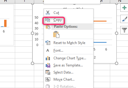
- Right-click on the graph for options to copy, save as an image, or use Excel’s built-in sharing features.
In this guide, we've walked through the process of creating and customizing graphs in Excel on Windows 10. Graphs are not just visual representations of data; they are powerful tools for analysis, presentation, and decision-making. By following these steps, you can:
- Select and organize your data effectively
- Choose the most suitable chart type for your narrative
- Customize every aspect of your graph to fit your style and purpose
- Make your graphs more readable with practical enhancements
Whether you're tracking sales trends, analyzing survey results, or presenting project progress, mastering graph creation in Excel will elevate your data presentation skills. Remember, practice is key, so don't hesitate to experiment with different data sets and chart types to understand what works best for your specific needs. Let your data tell its story through well-crafted graphs.
What type of graph should I use for my data?

+
The choice depends on the nature of your data. Use pie charts for proportions, bar charts for comparing quantities, line charts for trends over time, and scatter plots for relationships between variables.
Can I change the graph type after creation?

+
Yes, simply click on the graph, go to the Chart Tools > Design tab, and select “Change Chart Type” to switch to another type of chart.
How can I share my graphs created in Excel?

+
You can share your graphs by saving the Excel file and sending it, copying and pasting the graph into a presentation or document, or using Excel’s sharing features like cloud sharing or email attachments.


