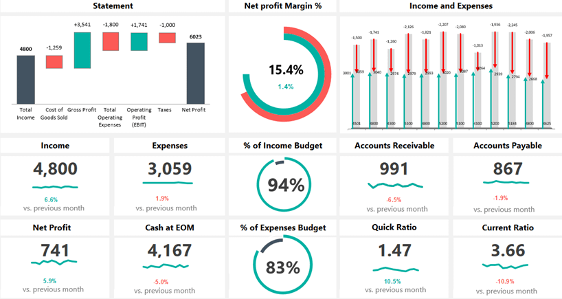
10 Tips for Designing Beautiful Excel Sheets

In the realm of business and data analysis, Microsoft Excel remains a ubiquitous tool due to its vast array of features and customization options. Designing a beautiful Excel spreadsheet can make data more accessible, understandable, and, frankly, more enjoyable to work with. Here are ten tips to help you elevate your Excel skills from functional to visually impressive:
1. Plan Your Layout


Before diving into Excel, sketch your layout on paper or a digital drawing tool. Consider how information will flow, what will be the primary focus, and how to minimize visual clutter. A clear plan ensures that your final spreadsheet doesn’t become a convoluted mess of data.
- Determine your core data sets.
- Group related information for easier reading.
- Place charts, tables, and images strategically.
2. Use Consistent Color Schemes

Color can both highlight important data and make your Excel sheet aesthetically pleasing. Consistency in your color usage prevents confusion and enhances readability:
- Define a palette of 4-6 colors to use throughout your document.
- Use color for highlighting, coding, and grouping data.
- Apply conditional formatting for dynamic color changes based on data values.
🎨 Note: Excel provides various color schemes in the “Themes” menu that you can customize for consistency across your document.
3. Master the Art of Formatting

Formatting isn’t just about aesthetics; it’s about guiding the user’s eye through the information:
- Bold headers and titles to separate sections.
- Use borders to define table boundaries.
- Employ cell alignment (center, left, right) to aid in visual flow.
4. Employ Clever Use of Fonts


Fonts can significantly impact the readability and style of your Excel sheets. Choose wisely:
- Use font styles to differentiate headers from body text.
- Limit your font variety to enhance consistency.
- Ensure text size is legible; larger for headers and smaller for cell content.
5. Create Dynamic Tables and Charts

Dynamic tables and charts add interactive elements to your Excel sheets, allowing data to be presented in a visually engaging manner:
- Use PivotTables to summarize large data sets dynamically.
- Incorporate charts that automatically update when data changes.
- Utilize slicers for interactive data filtering.
📊 Note: Excel’s PivotTable is an excellent tool for summarizing data, but it can also be used for creating dynamic charts that adjust when you manipulate filters or data.
6. Leverage Data Validation

Data validation controls data input, ensuring accuracy and allowing you to design beautiful user interfaces for data entry:
- Set up drop-down lists for user selection.
- Use error alerts to guide users in data entry.
- Create custom input messages for better user experience.
7. Add Visual Breaks

Visual breaks, like empty rows or columns, can provide breathing room for the eyes, making your sheet less overwhelming:
- Insert blank rows or columns to separate sections.
- Use lines or shading to create visual blocks.
8. Optimize for Data Entry

When designing an Excel sheet for data entry, consider the user:
- Use input forms for structured data entry.
- Implement conditional formatting for immediate visual feedback.
- Use macros or VBA for automating repetitive tasks.
9. Incorporate Multimedia Elements

Where appropriate, adding multimedia elements can enrich your spreadsheet:
- Embed images or icons to represent categories or data types.
- Include embedded spreadsheets for deeper data exploration.
- Use Excel’s ability to play audio or video for presentations.
10. Review and Refine

After creating your sheet, step back and review:
- Check for readability and usability.
- Adjust spacing, font size, and colors as needed.
- Get feedback from others for different perspectives.
In summary, designing beautiful Excel sheets goes beyond mere functionality; it’s about crafting an experience that’s both visually appealing and user-friendly. By following these ten tips, you can transform raw data into an informative and engaging masterpiece. Remember, effective design in Excel involves a balance of aesthetics, clarity, and functionality to truly make your data shine.
Why is it important to design a spreadsheet with aesthetics in mind?

+
A visually appealing design can make data easier to read, understand, and engage with, which is critical for effective communication of information.
How does planning the layout help in designing Excel sheets?

+
Planning helps in organizing data, preventing clutter, and ensuring that the most important information stands out, making the data analysis process smoother.
What are some ways to add interactivity to Excel sheets?

+
Using dynamic tables, PivotTables, charts, slicers, and macros can significantly enhance user interaction with your data, making your Excel sheets both beautiful and functional.


