5 Ways to Transform Excel Sheets into Stunning Illustrations

Excel isn't just about numbers and charts; it can be a playground for creativity. Transforming your spreadsheets into stunning illustrations opens up a new avenue for visual communication, making data presentation not only informative but also aesthetically pleasing. Here are five exciting ways to turn those cells into something beautiful.
1. Leverage Conditional Formatting for Patterns

Conditional formatting is often used for highlighting cell ranges, but it’s also an excellent tool for creating visual patterns.
- Selective Color Coding: Use gradients or solid colors to create simple shapes or even complex mosaic patterns.
- Icon Sets: Replace numbers with icons to form patterns that can represent different types of data or tell a story visually.
Here’s how you can start:
- Select the cells you want to format.
- Go to “Home” > “Conditional Formatting” > “New Rule.”
- Choose “Use a formula to determine which cells to format” and input your formula.
- Select the fill and pattern options that fit your design idea.
🎨 Note: Overuse of conditional formatting can slow down your workbook. Use it judiciously to maintain performance.
2. Crafting Custom Shapes with the Drawing Tools

Excel’s drawing tools are surprisingly robust, allowing for the creation of custom shapes or intricate illustrations.
- Line and Shape Drawing: Use these to sketch out basic shapes or complex forms.
- Freeform Shape: Draw with the Scribble tool for unique designs.
- Arrange Layers: Excel allows layering of shapes to create depth and detail.
Here are steps to get started:
- Go to “Insert” > “Shapes” and select your shape.
- Draw on your spreadsheet where you want your illustration to be.
- Customize the color, outline, and size from the “Format” tab.
- Use “Arrange” to layer shapes.
⚠️ Note: Too many shapes can increase file size significantly, impacting performance.
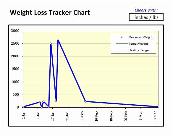
3. Turn Your Data into Artistic Charts

Charts are not just for presenting data; they can be transformed into works of art.
- Manipulate Data: Convert data into visually interesting shapes, like a donut chart to represent pie slices.
- Style the Charts: Customize chart styles to create a unique look, using custom markers, colors, and axis designs.
Here’s a practical approach:
- Create your data set.
- Choose a chart type from “Insert” > “Chart.”
- Right-click the chart, select “Format Chart Area,” and tweak the style to your taste.
Charts can be made to resemble flowers, trees, or any abstract representation you can imagine.
4. Utilize Excel Add-Ins for Enhanced Illustration

Excel’s add-ins provide additional tools for graphic design and data visualization:
- Shape Add-Ins: These can add more complex shapes or even 3D objects to your spreadsheet.
- Artistic Filter Add-Ins: Apply filters or effects to your data visualizations for a more artistic look.
Here are some steps to make the most of add-ins:
- Go to “File” > “Options” > “Add-ins.”
- Choose the add-in you need, install it, and restart Excel if necessary.
- Explore the new options in the “Insert” tab or specific add-in tabs.
5. Create Illustrated Data Dashboards

A dashboard can be much more than a summary; it can be a visual delight:
- Use Different Chart Types: Combine various chart types for a more comprehensive yet visually appealing representation.
- Add Custom Graphics: Incorporate custom illustrations or icons to guide the viewer’s eye through the dashboard.
- Conditional Formatting: Utilize this for background cells or headers to enhance the visual flow.
Here’s how to craft an illustrated dashboard:
- Plan your data layout.
- Insert charts and customize them as above.
- Add shapes, lines, and illustrations to guide the viewer.
- Apply conditional formatting where appropriate.
🛑 Note: Ensure the dashboard’s visual appeal does not compromise its readability or functionality.
By exploring these five methods, you can elevate your Excel skills from mere data management to creating visual masterpieces. Not only will this make your spreadsheets stand out, but it will also communicate your data in ways that captivate and engage your audience. Whether for professional presentations, personal projects, or simply for the joy of creation, Excel offers endless possibilities for those willing to think outside the grid.
Can I save my Excel illustration as an image?

+
Yes, you can save parts or all of your Excel sheet as an image. Select the cells or charts you want to convert, then go to “File” > “Save As,” choose the appropriate image format like PNG or JPEG, and save the file.
Are Excel add-ins safe to use?

+
Excel add-ins from the official Microsoft Office Store are generally safe, but always ensure you’re downloading from trusted sources. Be cautious with third-party add-ins, checking reviews and ratings, or researching their legitimacy.
What happens to the functionality of the Excel sheet if I heavily customize it for aesthetics?

+
While customization can make your Excel sheet visually appealing, too many customizations, especially with conditional formatting, shapes, or images, can slow down Excel’s performance. Always balance aesthetics with functionality to ensure the workbook remains efficient.