Transform Your Excel Data into Stunning Graphs Easily

In today's data-driven world, being able to present information effectively can make all the difference in business, education, and personal projects. Excel has long been the go-to tool for managing and analyzing data, but its capabilities extend far beyond basic calculations and data entry. With Excel, you can transform complex datasets into visually appealing graphs that not only catch the eye but also convey the message with clarity. Let's dive into how you can elevate your data presentation skills with Excel graphs.
Understanding Excel’s Graphing Capabilities

Excel provides a robust suite of charting options that cater to various data representation needs:
- Column and Bar Charts: Ideal for comparing values across categories or showing changes over time.
- Line Graphs: Best for showing trends over continuous intervals, like time or distance.
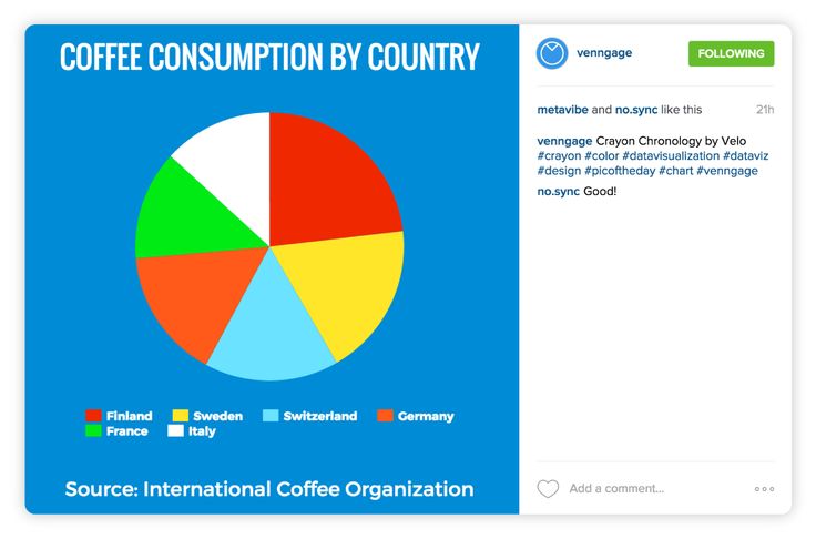
- Pie Charts: Perfect for illustrating proportions of a whole.
- Scatter Plots: Used for showing the relationship between two numeric variables.
- Area Graphs: Similar to line graphs but emphasize volume over time.
- 3D Charts: For advanced visualization when standard 2D charts are insufficient.

Preparing Your Data for Graphing
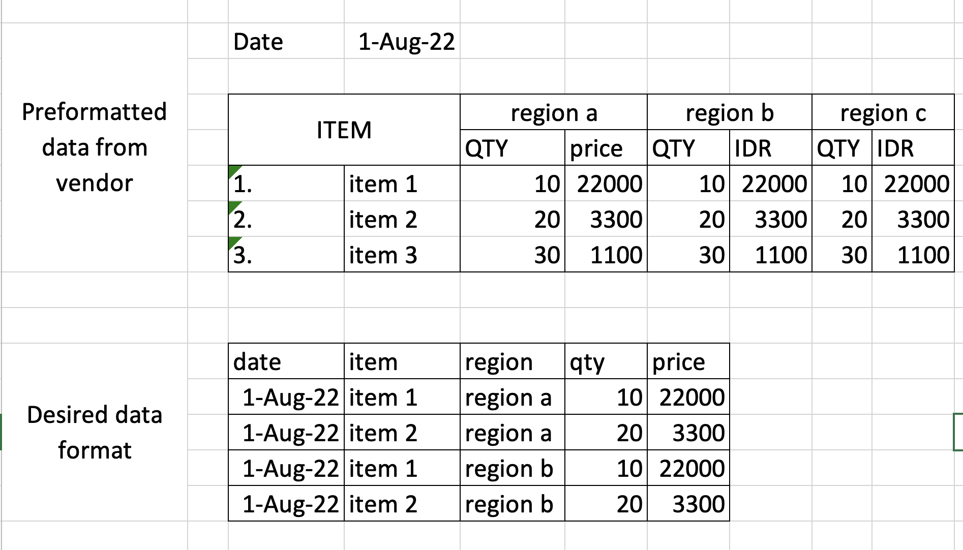
Before you can graph your data in Excel, ensure that your data is organized in a way that facilitates easy graphing:
- Use separate columns or rows for different variables or categories.
- Remove any blank rows or columns within your data range, as they can skew your chart.
- Ensure that the data is consistent in terms of units and scales.
Step-by-Step Guide to Creating Graphs in Excel

Here’s a simple yet effective walkthrough to transform your data into a visual masterpiece:
1. Select Your Data

- Highlight the cells containing the data you want to include in the graph.
2. Choose the Right Chart Type

- Go to the Insert tab on the Ribbon, where you’ll find various chart options.
- Select the chart type that best represents your data or suits your purpose.
3. Insert the Graph

- After selecting a chart type, Excel will display your data in the chosen format on your worksheet.
- You can reposition and resize the chart as needed.
4. Customize Your Graph

To truly stand out, your graph needs some personalization:
- Double-click on any part of the graph to access design tools.
- Customize titles, axis labels, and legends to enhance clarity.
- Adjust the color scheme or style to match your presentation or report.
- Add data labels to show specific values on the graph if necessary.

🔗 Note: Don't forget to check the data source if your chart isn't reflecting changes. Ensure the range used in the graph is up to date.
5. Analyze and Present Your Data

- Now that your graph is ready, analyze the trends, patterns, or anomalies it shows.
- Use the graph to support or explain your findings in presentations or reports.
Advanced Graphing Techniques
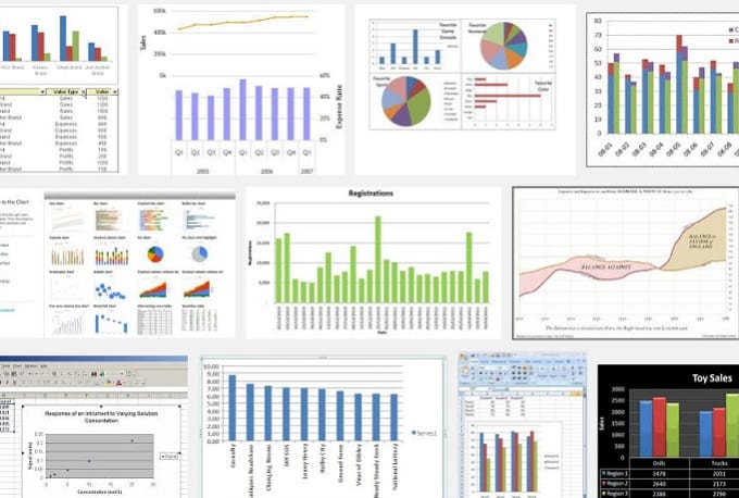
For those who wish to delve deeper into Excel’s capabilities:
Conditional Formatting with Graphs

Excel allows you to apply conditional formatting to graphs, changing colors based on data values, making trends or outliers stand out:
- Select your graph and go to the Format pane.
- Choose Shape Fill, and select Gradient Fill or Picture or Texture Fill for visual enhancement.
Combination Charts
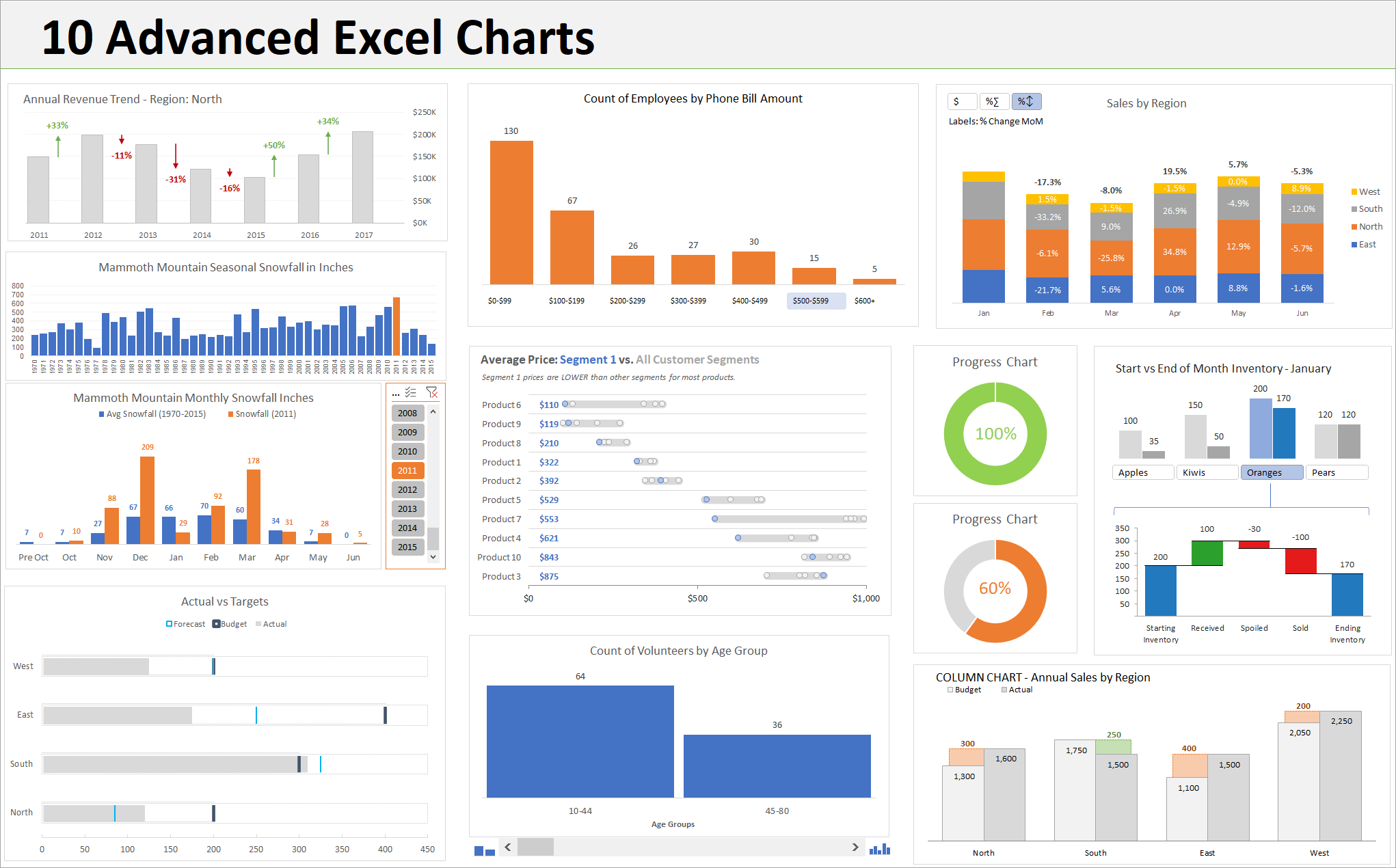
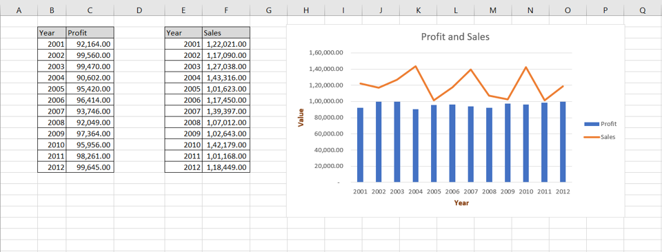
When you need to display different but related datasets on a single graph:
- Select the graph, then click on Change Chart Type in the Design tab.
- Combine two different chart types, like a column and a line, for a dual-axis chart.
| Chart Type | Best Used For |
|---|---|
| Column/Bar | Comparing values across categories |
| Line | Showing trends over time |
| Pie | Showing proportions of a whole |
| Scatter | Showing correlation between variables |
| Area | Highlighting volume over time |
⚠️ Note: Excel can be quirky. If your graph isn't behaving as expected, check for hidden rows, data inconsistencies, or incorrect chart type selection.
In wrapping up this journey through Excel’s graphing capabilities, remember that mastering these tools can enhance your data storytelling skills. Whether you’re a student, a professional, or someone just looking to make sense of numbers, Excel’s graph functions are indispensable for bringing data to life. By following these steps, you can not only present data effectively but also uncover insights that might otherwise be hidden in plain numbers.
Can I create a graph with more than one type of data?

+
Yes, Excel allows you to create combination charts where you can display different data types or variables on a single graph, often using dual-axis charts.
How do I change the axis labels or titles in an Excel graph?
+
Click on the graph to activate the chart tools. Use the “Chart Tools” Design tab to edit the chart title, axis labels, and legend.
Can I save my custom graph style for future use?
+
Yes, you can save your custom chart templates for reuse. Once you’ve customized a graph, right-click it, choose “Save as Template,” and your style will be available in the chart type dropdown menu in the future.