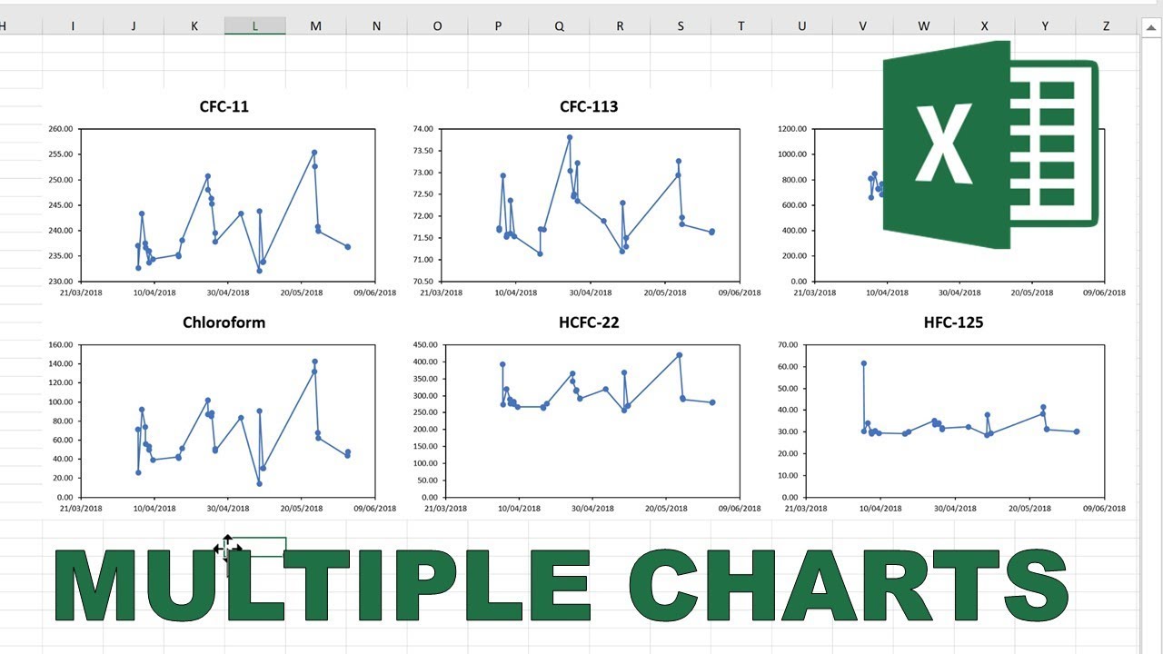
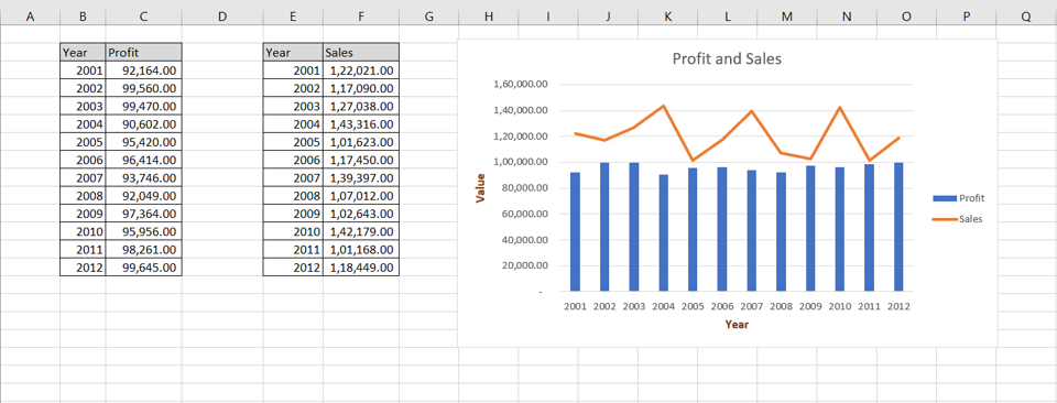
How to Display Multiple Charts on One Excel Sheet

Creating multiple charts on a single Excel sheet can be an incredibly powerful tool for data analysis and presentation. This comprehensive guide will walk you through how to effectively display multiple charts on one Excel sheet, optimizing your spreadsheets for both analysis and presentations.
Why Use Multiple Charts in Excel?

Charts are visual representations that make complex data easier to understand and analyze. Here are some reasons why displaying multiple charts in one Excel sheet might be beneficial:
- Comparative Analysis: Show trends or comparisons across different datasets or time periods.
- Space Efficiency: Utilize screen real estate effectively by placing multiple charts on one sheet.
- Storytelling: Tell a visual story by showing related data points in sequence or in parallel.
How to Set Up Your Excel Sheet for Multiple Charts

Before diving into the process of creating multiple charts, it's essential to prepare your data and Excel sheet:
- Organize Your Data: Ensure your data is clean, well-organized, and ready for charting. Each set of data should be in a separate range or table.
- Name Your Ranges: Assign names to your data ranges for easy reference when creating charts.
- Choose a Layout: Decide where on the sheet each chart should go. You can use gridlines to help with positioning.
Here is an example of how you might layout your Excel sheet:
| Sheet Layout | Column A | Column B | Column C | Column D |
|---|---|---|---|---|
| Row 1 | Chart Title 1 | Data for Chart 1 | ||
| Row 2 | ||||
| Row 3 | Chart Title 2 | Data for Chart 2 |

Steps to Create Multiple Charts

Step 1: Creating Your First Chart

Follow these steps to create your first chart:
- Select the range of data you want to chart.
- Go to the ‘Insert’ tab and choose the chart type that best represents your data.
- Drag the chart to the desired location on your Excel sheet. Adjust the chart title and other elements as needed.
Step 2: Adding Additional Charts

Once the first chart is in place:
- Select another range of data for the next chart.
- Insert another chart from the ‘Insert’ tab, choosing the appropriate chart type.
- Place the new chart adjacent to or below the first chart, leaving enough space to read each chart clearly.
💡 Note: You can resize charts by dragging the corners. Ensure all charts are sized proportionally to each other for consistency.
Step 3: Fine-Tuning Your Charts

Adjust the visual elements to ensure each chart stands out:
- Color Schemes: Use distinct but harmonious colors for each chart to help differentiate them visually.
- Labeling: Make sure all charts have descriptive titles, axis labels, and legends if necessary.
- Alignment: Align your charts in a grid or a logical pattern to guide the viewer’s eye.
- Formatting: Ensure chart titles, legends, and axes are formatted in a similar style to maintain a cohesive look.
Enhancing Your Multiple Chart Setup

To elevate your charts:
- Interactive Elements: Add sliders, dropdowns, or checkboxes for dynamic chart updates.
- Linked Charts: Link charts so that changes in one automatically reflect in the others.
- Highlight Key Data: Use data bars, color scales, or icon sets to highlight important data points within the charts.
🔧 Note: Interactive elements can make your worksheet more engaging but remember to test all functionality to avoid any errors in real-time use.
Best Practices for Readability

Here are some practices to ensure your charts are readable:
- Keep charts simple; avoid cluttering with too many elements.
- Ensure text is legible; use large enough fonts and consider using sans-serif for clarity.
- Use adequate white space between charts for visual breathing room.
- Maintain a consistent theme or style across all charts for visual coherence.
In summary, displaying multiple charts on one Excel sheet can significantly enhance your data presentation by providing a comparative and comprehensive view of information. By organizing your data, choosing the right chart types, and applying best practices in design and layout, you can create a powerful analytical tool that is both visually appealing and informative. Remember to use the notes provided here judiciously to guide your process, ensuring a seamless experience for both yourself and your audience.
Can I create charts from multiple sheets on one Excel page?

+
Yes, you can reference data from other sheets by using range names or cell references from those sheets when setting up your charts.
How can I make my charts interactive?

+
Use Excel’s interactive tools like data validation, form controls, or use VBA scripting for more advanced interactivity.
What’s the best way to share a sheet with multiple charts?

+
You can share the Excel file, export the sheet as a PDF, or use Excel Online to collaborate in real-time. Each method has its advantages depending on your needs.