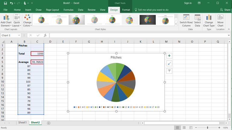
Easily Add Graphs to Your Excel Sheets: Step-by-Step Guide

Benefits of Using Graphs in Excel

Excel sheets are powerful tools for organizing and analyzing data, but their real power is unleashed when you transform this data into visual representations. Graphs can help you:
- Visualize Data Patterns: Easier pattern recognition and trend analysis.
- Summarize Information: Present complex data in a way that is digestible for stakeholders or decision-makers.
- Highlight Key Data: Focus attention on critical information or outliers.
- Communicate Effectively: Graphs can tell a story about the data, making it more impactful.
Preparing Your Data for Graph Creation

Before you create a graph, you must:
- Ensure that your data is clean, organized, and well-structured.
- Place the data you want to graph into columns or rows, clearly labeled.
- Check for and correct any inconsistencies like missing values or incorrect data types.
Here’s a quick guide on how to do this:
- Data Cleaning: Remove duplicate entries, fill in blank cells with appropriate data, and correct any formatting issues.
- Data Structuring: Arrange your data in a tabular format where one column or row represents categories or labels, and the adjacent columns or rows contain the values to be graphed.
- Data Validation: Verify the accuracy of the data to ensure it is fit for analysis.
Remember, good data preparation leads to accurate and meaningful graphs.
Step-by-Step Guide to Add Graphs in Excel

Follow these steps to create a graph:
- Select the Data: Highlight the cells that contain the data you want to graph.
- Choose the Graph Type:
- From the ribbon, click on
Inserttab. - Select your preferred graph type from the
Chartsgroup (e.g., Column, Line, Pie, Bar, etc.).
- From the ribbon, click on
- Insert the Graph: Click on the graph icon of your chosen type, and Excel will automatically generate the graph with the selected data.
- Customize the Graph:
- Use the
Chart Toolsthat appear when the graph is selected. Here, you can change colors, add titles, modify axes, and more.
- Use the
- Save the Excel File: Remember to save your work after adding or customizing the graph.
Common Types of Graphs and Their Uses

Here are some common graph types and when to use them:
- Column Charts: Ideal for comparing categories of data over time or different groups.
- Line Graphs: Best for showing trends, patterns, and progression over continuous time scales.
- Pie Charts: Useful for illustrating proportions or percentages of a whole.
- Bar Charts: Similar to column charts but typically used for horizontal comparison.
- Area Graphs: Emphasize the magnitude of change over time, showing cumulative totals.
🎓 Note: Each graph type serves a specific purpose, and choosing the right one can significantly enhance your data presentation.
Customizing Your Graph for Impact

Customization can make your graph stand out:
- Add Titles: Give your graph a clear and descriptive title.
- Label Axes: Clearly label your axes to clarify what the numbers or categories represent.
- Change Colors: Use colors that match your presentation theme or to highlight specific data points.
- Gridlines: Add or remove gridlines for readability.
- Legends: Add a legend if the graph has multiple data sets to avoid confusion.
Summary

Graphs in Excel transform raw data into visual stories that can be quickly understood. Whether you’re analyzing sales data, tracking progress, or comparing metrics, the ability to create and customize graphs will greatly enhance your data presentation skills. Remember, selecting the right type of graph for your data, preparing your data properly, and making your graph visually appealing are key steps to ensuring your audience understands the insights you’re conveying.
What are the steps to create a graph in Excel?

+
Select your data, choose a graph type, insert the graph, customize it, and save your work.
How can I customize the colors of a graph in Excel?

+
Click on the graph to bring up the Chart Tools, then go to the Design tab to change colors through the Chart Styles options.
Why isn’t my graph showing correctly?

+
Check if your data is correctly selected, there are no errors or missing values, and that you’ve chosen the appropriate graph type for your data.