Master Excel Pie Charts: Easy Guide for Beginners

Introduction to Pie Charts

Excel's pie charts provide a visual representation of parts to the whole, making them an excellent tool for data visualization. They are especially useful when you want to compare proportions within a data set, where each slice of the pie corresponds to a category, and the size of the slice represents the data's value relative to the total.
Creating Your First Pie Chart

Follow these steps to create your first pie chart in Excel:
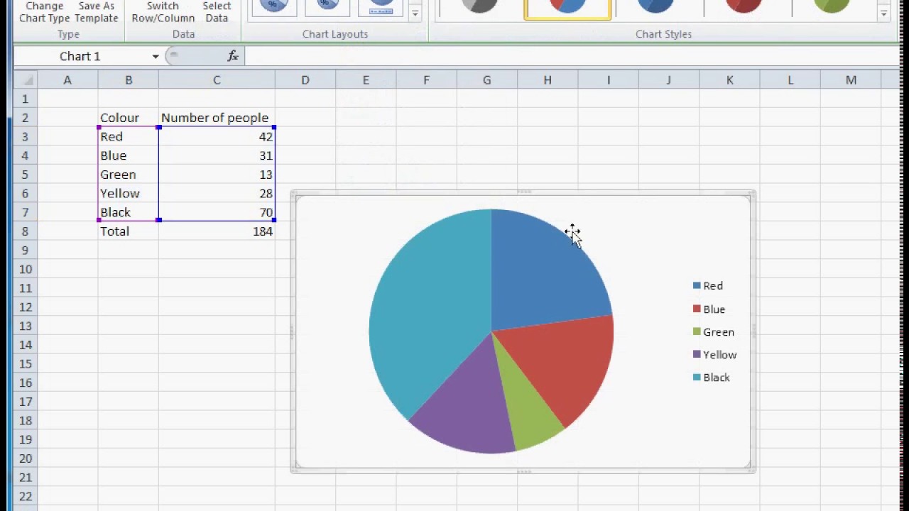
- Select Data: Highlight the range of data you want to plot. For a pie chart, ensure you have one column for categories and another for values.
- Insert Chart: Go to the 'Insert' tab, click on the 'Pie Chart' icon, and choose the pie chart style you prefer.
- Customize Your Chart: Use the 'Chart Tools' to customize colors, labels, and layout:
- Title: Add a descriptive title.
- Legend: Show or hide the legend as needed.
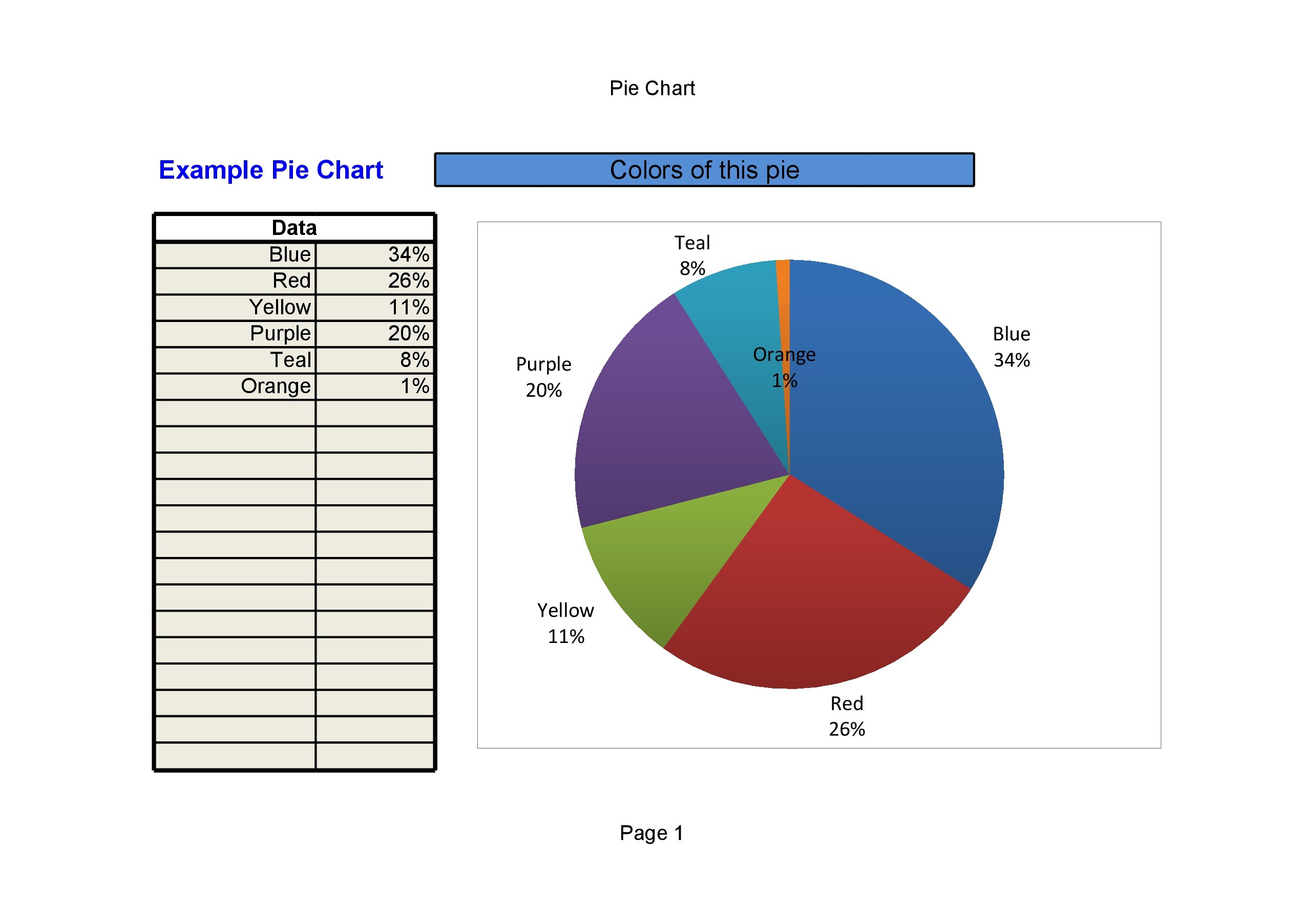
- Data Labels: Display values, percentages, or categories on the slices.
- Chart Style: Modify color schemes and effects.
Working with Data

Here’s how to handle data within pie charts:
- Update Data: When you update your data, the pie chart will automatically reflect these changes.
- Data Range: Ensure your data range includes the labels and values, but exclude totals to keep the chart accurate.
- Formatting Values: Use Excel's formatting options to control how values are displayed (e.g., decimal points, percentages).
Advanced Customization

Take your pie charts to the next level with these advanced tips:
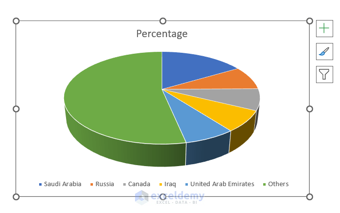
- 3D Pie Charts: Select a 3D pie chart for a more visually appealing chart.
- Exploded View: Separate slices to highlight certain data points.
- Rotating the Chart: Use rotation tools to change the starting angle for better representation.
💡 Note: Always check the readability of your chart after customizing, as some effects can reduce clarity.
Best Practices for Pie Charts

Here are some best practices to keep in mind:
- Simplicity: Keep the number of slices to a minimum to avoid cluttering.
- Data Hierarchy: Sort your data before creating the chart to ensure the largest slice is at the 12 o'clock position.
- Color Choices: Use colors that are easy to distinguish and ensure they align with your brand or the chart's purpose.
- Annotations: Add annotations for clarity, especially for smaller slices.
Analyzing Data with Pie Charts

Pie charts can help with several types of analysis:
- Proportion Analysis: Understand how much each category contributes to the total.
- Comparison: Compare the size of slices visually.
- Trend Analysis: Track changes over time by creating multiple pie charts for different time periods.
💡 Note: Pie charts are less effective for trend analysis compared to other chart types; consider a line or bar chart for such purposes.
Troubleshooting Common Issues

Encountering issues with pie charts? Here's how to troubleshoot:
- Disappearing Slices: Check if data values are too small or if your data range is incorrectly set.
- Label Overlap: Adjust label size or hide less important data labels.
- Color Confusion: Use consistent color schemes or patterns to avoid confusion.
The art of mastering Excel pie charts lies in understanding your data and how to present it clearly. By following these steps, you can create pie charts that are not only informative but also visually appealing, helping you convey the story behind your data effectively.
Can I add more than one pie chart to a worksheet?

+
Yes, you can add multiple pie charts to a worksheet. Each chart can visualize different sets of data, allowing for comprehensive analysis within the same view.
How do I deal with small data points in a pie chart?

+
Small data points can be grouped into an ‘Others’ category to avoid clutter, or you can use data labels to highlight these slices if necessary.
What’s the limit for the number of slices in a pie chart?

+
Excel doesn’t impose a strict limit on the number of slices, but for readability, it’s recommended to keep it below 10. If your data exceeds this, consider using a bar chart or grouping small values into one category.