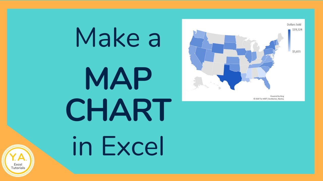
Master Excel Mapping: Quick and Easy Techniques

In the ever-evolving world of data analysis, mastering Excel remains a highly valuable skill. Whether you're working in finance, marketing, sales, or virtually any other sector, Excel mapping techniques can significantly streamline your workflow. This post will delve into quick and easy methods to map data in Excel, ensuring you enhance productivity and accuracy.
Understanding Excel Mapping

Excel mapping refers to the process of organizing and visually representing data in a way that makes sense for analysis, reporting, or presentation. This can involve mapping:
- Numerical data to specific categories or labels
- Geographical data to physical locations
- Relationships between different datasets
Why Map Data?

Mapping data in Excel can:
- Enhance data comprehension – Visual cues are easier to understand than raw numbers
- Highlight patterns – Making it easier to spot trends, outliers, or correlations
- Facilitate strategic decision-making – By providing a clearer picture of the data

Techniques for Mapping Data in Excel

1. Conditional Formatting

Conditional formatting is one of the simplest yet most effective ways to map data. Here’s how to use it:
- Select the range of cells you want to format.
- Go to ‘Home’ > ‘Conditional Formatting’.
- Choose from options like ‘Color Scales’, ‘Data Bars’, or ‘Icon Sets’ based on your data’s nature.
🔔 Note: Conditional formatting is excellent for identifying data trends at a glance, but remember, it affects only the visual representation, not the underlying data.
2. Data Validation

Data validation can map data by restricting input to predefined values or ranges:
- Dropdown Lists – Create lists to map categorical data
- Custom Rules – Ensure data meets certain criteria before it’s entered
To set up data validation:
- Select the cell or range where you want validation.
- Go to ‘Data’ > ‘Data Validation’.
- Choose the criteria and customize the error messages.
3. PivotTables

PivotTables are a powerhouse for mapping complex datasets:
- Select your data range or table.
- Go to ‘Insert’ > ‘PivotTable’.
- Drag fields into rows, columns, values, or filters to visually represent data relationships.
📌 Note: PivotTables are dynamic; they’ll update as your data changes, making them perfect for real-time analysis.
4. Heat Maps

Heat maps are ideal for visualizing data density or distribution:
- Select your data range.
- Choose a color scale under ‘Conditional Formatting’.
- Adjust the range for ‘Minimum’ and ‘Maximum’ to get the desired contrast.
5. 3D Maps

Available in Excel 2016 onwards, 3D Maps lets you:
- Plot geographical data
- Explore data over time
To create a 3D Map:
- Go to ‘Insert’ > ‘3D Map’.
- Select your data, and Excel will create an interactive 3D map.
✨ Note: 3D Maps require a Bing Maps Key for displaying accurate geographical data.
Practical Applications of Excel Mapping

Here’s how different industries utilize mapping techniques:
Marketing

- Segmentation – Map customer data for better targeting.
- Heat maps – Visualize website traffic or ad engagement.
Finance

- Budget Tracking – Use PivotTables to analyze financial inflows and outflows.
- Conditional Formatting – Highlight financial anomalies.
Sales

- Performance Analysis – Create heat maps for sales distribution.
- Trend Analysis – Use line or column charts to track sales over time.
Human Resources

- Employee Distribution – 3D Maps for geographical staff mapping.
- Data Validation – Ensure consistency in employee data entry.
These practical applications illustrate the versatility of Excel mapping in various business scenarios.
Key Takeaways

Throughout this post, we’ve covered several techniques to map data in Excel, from basic conditional formatting to advanced 3D visualization:
- Excel mapping enhances data readability and analysis.
- Techniques like conditional formatting, data validation, PivotTables, heat maps, and 3D Maps offer unique ways to visualize data.
- Understanding these methods can dramatically improve your ability to present, analyze, and make decisions based on data.
What are the primary benefits of Excel mapping?
+Excel mapping simplifies data analysis by providing visual cues, identifying trends, and aiding in strategic decision-making.
Can I use conditional formatting for text mapping?
+Yes, conditional formatting in Excel isn’t limited to numerical data. You can apply rules to format cells based on text content, making it an effective tool for text mapping.
How do I create a geographical heat map in Excel?
+To create a geographical heat map in Excel, ensure you have geographical data, then use conditional formatting with color scales or use Excel’s inbuilt ‘3D Map’ feature to plot the data over a map of the world.


