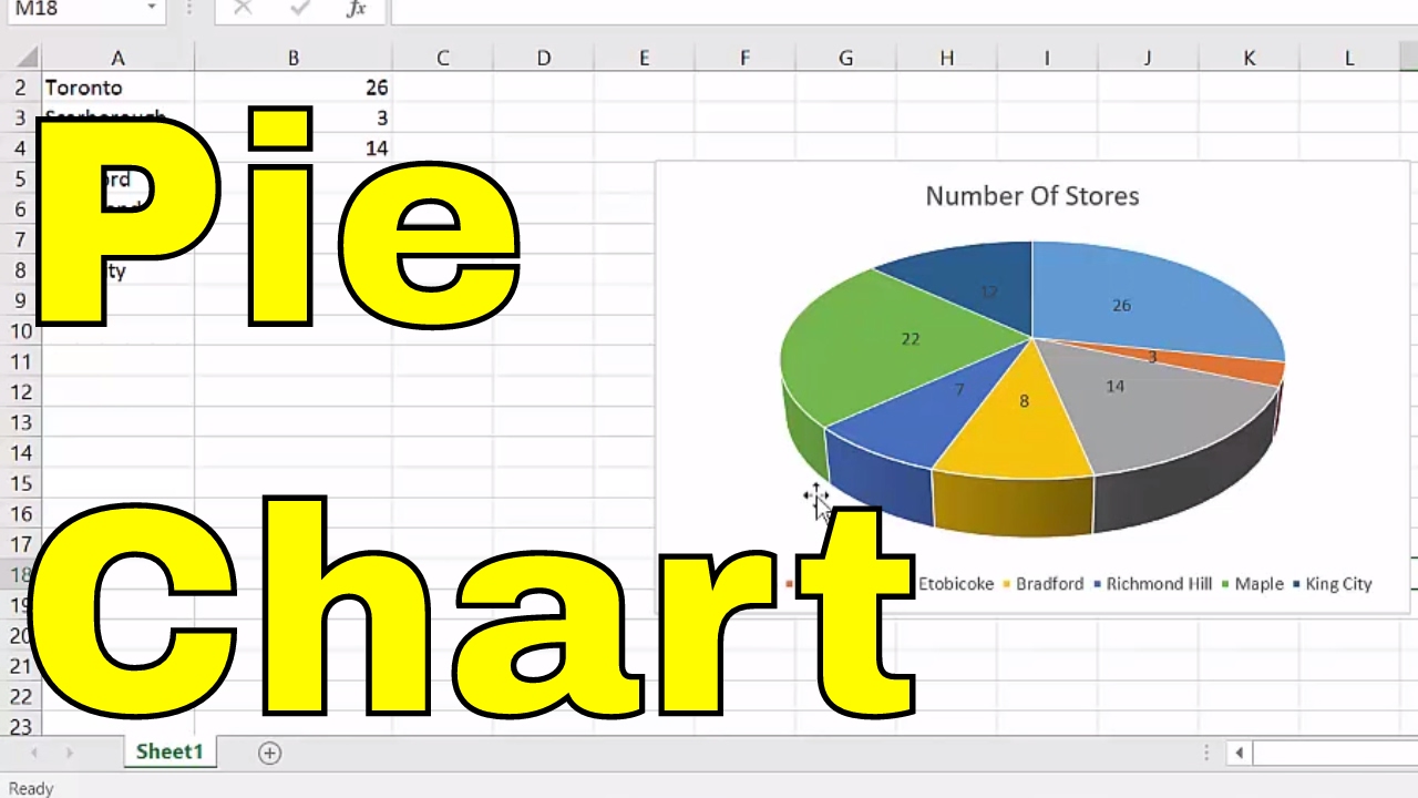
5 Simple Steps to Create a Pie Chart in Excel

Creating a pie chart in Excel can transform complex data into easily digestible visual information, making it a crucial skill for anyone working with numbers. Excel, Microsoft's versatile spreadsheet program, provides an array of charting options, with pie charts being one of the most popular due to their simplicity and effectiveness in representing categorical data. In this guide, we'll walk through five simple steps to create a compelling pie chart, ensuring that even beginners can follow along with ease.
Step 1: Prepare Your Data

The first step in creating a pie chart is to have your data ready. Here's how to ensure your data is pie chart-ready:
- Categories and Values: Your data should be in two columns. One column for categories and another for the corresponding values. For example, if you're showing the distribution of sales by product type, one column would list product types, and the next would display the sales figures.
- Ensure Accuracy: Double-check your data for errors or missing values. A pie chart's accuracy hinges on the correctness of your data.
- Sort if Needed: Although not mandatory, sorting your data by value can make the chart more readable. This also helps in quickly identifying which categories are largest or smallest at a glance.
Step 2: Select Your Data

With your data organized, the next step is selecting it:
- Click and drag to highlight the data range, including headers for categories and values. This selection will determine what data goes into the pie chart.
Step 3: Insert the Pie Chart

Now, let's insert the chart:
- Go to the 'Insert' tab on Excel's ribbon.
- Under the 'Charts' group, click on the 'Pie' or 'Doughnut Chart' icon.
- Select the basic 'Pie' chart for simplicity or explore other variations like 3-D Pie or Doughnut for different effects.
Your pie chart will appear on your spreadsheet. It might not look perfect yet, but we're just getting started.
Step 4: Customize Your Pie Chart

Customization is where your pie chart transforms from good to great:
- Change Chart Title: Click on the chart title and edit it to reflect what the pie chart represents.
- Add Data Labels: Right-click on the chart, select 'Add Data Labels', and choose to display percentages, values, or both.
- Adjust Colors: Use the 'Chart Styles' button or 'Format' tab to change colors, making sure your chart is visually appealing and color-blind friendly.
- Explode Segments: If you want to highlight a particular segment, right-click on it and choose 'Format Data Point', then adjust the 'Pie Explosion' to pull that slice out.
✨ Note: Consistency in your chart's appearance, like uniform font style and size, aids in maintaining a professional look.
Step 5: Finalize and Present Your Chart

Your pie chart is now ready for presentation:
- Check Readability: Ensure that all labels are legible, and the chart is not too cluttered.
- Final Adjustments: Make any last-minute size or placement adjustments to fit your document or slide.
- Save or Export: If you're presenting in a different format, remember you can copy and paste your chart as an image or use the 'Save as Picture' option for high-quality images.
The key to creating an effective pie chart lies in its simplicity. While the chart can offer a quick snapshot of your data, keep in mind its limitations. Pie charts are best for showing parts of a whole with up to 8 slices; beyond this, they can become cluttered. For more complex data sets, consider using bar or column charts instead.
Can I include more than 8 slices in my pie chart?

+
While it’s technically possible, it’s not advisable. Pie charts with too many slices can become confusing. Consider grouping smaller categories into an “Others” segment or using a different chart type.
How can I make my pie chart accessible for color-blind viewers?

+
Use patterns or textures in addition to color, ensure there is sufficient contrast between colors, and consider using labels directly on the chart segments to clarify which part represents which data.
Can I automate pie chart creation in Excel?

+
Yes, you can use VBA scripts in Excel to automate the creation and formatting of pie charts. This can be useful if you regularly update your charts with new data.


