7 Ways to Enhance Your Excel Sheet Aesthetics

The power of Excel isn't just in its calculations and data management capabilities; its visual appeal can also transform how data is perceived and interpreted. A well-designed Excel sheet not only makes your work stand out but also enhances data readability and comprehension. Here are seven techniques to give your Excel sheets a visual facelift:
1. Utilize Conditional Formatting

Conditional formatting allows you to apply formats to cells based on specific conditions. This can make your data analysis more intuitive by highlighting critical data points or trends. Here’s how you can use it effectively:
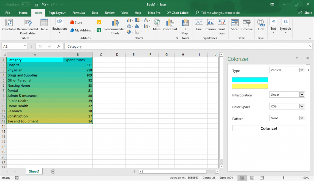
- Color Scales: Use color gradients to represent numerical values visually.
- Data Bars: Add a bar directly within the cell to represent the value of that cell relative to others.
- Icon Sets: Include symbols like arrows, flags, or traffic lights to indicate data performance.
🌟 Note: Overuse of conditional formatting can clutter the sheet. Use it judiciously to highlight key information or trends.

2. Enhance with Custom Themes and Styles

Excel provides a rich set of themes and styles that can give your spreadsheets a professional or personal touch:
- Create or select a theme that matches your company’s branding or your own aesthetic preference.
- Customize cell styles, including font, size, color, and background to maintain a consistent look throughout your workbook.
3. Use Headers and Footers for Clarity

Headers and footers aren’t just for documentation. They can provide context or instructions, making your Excel sheet easier to navigate:
- Add company logos, document titles, or version numbers in headers to ensure clarity and professionalism.
- Include navigation instructions or key takeaways in footers for an added layer of information.
🌟 Note: Headers and footers can slow down the print preview and printing processes if overly detailed.
4. Leverage Charts and Visuals

A picture is worth a thousand words, and in Excel, this translates to charts and graphs. They can:
- Summarize complex data in a visually appealing manner.
- Help identify trends, patterns, and outliers quickly.
- Provide a break from text and numbers, making your workbook less monotonous.
🌟 Note: Keep chart data clean and ensure your charts have a clear narrative or purpose; otherwise, they can become confusing.
5. Implement Smart Data Grouping

Grouping related data not only organizes your sheet but also makes it visually appealing:
- Use column and row grouping features to collapse or expand data sections.
- Group similar data types to streamline analysis and enhance focus on specific datasets.
6. Apply Borders, Shading, and Cell Merging

The use of visual boundaries like borders and shading can help separate and emphasize important sections:
- Borders: Define the edges of your data areas or highlight important cells.
- Shading: Use color fills to differentiate headers, columns, or rows for easy identification.
- Cell Merging: Merge cells to create titles or headers that span multiple columns or rows for a cohesive look.
| Element | Usage |
|---|---|
| Borders | To separate and define areas |
| Shading | To highlight or differentiate sections |
| Cell Merging | For creating headers or titles |

7. Optimize with Proper Font and Alignment Settings

The last touch that can significantly affect the readability and aesthetics of your Excel sheet:
- Choose fonts that are clear and professional, like Arial, Calibri, or Times New Roman.
- Align text to make it easier to follow: left align for text, center align for headers, and right align for numbers.
- Use font sizes and styles (bold, italic) to emphasize titles or highlight key figures.
As we’ve explored various ways to enhance the aesthetics of your Excel sheets, remember that the goal is not just to make the sheet visually appealing but to improve data comprehension and workflow efficiency. When applied thoughtfully, these techniques can transform your spreadsheets into a tool that not only performs well but also communicates data in the most effective and engaging way possible.
By mastering conditional formatting, customizing themes and styles, using headers and footers for clarity, implementing charts and visuals, organizing data through grouping, and applying smart design techniques like borders and alignment, you give your Excel sheets a professional edge.
Here are a few final thoughts:
🌟 Note: Always consider the purpose of your sheet and your audience. Aesthetics should serve functionality, not overshadow it.
How do I apply conditional formatting in Excel?

+
To apply conditional formatting, select your data range, go to the ‘Home’ tab, click on ‘Conditional Formatting’, and choose the type of formatting you want to apply. Set the rules or conditions as needed.
Can I create my own custom Excel themes?

+
Yes, you can create custom themes by selecting “Page Layout” tab > “Themes” > “Save Current Theme” to save your current formatting choices as a new theme.
Why are my charts not showing data accurately?

+
This could be due to incorrect data selection, or the chart type might not be suitable for the data you’re presenting. Ensure your data range is accurate and consider different chart types for visualization.
How can I group data in Excel?

+
Select the rows or columns you want to group, go to “Data” tab, and click on “Group”. This allows you to collapse or expand sections as needed for better data management.
What are the best practices for using borders and shading in Excel?

+
Use borders to clearly define sections or highlight important cells. For shading, keep it subtle to not distract from the data, and use it to differentiate headers or categories.