7 Design Tips for a Stunning Excel Sheet

Designing a visually appealing Excel sheet can transform how you interact with data, making complex information easier to understand, analyze, and present. Whether you're a business analyst, a project manager, or just someone looking to organize personal data effectively, these seven design tips will guide you in creating a stunning Excel sheet that's both functional and aesthetically pleasing.
1. Choose the Right Color Palette

Colors can significantly affect the readability and overall appeal of your Excel sheet. Here are some tips for selecting the right colors:
- Use soft and neutral colors as backgrounds to avoid overwhelming the viewer.
- Employ color coding for categorization or highlighting critical information. However, ensure the colors have good contrast with the text.
- Limit your palette to 3-5 colors to maintain a cohesive look.
- Consider color blindness when choosing your palette; tools like Color Safe can help.
2. Implement Consistent Formatting

Consistency in formatting across your Excel sheet not only looks professional but also aids in comprehension:
- Standardize font types, sizes, and colors throughout your document.
- Use bold, italic, and underline features sparingly to emphasize or highlight.
- Create and save custom number formats for repeated use, like currency or percentage symbols.
3. Optimize Your Gridlines and Borders

Gridlines and borders can define areas, emphasize data, and guide the eye:
- Remove unnecessary gridlines to reduce visual clutter.
- Use borders to create clear visual divisions between sections or for highlighting specific data sets.
- Experiment with different line styles and weights to distinguish different types of boundaries.
💡 Note: When adjusting borders, ensure that they do not overshadow the data or make the sheet look busy.
4. Utilize Conditional Formatting

Conditional formatting is a powerful feature for visually analyzing your data:
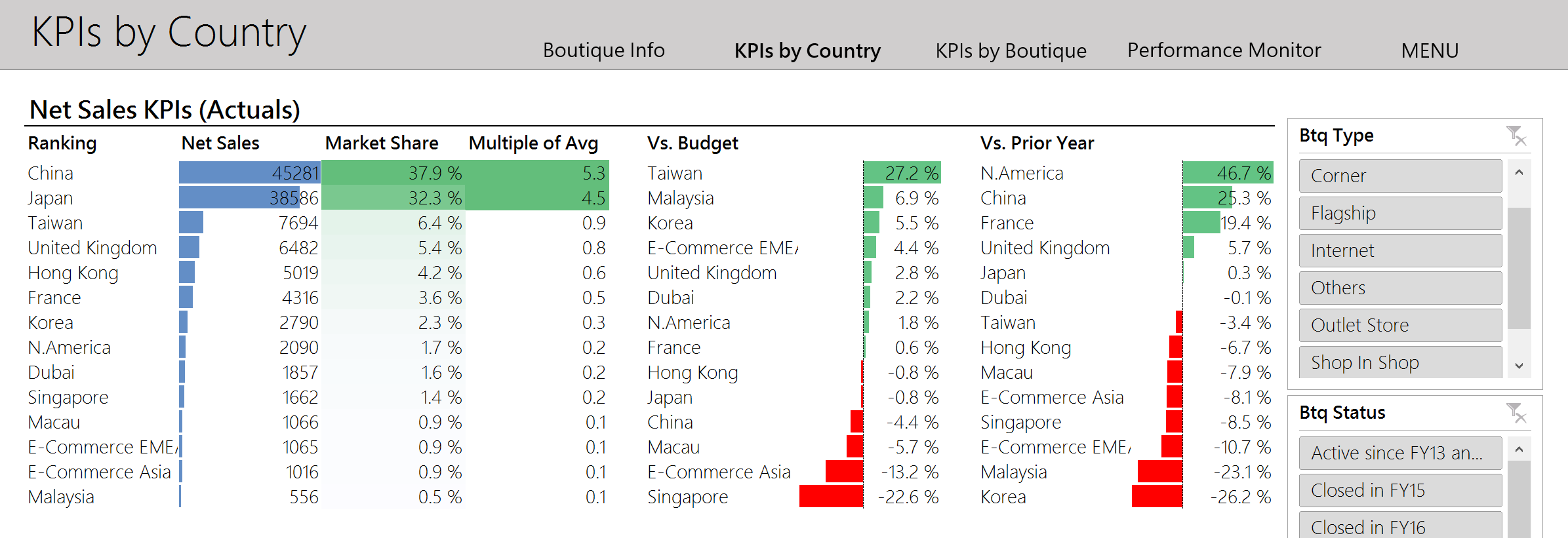
- Apply conditional formatting to highlight data points based on criteria like value, percentage, or date.
- Create visual cues like color scales, data bars, and icon sets to make trends or outliers stand out.
5. Create an Organized Layout

An organized layout helps users navigate and understand your data at a glance:
- Group related data together, either horizontally or vertically, depending on the analysis needed.
- Use ‘Freeze Panes’ to keep headers visible while scrolling through large datasets.
- Consider using ‘Outline’ or ‘Group’ features to manage expandable and collapsible sections.
| Feature | Description |
|---|---|
| Freeze Panes | Keep rows or columns visible when scrolling through large sheets. |
| Grouping | Collapse or expand sections of your data for better organization. |

6. Insert Meaningful Charts and Tables

Charts and tables can convey complex data in an easily digestible format:
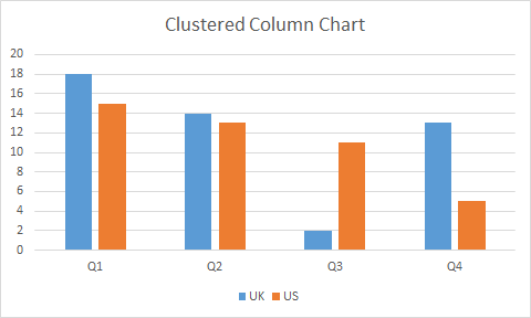
- Choose chart types that best represent your data (bar, line, pie, etc.).
- Label charts clearly, including axes, legend, and a descriptive title.
- Ensure table headers are bold or distinctively formatted to differentiate from data.
7. Design for Clarity and Simplicity

The ultimate goal is to make your data clear and accessible:
- Remove all unnecessary elements to reduce cognitive load.
- Employ white space or empty cells to create visual breathing room.
- Use features like ‘Data Validation’ to minimize user error when entering data.
Incorporating these seven design tips will not only make your Excel sheets look more professional but also enhance their functionality. An aesthetically pleasing Excel sheet isn’t just about looking good; it’s about making data more intuitive and engaging to analyze. Remember, the core purpose of Excel is data analysis, so while design elements enhance the user experience, they should never detract from the clarity of the information.
How do I apply conditional formatting in Excel?

+
To apply conditional formatting, select the cells or range, go to the ‘Home’ tab, click on ‘Conditional Formatting’, and choose from various rules like ‘Highlight Cell Rules’, ‘Top/Bottom Rules’, or ‘Data Bars’ to visualize your data.
Can Excel handle a lot of colors?

+
Yes, Excel can handle many colors, but for clarity and accessibility, it’s best to use a limited palette to prevent visual overload and to ensure the design remains professional.
What are the best practices for organizing data in Excel?

+
Best practices include grouping related data, using Freeze Panes for navigation, employing outlining for expandable sections, and maintaining a clean layout by removing unnecessary elements.