5 Easy Ways to Create Charts in Excel

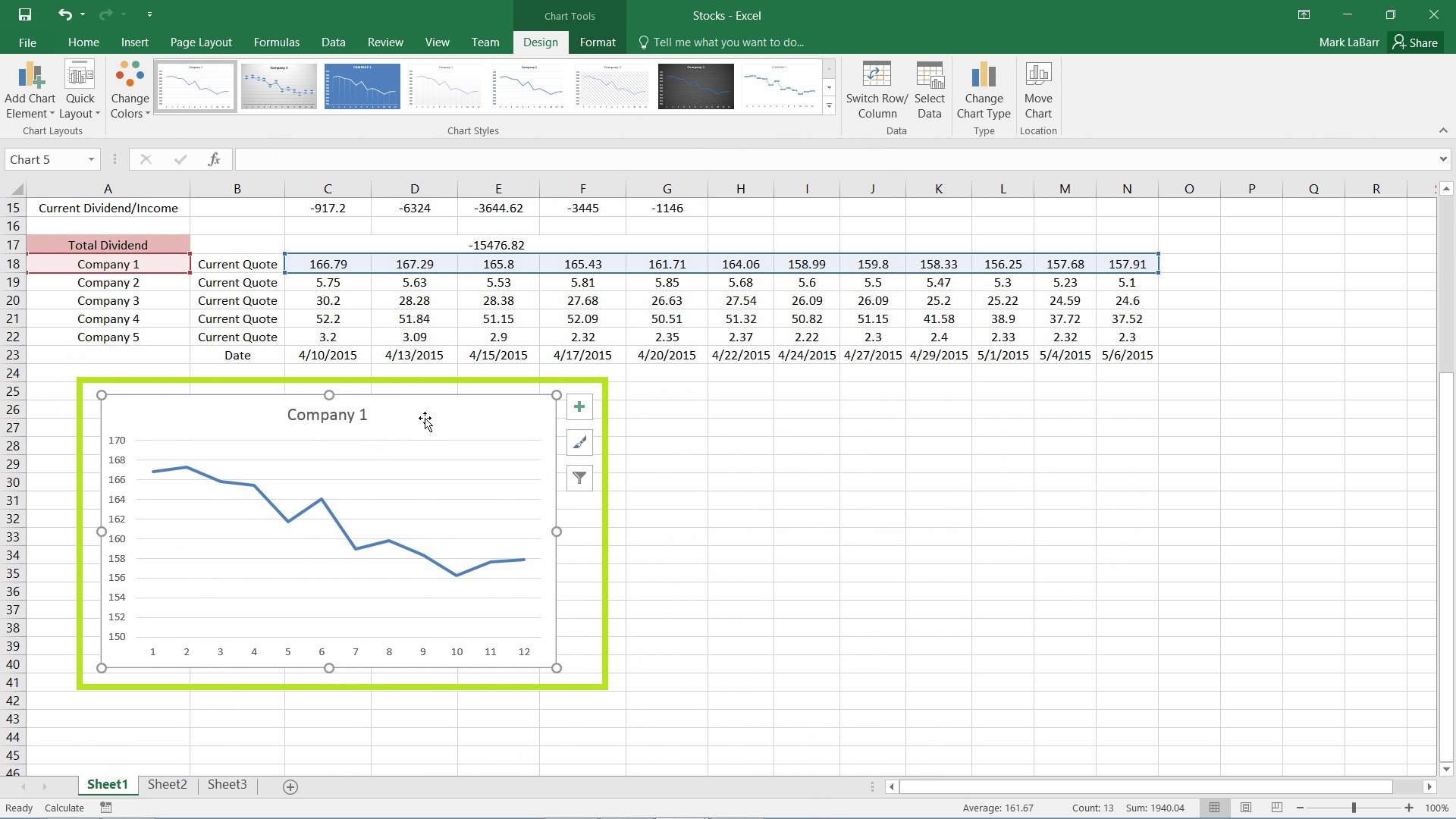
Microsoft Excel is a powerful tool for data analysis, and one of its most valuable features is the ability to create charts that visually represent your data. Whether you're tracking sales, analyzing trends, or presenting financial reports, charts can transform complex data sets into digestible visuals. Here are five straightforward methods to create charts in Excel:
Method 1: Using the Quick Analysis Tool

The Quick Analysis tool in Excel provides an easy way to visualize data:
- Select the data you want to chart.
- Click the Quick Analysis icon on the bottom right of your selection.
- Choose “Charts” from the options that appear.
- Hover over the chart types to see a live preview.
- Select your preferred chart type to insert it into your worksheet.

💡 Note: The Quick Analysis tool is only available in Excel 2013 and later versions.
Method 2: Using the Insert Tab

For a more manual approach, you can use the Insert tab:
- Select your data range.
- Go to the “Insert” tab on the Ribbon.
- Click on “Chart” and choose the chart type you want from the gallery.
- Customize your chart using the “Chart Tools” that appear when you select your chart.
Method 3: Creating Pivot Charts

Pivot charts are excellent for summarizing and analyzing large data sets:
- Ensure you have a PivotTable created from your data.
- Select any cell in the PivotTable.
- Go to the “Insert” tab, click “PivotChart”, and then choose the chart type.
- You can now filter or change the PivotTable to dynamically update the chart.
Method 4: Using Recommended Charts

Excel can recommend the most appropriate chart for your data:
- Select your data.
- Click on the “Insert” tab.
- Choose “Recommended Charts.”
- Excel will suggest various chart types based on your data; select one and click “OK.”
Method 5: Using VBA for Automated Chart Creation

For advanced users or those looking to automate chart creation:
- Open the VBA editor (Alt + F11).
- Insert a new module (Insert > Module).
- Write a VBA script to create a chart, customizing it as needed. Here’s a basic example:
Sub CreateSimpleChart()
    Dim rng As Range
    Set rng = Range("A1:B10") 'Change as per your data range
    Charts.Add
    ActiveChart.SetSourceData rng
    ActiveChart.ChartType = xlColumnClustered
End Sub
🔧 Note: This method requires knowledge of Visual Basic for Applications (VBA) programming.
Final Thoughts

By utilizing these five methods, Excel users can effectively create charts tailored to their needs, whether through quick previews, detailed customization, or automation. Each technique offers its own advantages, allowing you to adapt based on your comfort level with Excel and the complexity of your data analysis needs.
Can I customize the charts after creating them in Excel?

+
Yes, Excel provides numerous options to customize charts, including changing colors, labels, and even the type of chart after creation.
What’s the difference between a PivotTable chart and a regular chart?

+
Pivot charts dynamically update when changes are made to the underlying PivotTable, offering an interactive way to analyze and visualize summarized data. Regular charts, on the other hand, do not change unless manually updated.
Is VBA necessary for creating charts in Excel?

+
Not at all. While VBA can automate and create more complex charts, Excel’s built-in tools are sufficient for most basic chart creation tasks.