5 Easy Steps to Create Excel Graphs

Creating visual representations of data can significantly enhance your ability to analyze, present, and interpret information effectively. Microsoft Excel, with its robust graphing tools, makes this process straightforward even for those who might not consider themselves tech-savvy. In this post, we'll explore five easy steps to create Excel graphs that not only look professional but also communicate data in a visually appealing manner.
Step 1: Prepare Your Data

Before diving into graph creation, your data should be organized and clean. Here are the steps to prepare your data:
- Ensure Data Completeness: Verify that there are no missing values or unnecessary spaces.
- Align Data: Make sure your data is aligned in columns with headers for clarity.
- Sort if Necessary: Sorting can help in creating trend graphs.
📝 Note: Keeping your data clean from the start will save you time and potential headaches later.
Step 2: Selecting Your Data

With your data prepared:
- Click and drag to select the range of data you want to include in your graph.
- If you’re graphing different data sets together, you can hold down the Ctrl key while selecting multiple ranges.

👍 Note: Only select the relevant data for your graph to avoid clutter.
Step 3: Choose Your Graph Type

Excel offers various chart types for different data visualization needs:
- Column and Bar Graphs: Ideal for comparing groups or tracking changes over time.
- Line Graphs: Perfect for continuous data and trends.
- Pie Charts: Best for showing proportions of a whole.
- Scatter Plots: Useful when you need to see patterns or relationships.
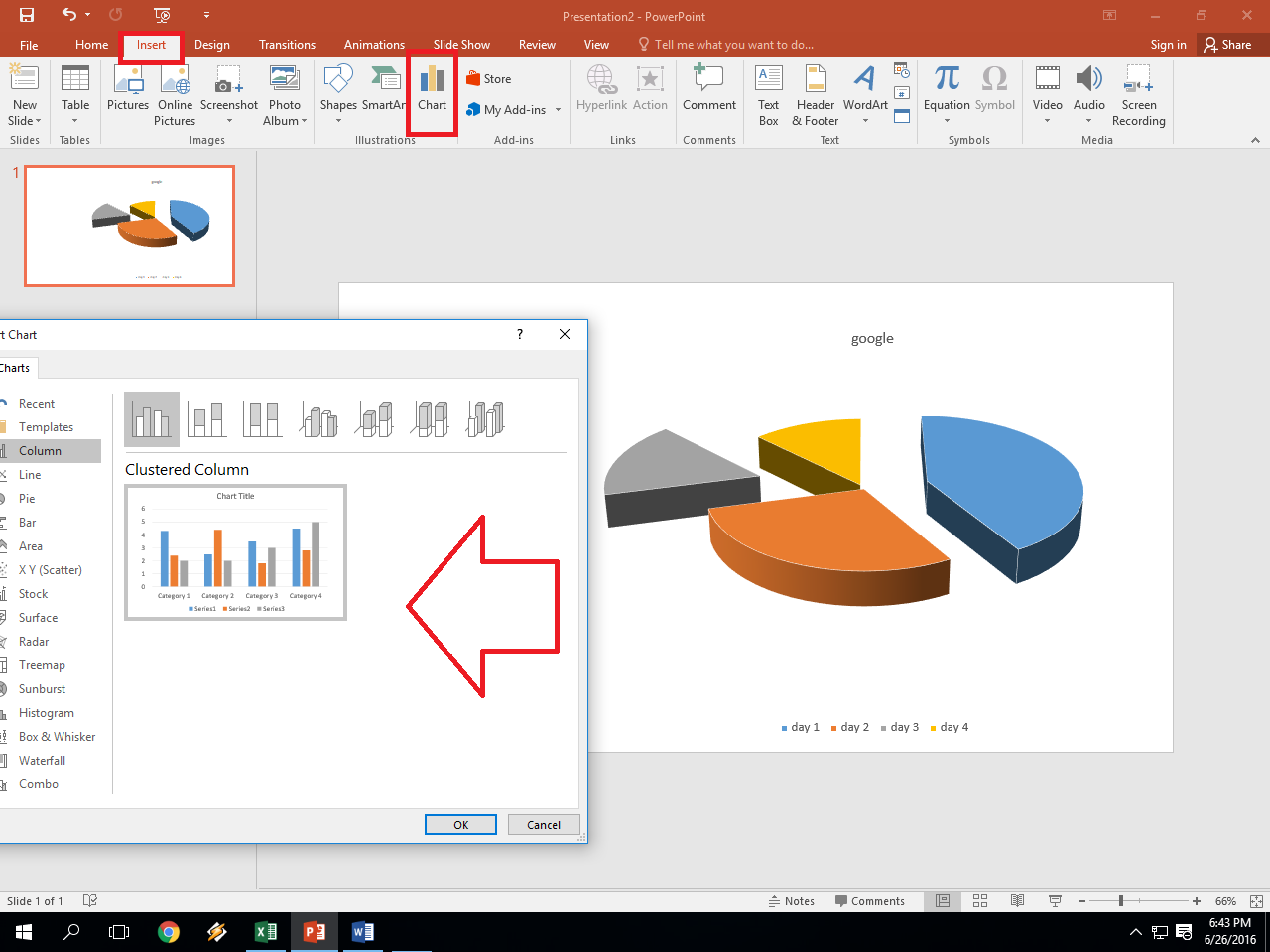
From the ‘Insert’ tab in the ribbon, you can preview different graph types and select the one that best suits your data:
- Click on ‘Insert’ and explore the ‘Charts’ group.
- Hover over different types to see a live preview, then click to insert the graph.

✏️ Note: Different data calls for different types of graphs; choosing the right one is key to clear communication.
Step 4: Customize Your Graph

Once your graph is created, you might want to:
- Change the chart title to be more descriptive.
- Adjust axes labels for clarity.
- Modify colors, fonts, and styles to match your presentation or branding.
- Include or modify a legend to help viewers interpret the data.
- Add or remove gridlines for better readability.
The ‘Design’ and ‘Format’ tabs provide extensive options to tweak your graph:
- Select your graph, then navigate to the ‘Design’ tab for quick layout changes.
- Use the ‘Format’ tab to fine-tune elements like data labels and axis scales.

🎨 Note: Customization is key to making your graph not only accurate but also aesthetically pleasing.
Step 5: Analyze and Present Your Graph

After customizing, take time to:
- Analyze the graph to ensure it conveys the intended message.
- Practice presenting the graph, highlighting key points or trends.
- Consider adding annotations or notes directly on the graph for additional context.
Your finalized graph can be:
- Copied and pasted into presentations, reports, or other documents.
- Saved as a separate Excel file for future reference.

🔍 Note: Good analysis can turn data into insights, making your graph an effective communication tool.
In summary, creating effective Excel graphs involves several steps, each crucial for accuracy, clarity, and impact. From preparing your data to presenting your findings, each phase requires attention to detail. These five steps provide a roadmap to turn raw data into compelling visualizations, aiding in better decision-making and communication. Whether for business presentations, academic research, or personal projects, the skills to craft meaningful graphs in Excel are invaluable in today's data-driven world.
Can I use these steps for any version of Excel?

+
Yes, these steps are general enough to apply across various versions of Excel. However, some features or interfaces might look different in older or newer versions.
What if my graph doesn’t look right?

+
Ensure your data is formatted correctly, consider adjusting the scale or type of graph, and check for any formatting issues. Also, try using the ‘Chart Elements’ button on the right side of your graph for quick fixes.
How do I add trend lines to my graph?

+
Select your graph, go to ‘Chart Elements’ > ‘Trendline’ > ‘More Options’, and choose the type of trend line you need (e.g., linear, exponential).
How do I make my graph more accessible?

+
Use alt text for your charts, keep color contrasts high, and provide clear and descriptive labels. Also, consider creating a text description alongside your graph for screen readers.