5 Ways to Graph Data from Different Sheets in Excel

Dealing with data across multiple sheets in Excel can be both challenging and rewarding. Whether you're a business analyst, a scientist, or just someone trying to make sense of financial data, understanding how to graph data from different sheets can elevate your data presentation. This post will guide you through five effective methods to integrate and visualize data from separate sheets in Excel, ensuring your charts are not only accurate but also visually compelling.
1. Using Consolidation Functions

Excel’s consolidation functions like SUM, COUNT, and AVERAGE can be used to merge data from different sheets. Here’s how you can do it:
- Summarize by Position or Category: Go to Data > Consolidate, choose the function you need, and select the range from different sheets. For example, if your sales data is on Sheet1, Sheet2, and Sheet3, you can add these ranges together to get a consolidated sum.
- Note: When selecting ranges, ensure you specify the exact cells from each sheet to avoid discrepancies.
Graphing Consolidated Data:

Once you’ve consolidated your data:
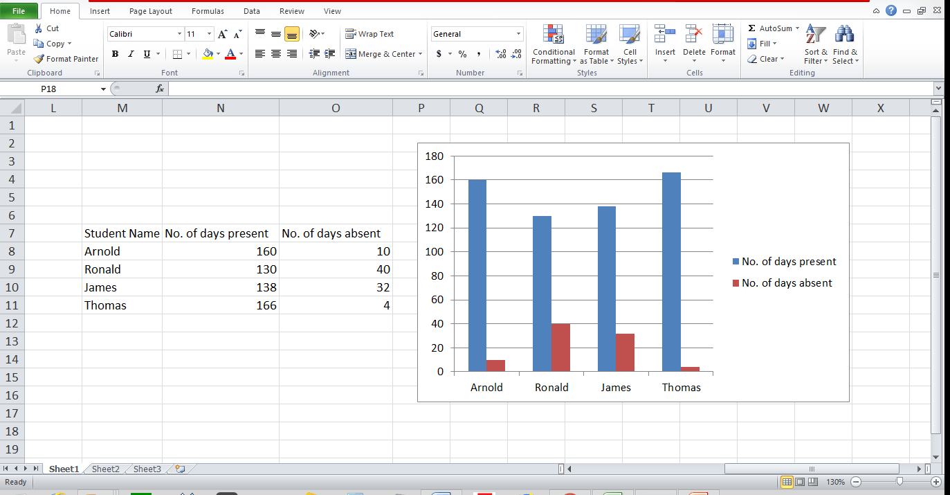
- Create a chart by selecting the consolidated data range.
- Go to Insert and choose the chart type that best represents your data.
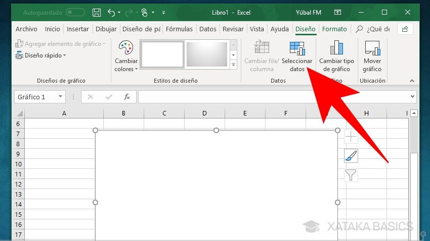
- Right-click the chart, select Data Source, and make sure to include all the series from the consolidated data.
💡 Note: For dynamic updates, use cell references in your consolidation formulas.
2. Linking Data with 3D References

3D references in Excel allow you to reference the same cell across multiple sheets. Here’s how you can use this for graphing:
- Create a summary sheet where each cell links to the same cell on other sheets. For example, ‘=Sheet1:Sheet3!A1’ would reference cell A1 on all sheets named Sheet1 through Sheet3.
- Use this summary sheet to graph your data, which will dynamically update as changes occur on the referenced sheets.
How to Set Up 3D References:

To create a chart using 3D references:
- On your summary sheet, type the formula to reference data from different sheets.
- Highlight the cells containing these references.
- Create your chart from this summary range.
💡 Note: Ensure all sheets are named consistently for easy reference.
3. Utilizing Power Query

Power Query is an Excel feature for data transformation and preparation. Here’s how to use it to gather data for graphing:
- Load Data: Go to Data > Get Data > From Other Sources > Blank Query to start.
- Combine Files: Use Combine > Combine & Transform to merge multiple sheets into one.
- Transform Data: Filter, sort, or perform any transformation needed to ready your data for graphing.
- Load to Excel: Click Close & Load to bring the data into your workbook.
- Graph the Data: Select the transformed data and insert a chart of your choice.
💡 Note: Power Query is particularly useful for managing large datasets from various sources.
4. Creating a PivotChart with Multiple Sheet Sources

PivotCharts in Excel allow dynamic analysis of data. Here’s how you can use them:
- Create a pivot table from a single sheet containing your data.
- Right-click the pivot table, choose Add to Data Model.
- Go to Power Pivot > Relationships, and relate your tables if they aren’t already connected.
- From the pivot table, click Insert > PivotChart and choose the type of chart you want.
- Drag the necessary fields to the Axis and Values areas to create your visualization.
Adding Data from Different Sheets:

If your data is not already in one location:
- Import each sheet into the data model separately.
- Establish relationships in the data model to link your data.
- Use these combined data sets to create your PivotChart.
💡 Note: Ensure your pivot table and chart are on a separate sheet for clarity.
5. Using Macros or VBA for Custom Graphing

For those who need more control and automation, VBA can be a powerful tool:
- Record a Macro: Start by recording a macro to understand the steps involved in creating a graph from different sheets.
- Edit Macro: Open the VBA editor (Alt + F11), and modify your macro to dynamically pull data from multiple sheets. Here’s a basic example:
Sub CreateDynamicChart()
    Dim ws As Worksheet, destSheet As Worksheet
    Dim chartRange As Range, lastRow As Long, i As Integer

    Set destSheet = ThisWorkbook.Sheets("Summary")
    i = 1
    For Each ws In ThisWorkbook.Worksheets
        If ws.Name <> destSheet.Name Then
            With ws
                lastRow = .Cells(.Rows.Count, "A").End(xlUp).Row
                If i = 1 Then
                    Set chartRange = Union(.Range("A1:A" & lastRow), .Range("B1:B" & lastRow))
                Else
                    Set chartRange = Union(chartRange, .Range("A1:A" & lastRow), .Range("B1:B" & lastRow))
                End If
                i = i + 1
            End With
        End If
    Next ws

    destSheet.Shapes.AddChart2(201, xlColumnClustered).Chart.SetSourceData chartRange
End Sub
- This macro loops through all sheets, gathers the data, and creates a chart.
💡 Note: Be careful with naming conventions in your VBA code to avoid errors.
By mastering these techniques, you can present your data in a way that is not only visually appealing but also tells a clear story. Each method has its strengths, depending on the complexity and nature of your data:
- Consolidation Functions are quick for simple data integration.
- 3D References offer dynamic updating of charts.
- Power Query excels in transforming large, disparate datasets.
- PivotCharts provide robust data analysis capabilities.
- Macros and VBA give you unparalleled customization and automation.
Remember, the key to effective data visualization in Excel is understanding the tools at your disposal and knowing when to apply each. Whether you're consolidating financial reports, analyzing scientific data, or tracking project milestones, these techniques will help you visualize data effectively from different sheets in Excel.
How do I link data from different sheets for graphing?

+
Use 3D references or consolidation functions to link data from different sheets for graphing. Alternatively, use Power Query to combine and transform data before graphing.
Can I update a chart automatically when new data is added to the source sheets?

+
Yes, if you use 3D references or set up a dynamic range using formulas or VBA, charts will update automatically as you add or change data on the source sheets.
What’s the difference between using Power Query and a Pivot Table for graphing?

+
Power Query is for data transformation and preparation, allowing you to combine data from multiple sources before analysis. Pivot Tables provide dynamic analysis tools where you can quickly summarize, analyze, and visualize data within Excel.