5 Easy Steps to Create a Chart Sheet in Excel 2013

Creating a chart sheet in Microsoft Excel 2013 can transform complex data into visually appealing and easily understandable charts, making it an invaluable tool for presentations, reports, and data analysis. Here’s a detailed guide on how you can turn your data into a standalone chart sheet in just a few steps.
Step 1: Prepare Your Data

Before you can chart your data, it needs to be organized effectively:
- Ensure Data Consistency: Make sure your data is clean, with no empty cells or errors, and that each column has a header.
- Select an Appropriate Range: Highlight the data you wish to include in the chart. This includes headers and all the relevant data points.
Step 2: Insert a Chart

Now that your data is ready:
- Select your data range.
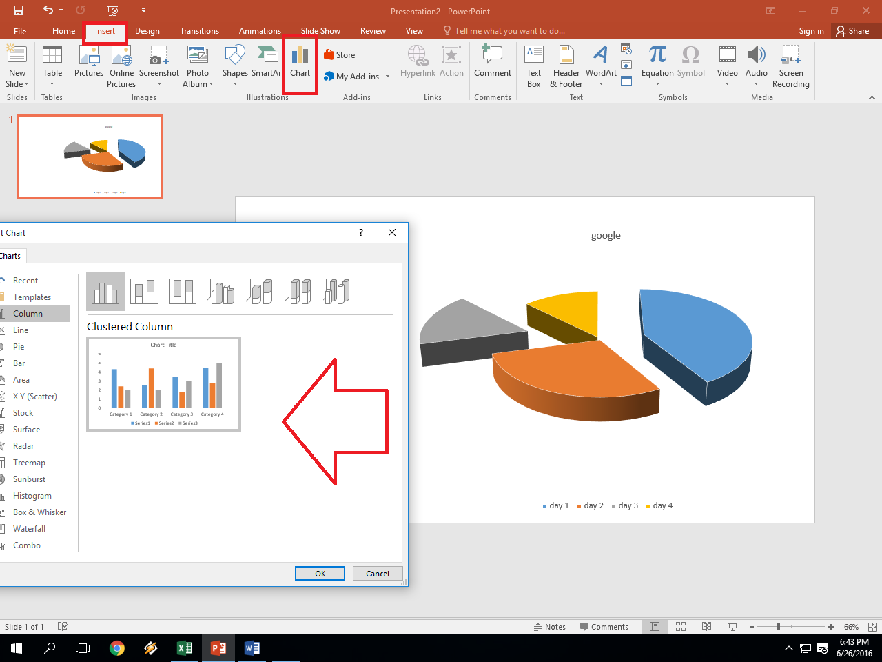
- Go to the Insert tab on the Ribbon.
- Choose from the various chart types under Charts (e.g., Column, Line, Pie).
- Select the chart sub-type that best represents your data.
An embedded chart will appear in your current worksheet.
Step 3: Move the Chart to a New Sheet

To make your chart stand out as its own page:
- Right-click on the chart you’ve just created.
- From the context menu, select Move Chart.
- In the Move Chart dialog box, select New Sheet.
- Type in a name for your new chart sheet or leave the default name (e.g., Chart1).
- Click OK.
🔍 Note: Moving your chart to a new sheet not only declutters your main data sheet but also provides more space to adjust and format the chart.
Step 4: Customize Your Chart

With the chart now on its own sheet, you can:
- Adjust the chart elements like titles, axis labels, and legends through the chart tools.
- Change the chart style, colors, and format by using the tools available in the Chart Tools tabs (Design, Layout, and Format).
- Add data labels or error bars to convey more information.
Step 5: Fine-Tune Your Chart Sheet

Here are some final touches to make your chart sheet perfect:
- Use Chart Options to adjust layout settings for spacing or placement.
- Set chart sheet options like zooming and printing through the Page Layout tab.
- Add a title to the sheet by clicking in the title box and typing in a descriptive name.
This step ensures your chart looks professional and is ready for use in reports or presentations.
Mastering the creation of chart sheets in Excel 2013 opens up a world of possibilities for visual data representation. By following these steps, you not only organize your data but also present it in a manner that enhances communication and understanding. Remember, charts are powerful tools for analysis, but the real value comes from interpreting the data they represent. Adjust and tailor your charts to suit the story you wish to tell, making sure every chart element contributes to that narrative.
What is the difference between an embedded chart and a chart sheet?

+
An embedded chart appears as part of your current worksheet while a chart sheet is a separate tab dedicated solely to displaying a chart. This allows for more focused presentation and editing of the chart itself.
Can I link a chart on a chart sheet to my data?

+
Yes, Excel automatically links the chart to your data when you create it. Any changes to your data will reflect in real-time on the chart sheet, ensuring that your chart always displays the most current information.
What if I need to change the data source for my chart?

+
You can change the data source by going to the Select Data source option in the Chart Tools under the Design tab. Here, you can redefine the range or select a new range for your chart to display.
Can I print just the chart sheet?

+
Absolutely. When you want to print only the chart, go to the chart sheet, click on the chart, and then print. This will print just the chart without the data or other worksheet elements.
What are some common mistakes when creating chart sheets?

+
Common mistakes include not updating the chart after data changes, using inappropriate chart types, failing to clearly label axes, and ignoring the design principles that make charts readable and understandable. Always ensure your chart communicates the intended information effectively.