Excel Graphing Made Easy: A Step-by-Step Guide

In the world of data analysis and presentation, Microsoft Excel stands as a fundamental tool, offering powerful features for managing, analyzing, and visualizing data. Among its myriad capabilities, graphing is particularly useful for illustrating data trends, patterns, and insights in a visually intuitive manner. This guide will walk you through the steps to create, customize, and present effective graphs in Excel, making the process straightforward even for beginners.
Creating a Basic Graph

To begin creating a graph in Excel:
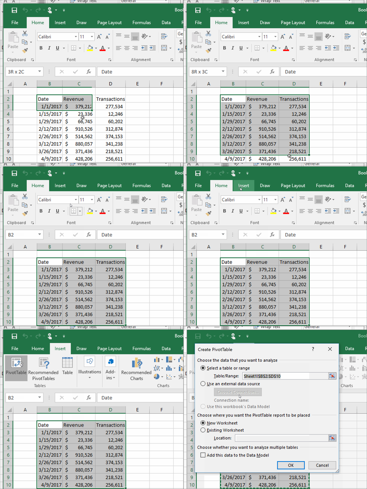
- Open your dataset in Excel. Ensure your data is organized with clear column headers and rows.
- Select the range of data you wish to include in your graph. This might include headers for labels.
- Navigate to the Insert tab on the ribbon at the top of the Excel window.
- From the 'Charts' group, choose the type of graph you want to create. Common options include:
- Column or Bar charts
- Line graphs
- Pie charts
- Scatter plots
- Click on the chart type icon to insert a basic graph into your worksheet. The graph will automatically include the selected data.
📌 Note: Your data should be in a tabular format for Excel to recognize it as a source for graphing.
Customizing Your Graph

After inserting a basic graph, you can tweak its appearance to better communicate your data:
Changing Graph Style and Colors

- Click on the graph to activate the Chart Tools options at the top.
- Go to the Design tab to choose from different style presets or manually adjust colors.
Adding Titles and Labels

- Select your chart and click on Chart Elements (the plus sign icon near the graph).
- Check boxes for Chart Title, Axis Titles, Data Labels, etc., to add or modify these elements.
Formatting Data Series

- Right-click on any data series in your graph, then choose Format Data Series.
- Here, you can change the series color, line style, marker options, and more.
| Graph Element | Customization Option | How to Access |
|---|---|---|
| Chart Title | Text, Font, Size, Color | Click on title or through Chart Elements |
| Axis Labels | Font, Size, Color, Angle | Right-click on axis or through Chart Elements |
| Data Labels | Position, Format, Callout | Right-click on data point or Chart Elements |

🔔 Note: Remember to keep your customizations consistent with the information you're trying to convey for clarity and professionalism.
Advanced Graphing Techniques

Creating Combination Charts

- Use Combo Chart under Insert > Recommended Charts for mixing chart types on the same graph.
- Adjust series types and axis (primary or secondary) for each dataset for better visualization.
Add Trendlines

- Right-click on a data series and select Add Trendline to forecast or analyze trends.
- Choose from Linear, Exponential, or Polynomial trendlines to fit your data model.
Interactive Elements

- Add Slicers or Timeline for filtering data dynamically in a PivotChart.
Presenting Your Graph

Once you’ve crafted your graph:
Adjusting Size and Position

- Drag the graph’s corners to resize or click and drag the entire chart to reposition it.
Exporting Your Graph

- Right-click the graph, choose Save as Picture to save it as an image file.
Remember that the goal of graphing is not just to present data but to tell a story or highlight insights. Keep your audience in mind, ensuring your graph communicates the information effectively.
Graphs and charts in Excel are powerful tools for data visualization. With this step-by-step guide, you now have the knowledge to create, customize, and present compelling visual representations of data. Whether for business reports, academic presentations, or personal projects, Excel's graphing capabilities can help you convey complex information in an easily digestible format, making your data analysis both informative and visually appealing.
What are the most common types of graphs used in Excel?

+
The most commonly used graphs in Excel include Column Charts for categorical data, Line Graphs for showing trends over time, Pie Charts for part-to-whole comparisons, and Scatter Plots for observing relationships between two numeric variables.
Can I create graphs from Excel data for use in other applications?

+
Yes, you can export Excel graphs as images or directly copy and paste them into other applications like PowerPoint, Word, or graphic design software.
How can I make my graph more accessible to people with color vision deficiency?
+Use patterns, textures, or different line styles in addition to colors. Also, ensure that your labels and legends are clear, and consider using a color-blind friendly color palette available in Excel’s design options.