5 Easy Steps to Graph Data in Excel

When dealing with extensive datasets, creating charts is crucial not only for making your data visually appealing but also for providing insightful analysis to your audience. Excel, a powerhouse among spreadsheet software, offers numerous chart types to fit various data visualization needs. Below, we've outlined five straightforward steps to graph your data effectively in Excel.
Step 1: Organize Your Data

Before you can graph, your data must be well-structured and organized. Ensure:
- Your data is clean and free of any errors or outliers.
- The information you want to graph is in contiguous rows or columns.
- Headers are used to label data points and categories.
Organizing your data properly will make your analysis more accurate and your chart creation process much smoother.
Step 2: Select Your Data

Once your data is set up, click and drag to highlight the cells containing the data you wish to graph. Make sure to:
- Include headers if you want Excel to use them as chart titles or labels.
- Include all the necessary data without leaving out any relevant information.
🎯 Note: Ensure that you are selecting the data accurately to avoid misleading or incorrect charts.
Step 3: Choose a Chart Type

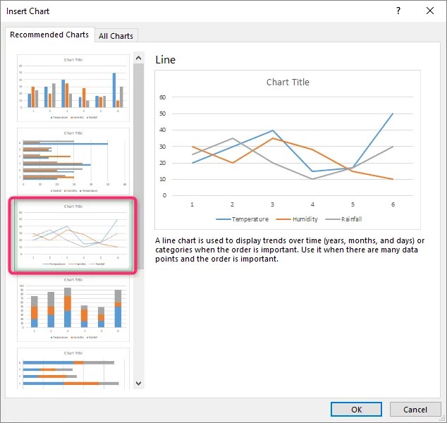
With your data selected, navigate to the Insert tab on Excel’s Ribbon. Here you’ll find various chart types like:
- Column charts for showing comparisons among categories.
- Line charts to display trends over time.
- Pie charts for illustrating proportions.
- Scatter plots for visualizing relationships between variables.
Select the chart type that best suits your data’s narrative.
Step 4: Customize Your Chart

After selecting your chart type, Excel will generate a basic chart. Now, it’s time to make it yours:
- Adjust the chart’s layout, style, and color scheme via the Chart Tools options that appear.
- Label axes, titles, and legends to provide context and clarity.
- Use filters to show or hide specific data points if needed.
📝 Note: Customization is key to making your chart not only informative but also visually engaging.
Step 5: Analyze and Present

Once your chart looks good, delve into the insights it provides:
- Analyze trends, patterns, and anomalies in the data.
- Use chart elements like trendlines, data labels, and error bars to enhance analysis.
- Prepare to present your findings, ensuring your chart supports your narrative.
Remember, a well-crafted chart can tell a story at a glance, making complex data accessible to all.
By following these five steps, you can confidently graph data in Excel, turning raw numbers into visually compelling narratives that communicate insights effectively. Whether you're presenting at a board meeting, summarizing sales data, or just trying to understand your monthly expenses, Excel charts can be your tool for clear data visualization and analysis.
How do I change the chart type after creating it in Excel?

+
To change the chart type after creating it, click on the chart to select it, then navigate to the Design tab under Chart Tools, click on Change Chart Type, and select a new chart type from the dialog box that appears.
Can I add multiple data sets to one chart?

+
Yes, you can add multiple data sets to one chart. Simply select your chart, click on Select Data in the Design tab, and use the Add button to include additional data series from your spreadsheet.
What if my data doesn’t fit neatly into columns or rows?

+
If your data isn’t organized in a structured way, you might need to reorganize it first. Consider using pivot tables to help you summarize and arrange your data more efficiently for charting.