5 Simple Steps to Draw Graphs in Excel

The ability to visualize data effectively is a skill much sought after in today's data-driven world. Graphing in Excel is one of the simplest yet powerful methods to convey information. Whether for business, academic, or personal use, learning how to draw graphs in Microsoft Excel can significantly enhance the way you present and analyze data. Here's how to get started with 5 simple steps to create your own graphs in Excel.
Step 1: Enter Your Data

Before you can graph your data in Excel, you first need to organize and input it accurately:
- Open Microsoft Excel on your computer.
- In the worksheet, select a cell where you want to start entering your data.
- Input your data in columns for clarity. For instance, if you’re charting sales over time, put the dates in one column and the corresponding sales figures in the next.
- Ensure all data is consistent (e.g., dates are in the same format, values are in the same unit).
- Label your columns appropriately to make it easier for Excel to understand your data’s structure.
Step 2: Select Your Data

Selecting the right data range is crucial for a clean graph:
- Click and drag to select the cells containing your data, including headers if you want them to appear in your graph.
- If your data is large, you might want to use the Excel feature to select an entire column or row.
📌 Note: Selecting the wrong range will result in an inaccurate graph.
Step 3: Choose a Graph Type

Excel offers a plethora of graph types to suit different data sets and analysis needs:
- Go to the Insert tab in Excel’s ribbon.
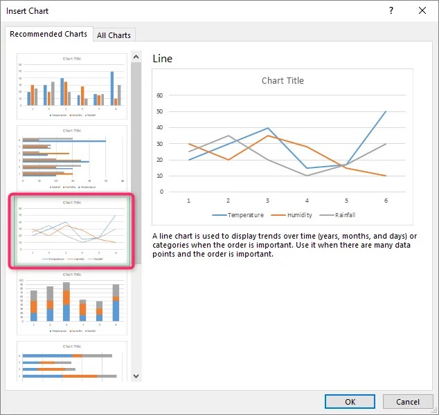
- In the Charts group, click the graph icon to view all available chart types (Column, Line, Pie, Bar, Area, Scatter, etc.).
- Hover over each option to preview what your graph might look like with your selected data.
- Click on your desired chart type to insert it into your spreadsheet.
Here’s a quick reference table for common graph types and their use:
| Graph Type | Best for… |
|---|---|
| Column | Comparing values across categories. |
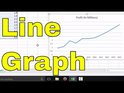
| Line | Displaying trends over time. |
| Pie | Showing proportions of a whole. |
| Bar | Comparing multiple variables or attributes. |

Step 4: Customize Your Graph

Once your basic graph is inserted, it’s time to refine and personalize:
- Chart Elements: Click on the Chart Elements button (the plus sign next to your graph) to add or remove elements like axis titles, data labels, or legends.
- Chart Styles: Select a style or color scheme that matches your presentation or report theme.
- Format Chart Area: Right-click on parts of your chart to format them. You can change fonts, colors, line styles, and more.
🌟 Note: Customization is key to making your graph not only informative but also visually appealing.
Step 5: Save and Use Your Graph

After creating and customizing your graph:
- Save your Excel file to retain your work.
- If you want to use the graph outside of Excel, right-click and choose ‘Save as Image’ or copy the graph to paste into documents or presentations.
- To print or present, ensure you’ve added any necessary explanations or notes directly on the chart or in a legend.
In summary, drawing graphs in Excel is a straightforward process once you understand these five steps. From entering your data to finalizing your graph, this guide helps you navigate through Excel’s graph creation capabilities. Remember, the key to a good graph is not only about making it look pretty but also ensuring it accurately represents your data and tells the story you want to convey.
What’s the difference between a bar chart and a column chart?

+
A bar chart displays data horizontally, which is useful for comparing multiple attributes or when the labels on one axis are too long. Column charts, on the other hand, present data vertically and are typically used for comparing categories over time or across groups.
How can I update my graph if my data changes?

+
Excel graphs are dynamic; simply update your data in the spreadsheet, and the graph will automatically reflect these changes. If you’ve used named ranges for your data, ensure you update those ranges as well.
Can I create a dual-axis graph in Excel?

+
Yes, Excel allows you to create graphs with dual axes. This is useful when you want to compare two sets of data with different scales. Right-click on a data series in your chart, select ‘Format Data Series’, and choose to plot on the secondary axis.