Bar Diagram Mastery: Simple Excel Tutorial

Are you looking to make your Excel data more visually appealing and insightful? Using bar diagrams can turn complex data into understandable visual summaries, helping you present data clearly for business meetings, reports, and educational settings. In this tutorial, we'll delve into creating a basic bar diagram in Excel, from entering your data to customizing the chart for maximum impact.
Step 1: Prepare Your Data

Begin with preparing your data:
- Category - This will be the x-axis of your chart (e.g., Months, Products, etc.).
- Value - This corresponds to the y-axis, showing the numerical value for each category (e.g., Sales, Temperatures, etc.).
Enter this information into a simple table like so:
| Month | Sales |
|---|---|
| January | 500 |
| February | 750 |
| March | 600 |

Step 2: Insert a Bar Chart

Follow these steps to insert a bar chart:
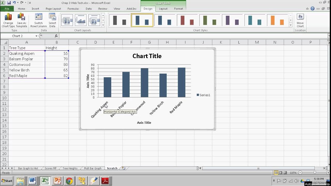
- Select the data range, including headers.
- Go to the Insert tab.
- Choose Bar Chart from the Chart section.
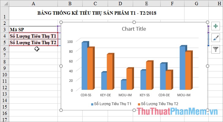
- Select a style that fits your needs (2D Bar, 3D Bar, etc.).

Step 3: Customize Your Chart

After inserting the chart, you can refine it to make it more effective:
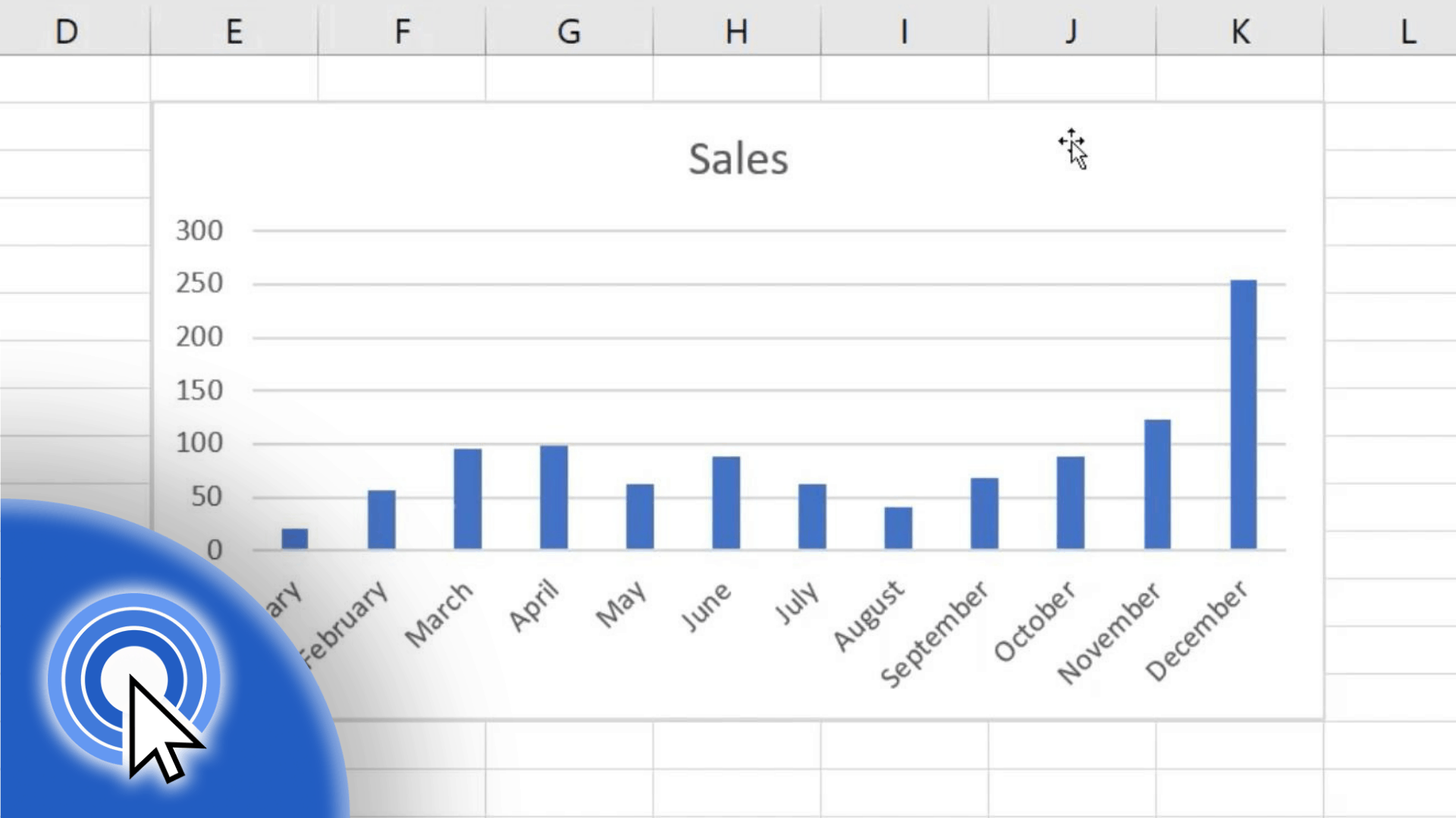
- Change chart title: Click on the chart title and type in a new title that reflects the chart’s purpose.
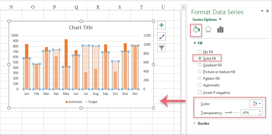
- Color and style: Right-click on any bar, choose Format Data Series, and adjust fill, borders, and effects.
- Axes and labels: Use Axis Options to format the axes, add gridlines, or adjust number format.
- Data Labels: Add data labels to show exact values by right-clicking a bar, selecting Add Data Labels.

🔍 Note: Experiment with different chart types like Column, Stacked, or 100% Stacked Bar charts for different data representations.
Step 4: Enhance with Additional Features

To make your chart more informative, consider adding:
- Trendlines: Help visualize data trends over time.
- Error Bars: Show the variability of the data or potential errors in measurements.
- Data Tables: Present the numerical data alongside the visual chart for quick reference.
These features are accessible through the Chart Tools > Design > Add Chart Element menu.
💡 Note: Adding too many features can clutter the chart, reducing its effectiveness. Keep it simple yet informative.
Step 5: Finalize and Present

Review your chart for accuracy, ensuring:
- All labels are legible and correctly placed.
- The chart title reflects the data accurately.
- Colors are consistent and appropriate for printing or screen sharing.
Once you are satisfied, you can either save your work or copy the chart for use in presentations or reports.
To wrap up this tutorial on bar diagram mastery in Excel, we've explored the process of turning plain data into engaging visual stories. From organizing your data, selecting the right chart type, customizing for clarity, to enhancing with additional features, you now have the tools to create charts that not only look good but also communicate your data effectively. Whether you're in business, education, or personal finance, mastering bar diagrams in Excel can significantly improve your data presentation skills, helping you make informed decisions, share insights, and impress your audience.
How do I choose between a column and a bar chart?

+
Column charts are typically used for time-based data or when comparing different categories. Bar charts are better for long labels or when data points are numerous, providing a horizontal view for better readability.
Can I add a secondary axis to my bar chart?
![[100% Off] Top Microsoft Excel Tools Mastery Course (Advance 20 Tools ... [100% Off] Top Microsoft Excel Tools Mastery Course (Advance 20 Tools ...](https://mlv.smbcoach.ca/assets/img/100-off-top-microsoft-excel-tools-mastery-course-advance-20-tools.jpeg)
+
Yes, to show two sets of data with different scales, you can add a secondary vertical axis. Right-click the chart, select Change Chart Type, and choose a combo chart with a secondary axis.
How can I make my bar chart more accessible for all viewers?

+
Ensure that your chart has sufficient contrast between colors, use clear and distinct labels, provide alt text for the chart, and consider using patterns or textures in addition to color for differentiation.