5 Easy Steps to Draw a Pie Chart in Excel

Creating a pie chart in Excel is an excellent way to visually represent parts of a whole, providing a clear overview of data proportions. Whether you're tracking sales, expenses, or survey results, pie charts help in simplifying complex data into easily digestible visuals. Here are five straightforward steps to craft your pie chart in Excel:
Step 1: Organize Your Data

The foundation of an effective pie chart lies in well-organized data. Here’s how to set up your data:
- Open a new or existing Excel workbook.
- In one column, list the categories for your pie chart.
- In an adjacent column, enter the corresponding values.
Here is an example of how your data might look:
| Category | Values |
|---|---|
| Fruits | 50 |
| Vegetables | 25 |
| Meat | 15 |
| Dairy | 10 |

📝 Note: Ensure the data you select for the pie chart is accurate and complete to avoid misrepresentation.
Step 2: Select Your Data

Once your data is structured:
- Highlight the range of cells that contains your category labels and values. For our example, select A1:B5.
Selecting the correct data range is crucial to generate an accurate pie chart.
Step 3: Insert the Pie Chart

With your data selected:
- Go to the Insert tab.
- Click on the Insert Pie or Doughnut Chart icon in the Charts group.
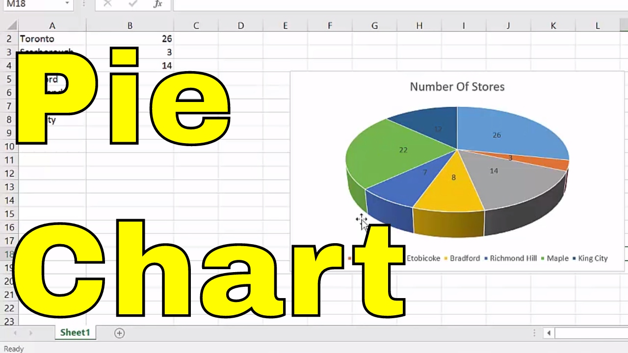
- From the dropdown, choose a Pie Chart type. Options include 2D, 3D, or other variations. Select the basic 2D pie chart for simplicity.
The chart will appear on your worksheet, automatically depicting your selected data in pie slices.
Step 4: Customize Your Pie Chart

Excel offers numerous customization options to enhance your pie chart:
- Chart Title: Click on the chart title to edit. Make sure it accurately describes what your chart represents.
- Labels: Right-click on any pie slice, choose Add Data Labels or Data Labels Options to show or format labels.
- Legends: Customize the legend by right-clicking it and choosing Format Legend. You can adjust its position or even remove it for a cleaner look.
- Colors: Change the color of slices by double-clicking on a slice or using the Fill options in the Format menu.
- Explode Slices: To highlight a specific category, right-click the slice and choose Format Data Point, then adjust the explosion size.
💡 Note: Use different colors and labels effectively to enhance readability and understanding of your chart.
Step 5: Analyze and Present Your Pie Chart

After customizing:
- Review the pie chart to ensure all data is represented correctly.
- Make any final adjustments for presentation clarity.
- Consider exporting the chart or embedding it into a report for presentations or analysis.
Your pie chart should now visually communicate the proportions of your data effectively.
By following these five steps, you've created a pie chart that not only displays your data but does so in a manner that's easy to comprehend. Pie charts are great for comparing parts of a whole, but remember, they are most effective when comparing only a few categories to avoid overcrowding. Keep in mind that too many slices can make the chart confusing, so choose your data wisely.
Here's to making data visualization in Excel an effortless task with these simple steps!
Why should I use a pie chart in Excel?

+
Pie charts in Excel are ideal for showing the relative sizes of groups or segments within a total, making it easier to grasp proportions visually.
Can I add multiple data series to a single pie chart?

+
A single pie chart can only represent one data series. If you need to compare multiple series, consider using a stacked column or bar chart instead.
How do I handle percentage labels in my pie chart?

+
Right-click on the pie chart, select Format Data Labels, and check Percentage to show the percentage of each slice relative to the total sum of the data.
What if my pie chart looks cluttered?

+
If your pie chart seems too crowded, consider simplifying your data by grouping smaller categories into an “Other” category or selecting a different chart type that can handle more categories better.