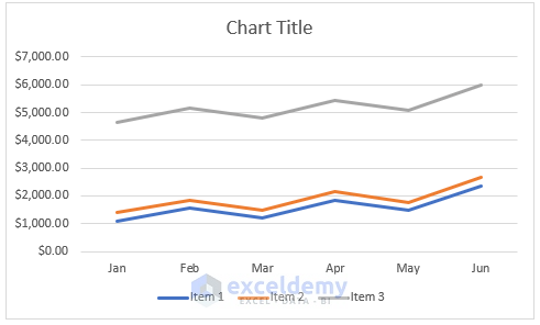
5 Easy Steps to Create a Line Graph in Excel

Creating a line graph in Microsoft Excel is a straightforward process that can help you visually represent data trends, patterns, and changes over time. Whether you're tracking sales performance, website traffic, or any other metric, a line graph provides a clear way to display and analyze continuous data. Here's how you can craft a compelling line graph in just five easy steps.
1. Organize Your Data

Before you dive into Excel to create a graph, ensure your data is well-organized:
- Your data should be in tabular format with each column representing a different variable or dataset.
- Ensure there are labels for your X-axis (typically dates or time intervals) and Y-axis (numerical values or percentages).
- Avoid blanks and ensure all necessary data points are present to prevent gaps in your line graph.

2. Select Your Data Range

Once your data is ready:
- Click on the cell where your data starts, hold down the mouse button, and drag to highlight all the relevant data you want to include in your graph.
- Make sure to include your labels as these will be used for the axes in your graph.
3. Insert the Line Graph

With your data selected, follow these steps to insert the graph:
- Go to the Insert tab on the Ribbon.
- Click on the Line or Line with Markers chart icon under the Charts group. You’ll see different options for styling your line graph.
- Click on the chart style you prefer. The graph will appear in your worksheet instantly.
Make sure you choose a style that complements the presentation of your data, whether it’s simple lines or lines with markers for emphasis on data points.
4. Customize Your Graph

Now that you have your basic graph, it’s time to tailor it to your needs:
- Change the Chart Title: Click on the title of your graph and type in a new, descriptive one.
- Label Axes: Right-click on the axis, choose “Format Axis”, and ensure both X and Y axes have descriptive labels.
- Add or Modify Data Series: If you want to add more data or change existing series, right-click on the chart area and select “Select Data”.
- Adjust Color and Line Style: Use the “Chart Styles” and “Chart Elements” options to change line colors, add data markers, or adjust the line style (solid, dashed, etc.).

⚠️ Note: When customizing, consider your audience. Ensure the graph is easily readable and the colors or styles do not distract from the data.
5. Finalize and Save

After customizing:
- Use the chart toolbar to adjust any final elements like adding data labels or a legend if needed.
- Check your graph for readability. Is it clear what the data represents?
- Save your Excel file to keep the graph embedded within the spreadsheet.
To encapsulate, creating a line graph in Excel is a matter of organizing your data, selecting it, inserting the graph, customizing it for clarity and style, and then saving your work. This simple yet powerful tool can turn complex data sets into visually understandable trends, making it easier for anyone to comprehend and make decisions based on your data.
How do I add a secondary axis to my line graph in Excel?

+
To add a secondary axis, right-click on the data series you want on the secondary axis, choose “Format Data Series”, and select the “Secondary Axis” option from the “Series Options” menu.
Can I change the type of one data series in a line graph?

+
Yes, you can change the chart type for a single data series. Right-click on the series, go to “Change Series Chart Type”, and select the desired chart type from the list.
What are the best practices for color selection in Excel graphs?

+
Best practices include using colors with good contrast, ensuring readability for those with color vision deficiencies, and avoiding overuse of colors which can clutter the graph. Also, align colors with any brand or thematic guidelines.


