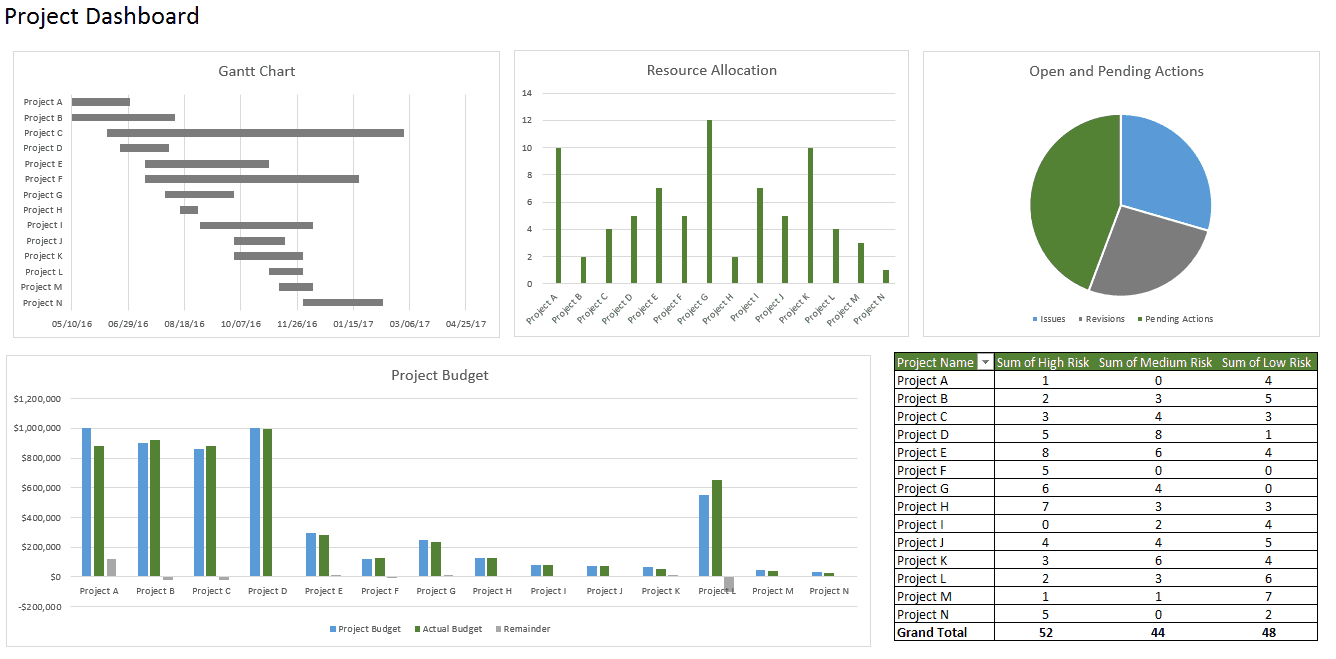
Excel Dashboard Creation Guide: Simple Steps to Follow

When it comes to data analysis and presentation, Excel dashboards serve as a powerful tool to visually summarize, display, and interpret key metrics and performance indicators in real-time. Whether you are managing a small team, running an entire department, or working on personal projects, learning how to create an effective Excel dashboard can significantly boost productivity and decision-making efficiency. Here, we provide a comprehensive guide on creating Excel dashboards in a straightforward and logical manner.
Understanding Excel Dashboards

A dashboard in Excel consolidates and visually represents data from various sources into a single, easy-to-read interface. Unlike static reports, dashboards are dynamic; they allow users to interact with data, view trends, and make data-driven decisions with agility.
Benefits of Excel Dashboards

- Enhanced Data Visibility: See trends, outliers, and patterns at a glance.
- Interactive Analysis: Users can manipulate data to gain insights tailored to their needs.
- Time-Saving: Consolidate data analysis into a single, reusable view.
- Improved Decision Making: With all key metrics at hand, decisions are made faster and with more confidence.
Key Components of an Effective Dashboard

- Data Source: Clean, well-organized data in Excel, or via external connections.
- Charts and Graphs: Visual representations like pie charts, bar graphs, line charts, etc.
- Tables and PivotTables: To summarize data dynamically.
- Key Performance Indicators (KPIs): Quantifiable measures to evaluate performance.
- Interactive Elements: Drop-down menus, slicers, and other controls for user interaction.
Step-by-Step Guide to Creating an Excel Dashboard

1. Define Your Objectives

Before you dive into Excel, clarify what your dashboard needs to achieve. Who are the users, and what metrics are they interested in? Are you tracking sales, website traffic, or project progress?
📊 Note: Keep the objectives SMART (Specific, Measurable, Achievable, Relevant, Time-bound).
2. Gather and Prepare Your Data

Collect data from various sources into an Excel workbook. Ensure data is clean, formatted consistently, and is in a format suitable for analysis:
- Remove duplicates.
- Consolidate data from multiple sheets or files.
- Ensure there are no blank cells in columns used for pivot tables.
3. Set Up Your Data Source

Create a dedicated tab or section in your workbook for data:
- Use named ranges or tables for easier reference.
- If using external data, establish connections (like ODBC, SQL Server).
- Set up a ‘Raw Data’ tab if dealing with large datasets.
4. Create Dynamic Elements

Here’s where Excel’s power shines:
- PivotTables: Use these to summarize large datasets dynamically.
- Named Ranges: Reference data using names for better management.
- Formulas: Utilize complex formulas like VLOOKUP, INDEX/MATCH, or SUMIFS for calculated fields.
Make sure your formulas are efficient, using array formulas or other optimization techniques when dealing with large datasets.
🔍 Note: Efficiency matters; ensure formulas calculate quickly to keep your dashboard responsive.
5. Design Your Dashboard

Now, you’ll arrange charts, tables, and KPIs on your dashboard sheet:
Charts and Graphs
- Use Excel’s Chart Wizard or right-click on data and choose “Insert Chart”.
- Select appropriate chart types for your data (e.g., bar for comparison, line for trends).
- Customize colors, fonts, and layout to match your brand or to emphasize key data.
Tables and PivotTables
- Place tables where they’re easily readable and relevant.
- For pivot tables, use slicers for user interaction.
Key Performance Indicators (KPIs)
- Use conditional formatting to highlight performance (e.g., red for below-target, green for above-target).
- Include sparklines for a quick visual overview within cells.
6. Adding Interactive Elements

Enhance user interaction:
- Add drop-down menus to select data filters.
- Use Form Controls or ActiveX Controls for custom interactions.
- Implement macros for more complex functionality (e.g., refreshing data or navigating to different sections).
7. Test and Refine Your Dashboard

Here’s where you ensure everything works as intended:
- Check data integrity and connections.
- Test interactivity; do slicers, buttons, or other controls respond appropriately?
- Review visual clarity and aesthetics.
Advanced Tips for Excel Dashboards

- Use Power Query: For data transformation and integration from multiple sources.
- Power Pivot: Utilize to build more complex data models and to handle large volumes of data.
- Excel Add-ins: Consider using tools like Power BI Desktop for more advanced analytics and interactive dashboards.
🛠️ Note: Don't overcomplicate; simplicity and functionality should be your guiding principles.
Creating an Excel dashboard involves careful planning, a good understanding of data manipulation techniques, and a design eye for usability. By following the steps outlined above, you can develop dashboards that not only look professional but also provide valuable insights at a glance. Remember, an effective dashboard is one that is user-friendly, accurate, and capable of evolving with your data needs.
What data sources can I use for my Excel dashboard?

+
You can use various data sources such as Excel files, databases (SQL, Oracle, etc.), external text files (CSV, XML), web services, and even other workbooks. Ensure your data connections are secure and up-to-date.
How do I make my dashboard interactive?
+Use Excel’s built-in interactive elements like slicers, drop-down menus, checkboxes, or form controls. Additionally, VBA macros can enhance interactivity with custom functionality.
Can I share my Excel dashboard with others?
+Yes, you can share Excel dashboards via email, cloud storage services, or through Excel Online. Ensure external data sources are accessible, and for complex dashboards, consider using the Excel binary workbook format (.xlsb) to preserve functionality.