5 Easy Steps to Create Excel Bar Charts

If you're looking to visualize your data in a way that's both easy to understand and visually appealing, Excel bar charts are an excellent choice. These charts are ideal for comparing quantities, tracking progress, or highlighting trends among different categories. This blog post will guide you through creating bar charts in Microsoft Excel with five straightforward steps. Let's dive in!
Step 1: Organize Your Data

Before you can create a bar chart, you need to ensure your data is in a format that Excel can easily interpret. Here’s what you should do:
- Select your data: Your data should be organized in columns or rows, with labels for each category on the left or top.
- Ensure data is clean: Check for any missing values, duplicates, or errors that might skew your chart.
📝 Note: Keep your data as simple as possible. Each column or row should represent a different series or category you want to compare.
Step 2: Highlight Your Data

After organizing your data:
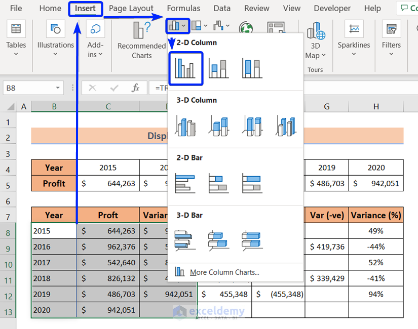
- Highlight the range of cells that contains the data you want to chart.
- Ensure that you include headers or labels as they will appear in the chart legend.
Step 3: Insert the Bar Chart

To create your bar chart:
- Go to the Insert tab on the Ribbon.
- In the Charts group, click the Bar or Column chart icon (depending on the orientation you prefer).
- Choose your desired bar chart style from the options presented. Excel offers a variety of styles, including 2-D or 3-D charts.
Step 4: Customize Your Chart

Customization is key to making your chart both functional and appealing:
- Edit chart elements: Click on any part of the chart to customize. Change titles, labels, and axes for clarity.
- Adjust chart style: Use Chart Tools Design tab to change colors, styles, or apply a predefined theme.
- Add data labels: These provide exact figures on each bar, making the chart more informative.
- Format axes: Right-click the axes to adjust scale, add gridlines, or change the display of numbers.
💡 Note: While customizing, remember to keep your chart readable. Over-customization can lead to confusion.
Step 5: Analyze Your Data

With your bar chart ready:
- Compare categories: Look at the heights of the bars to compare different categories or track changes over time.
- Identify trends: Bar charts excel at highlighting trends, especially when data spans multiple periods.
- Use chart tools: Tools like data analysis add-ins can help you delve deeper into your data set.
By following these steps, you've not only created a visual representation of your data but also made it easier for others (or yourself) to understand the underlying story. Whether it's for business presentations, school projects, or personal finance tracking, bar charts are versatile tools in your data visualization toolkit. Now, you can present your findings in a manner that is visually impactful and easy to interpret.
Can I make my bar chart interactive in Excel?

+
Yes, Excel allows you to add interactive features like dropdown menus for selecting different data series or adding hover-over tooltips for more detailed information on each bar.
How can I ensure my chart looks professional?

+
Focus on clean lines, appropriate colors, clear labels, and minimalistic design elements. Avoid clutter, and ensure your chart communicates its message clearly and professionally.
What should I do if my data changes frequently?

+
If your data changes often, you can set up dynamic named ranges or use Excel Tables to ensure your charts automatically update as the data changes.