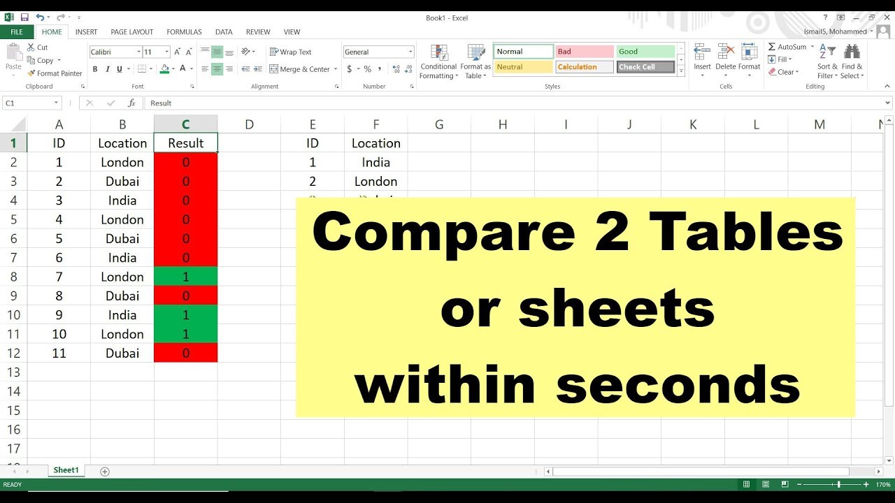
Excel Tips: Compare Services and Materials Easily

Excel is a powerful tool for data analysis, and one of its key strengths is its ability to help you compare services and materials with ease. Whether you're a business owner, a project manager, or just someone who loves organizing data, knowing how to effectively compare in Excel can streamline your work and lead to better decision-making. Here, we'll dive deep into how you can utilize Excel to compare various services and materials, ensuring you make the most informed choices.
Setting Up Your Comparison Spreadsheet

Before diving into the nitty-gritty of comparison, setting up your Excel spreadsheet correctly is crucial:
- Create columns for Service Name/Material Type, Features, Cost, Quality Rating, and any other relevant criteria.
- Organize your data in a tabular format. Use the Table feature to ensure all your data is neatly organized:
| Service/Material | Features | Cost | Quality Rating |
|---|---|---|---|
| Service A | Feature 1, Feature 2, Feature 3 | $50 | 4.5 |
| Material X | Characteristic 1, Characteristic 2 | $200 | 4 |

🧠 Note: Organize your data logically for easier manipulation and analysis.
Comparative Analysis Techniques

Conditional Formatting

- Use conditional formatting to visually highlight data. For example, cells can be colored based on cost thresholds or quality ratings:
- Go to “Home” > “Conditional Formatting” and set rules based on your data:
| Data Field | Formatting Rule |
|---|---|
| Cost | Red for >100, Green for ≤100 |
| Quality Rating | Gradient color scale with green being highest |
📌 Note: Conditional formatting helps in quick analysis of large datasets.
PivotTables for Grouped Analysis

- To analyze grouped data, PivotTables are indispensable. Here’s how to use them:
- Select your data range, then click on “Insert” > “PivotTable”.
- Drag fields to Rows, Columns, Values, and Filters areas to compare services or materials across different dimensions.
Excel Formulas for Comparison

- IF function for criteria-based comparison.
- VLOOKUP or INDEX MATCH to pull related data from other sheets or datasets.
- Use SUMIF, AVERAGEIF, etc., to get aggregate data for comparison.
Data Visualization for Better Insights

Visual representations of your data can often reveal insights that raw data might not:
Charts and Graphs

- Insert a bar chart or scatter plot to visualize cost versus quality:
- Select your data and go to “Insert” > “Chart” to create your preferred type of visualization.
Sparklines

- Add Sparklines for in-cell trends:
- Select the cell next to your data and go to “Insert” > “Sparklines” to choose Line, Column, or Win/Loss.
📊 Note: Visual aids make it easier to spot trends and outliers in your data.
Making Your Decision

After organizing and analyzing your data, the next step is to make a decision:
- Look for the best value, considering cost, features, and quality.
- Use filters or slicers in PivotTables to narrow down options based on specific criteria.
Wrapping up, Excel provides robust tools for comparing services and materials. By structuring your data properly, utilizing functions and conditional formatting, and creating compelling visualizations, you'll be in a prime position to make well-informed decisions. Keep in mind that Excel's flexibility allows you to adapt these techniques to a wide variety of comparisons beyond just services and materials. Always remember to keep your data clean and up-to-date for the best results. Good luck in your comparative analysis!
Can Excel compare data automatically?

+
Yes, Excel can automate comparisons with features like Conditional Formatting, sorting, filtering, and PivotTables, which help in quickly analyzing and comparing data.
How do I compare data from different sheets in Excel?

+
Use the VLOOKUP or INDEX MATCH functions to reference data across sheets. This allows you to pull in and compare relevant information from other datasets within your workbook.
What is the best way to visualize comparison data in Excel?

+
Bar charts, pie charts, or line graphs are often used, depending on the nature of your data. For more detailed comparisons, consider using PivotCharts or conditional formatting.