5 Easy Ways to Make Graphs in Excel

Creating charts and graphs in Excel has never been easier. Whether you need to visualize data for a business presentation, a school project, or personal budgeting, Excel offers a versatile suite of tools to help you represent your data visually. In this blog post, we will explore 5 Easy Ways to Make Graphs in Excel that can enhance your data presentation and storytelling.
1. Using Predefined Charts


Excel comes with a variety of predefined chart types such as column, pie, line, and more:
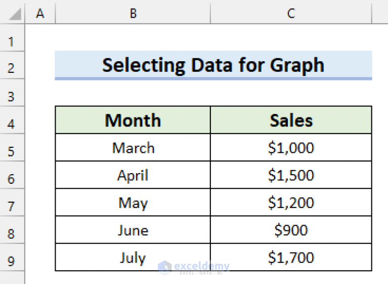
- Select Your Data Range: Highlight the data you want to visualize.
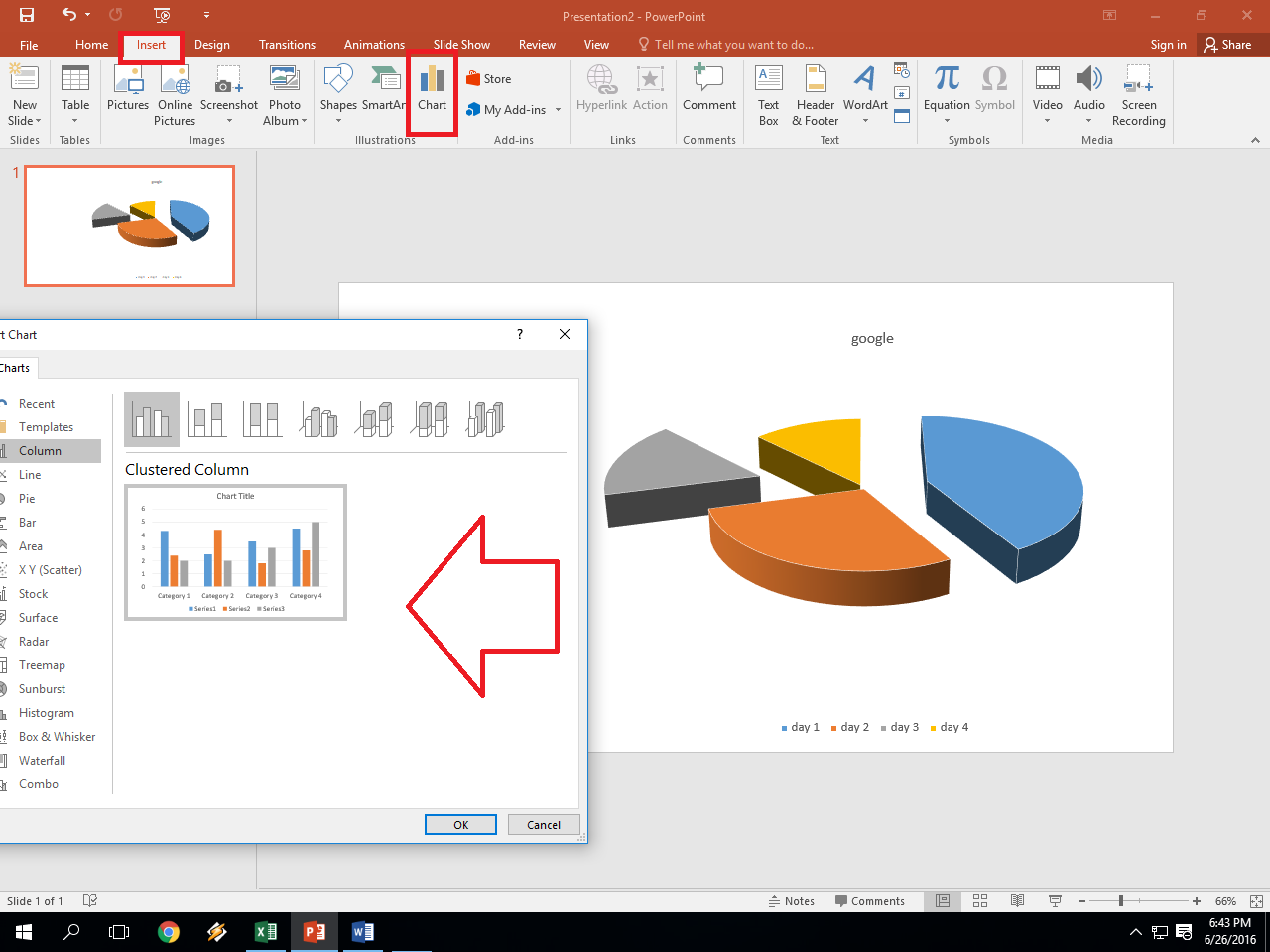
- Insert Chart: Go to the Insert tab, choose your preferred chart type from the 'Charts' section.
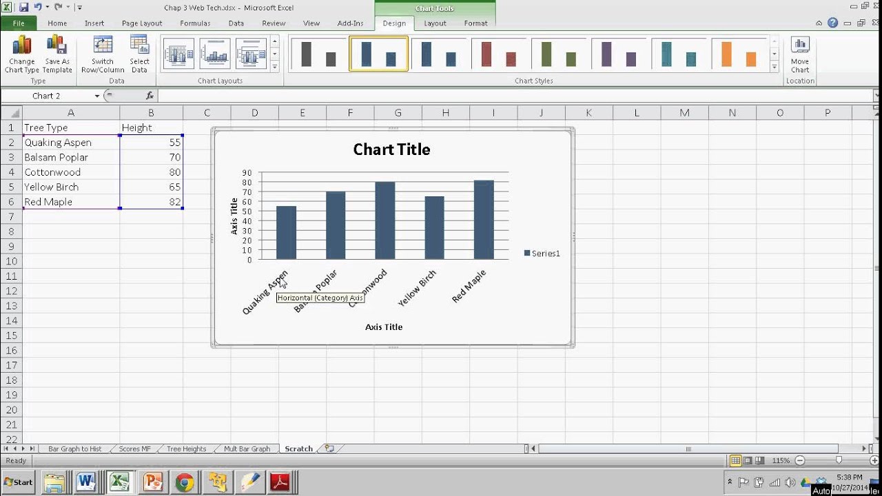
- Customize: Once your chart is created, customize its appearance via the 'Chart Tools' that appear, adjusting colors, titles, and labels to your liking.
📝 Note: Choose the chart type that best represents the relationship within your data for clearer communication.
2. Recommended Charts

Not sure which chart to use? Let Excel decide:
- Select your data.
- Click on the Insert tab, then Recommended Charts.
- Excel will suggest charts based on your data. Preview them and select the one that suits your needs.
- Click OK to insert your chart into the worksheet.
3. Creating Charts from PivotTables


Advanced users often use PivotTables to summarize and analyze data:
- Create or Insert a PivotTable: Use the Insert tab to start your PivotTable.
- Add Data to Rows or Columns: Organize your data into rows and columns to create meaningful summaries.
- Generate Chart: Click anywhere inside the PivotTable, then select PivotTable Tools > Analyze > Options > Insert Chart.
📝 Note: Ensure your PivotTable is set up correctly before creating charts for accurate data representation.
4. Sparklines for In-Cell Graphs

Sparklines are mini-charts that fit within a single cell:
- Select the cell or range next to your data where you want the sparkline.
- Go to the Insert tab, click on Sparklines.
- Choose from Line, Column, or Win/Loss Sparklines based on your data.
- Define the data range for your sparklines and click OK.
5. Customizing Existing Charts

| Task | Action |
|---|---|
| Add Data Labels | Select the chart, right-click on a data series, select ‘Add Data Labels’ |
| Change Chart Type | Select the chart, go to ‘Design’ under ‘Chart Tools’, click ‘Change Chart Type’ |
| Format Chart Elements | Use ‘Format’ options to change colors, styles, or the entire layout |

Your journey to mastery in Excel charts might also involve learning about:
- Using secondary axes for complex data sets
- Creating combination charts for diverse data representation
- Automating chart creation through macros or VBA
To wrap it up, mastering how to make graphs in Excel opens up a myriad of possibilities for data visualization. From simple predefined charts to intricate PivotTable visualizations, these tools can turn raw numbers into compelling stories, insights, and decisions. The key is to experiment with different chart types, customize them to fit your data narrative, and explore Excel's lesser-known features like sparklines or PivotTables for more advanced uses. With these skills, you can impress in business meetings, school, or even just manage your personal finances more effectively.
What is the quickest way to make a chart in Excel?

+
The quickest way is to select your data and use the ‘Recommended Charts’ feature, which suggests appropriate chart types for your data.
How can I change the chart type after it’s created?

+
Select your chart, go to the ‘Design’ tab under ‘Chart Tools’, and click on ‘Change Chart Type’ to modify it as needed.
Is it possible to automate chart creation in Excel?

+
Yes, through VBA macros, you can automate the creation and modification of charts. This requires some programming knowledge in Excel VBA.


