Graph Data from Multiple Excel Sheets Easily

Integrating data from multiple Excel sheets into a single graph can transform complex datasets into insightful visuals. Whether you're a data analyst, researcher, or business professional, mastering this technique is invaluable for comparing trends, highlighting discrepancies, or presenting comprehensive data stories. This guide will show you how to graph data from multiple Excel sheets using Microsoft Excel, offering both simple solutions for beginners and advanced techniques for seasoned users.
Consolidating Data

The first step is to ensure that all your data is in a usable format. Here’s how you can prepare your data:
- Consistent Structure: Ensure that each Excel sheet has the same structure for headers and data placement. This makes consolidation easier.
- Naming Conventions: Name your sheets in a way that makes them easy to identify when combining data. For instance, ‘Sheet1’, ‘Sheet2’, etc., or by date like ‘202301’, ‘202302’.
Let's consolidate the data using a straightforward approach:
- Open Excel and navigate to the workbook containing your sheets.
- Select a new, empty sheet or create one to serve as the consolidation sheet.
- Use Excel's Data Consolidation tool:
- Go to Data > Data Tools > Consolidate.
- Choose the function for consolidation. Often, Sum or Average are used, but it depends on your data needs.
- Select each range from your sheets by clicking the worksheet tab at the bottom, selecting your range, and adding it to the consolidation list.
- Once you've added all relevant ranges, click OK to consolidate.
✅ Note: Remember to check for any hidden rows or columns in your sheets as these could skew your consolidated data.
Creating the Graph

Now, with your data ready, let’s proceed to create a graph:
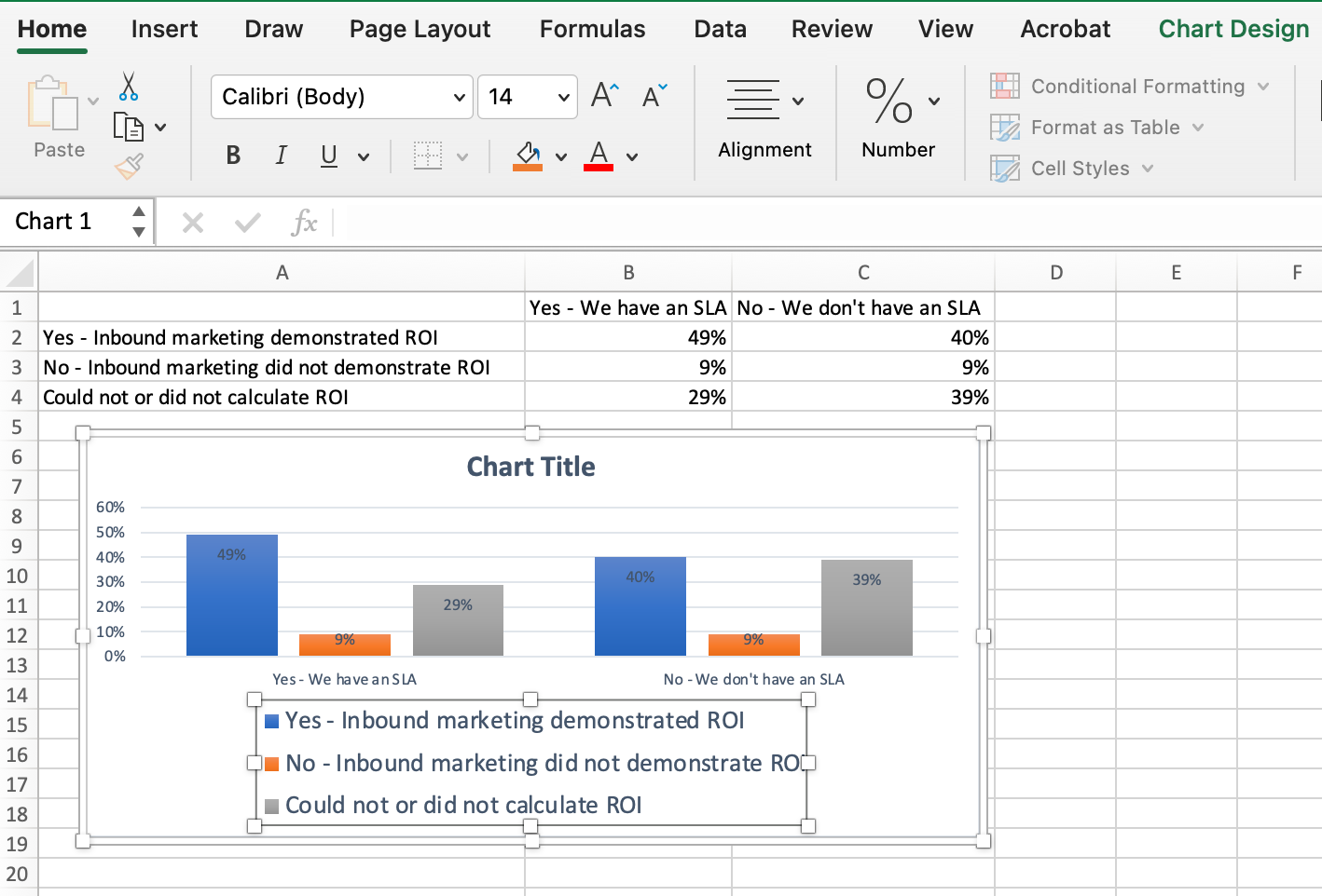
- Select the Range: Click and drag to select the entire consolidated data range you’ve just created.
- Insert Graph:
- Go to Insert > Charts > Choose the type of chart (e.g., Line, Column, Bar, etc.).
- Right-click on the chart and select Edit Data to make any necessary adjustments.
- Formatting:
- Click on the chart elements (e.g., axis, legend) to format them. Use the Format Chart task pane for detailed options.
- Add chart titles, axis labels, and data labels for clarity.
Advanced Charting Techniques

For users with more complex data visualization needs:
- Secondary Axis: If your data has different scales, consider using a secondary axis for comparison:
- Right-click on a data series, choose Format Data Series, and select Secondary Axis.
- Multiple Series from Sheets: Instead of consolidating, you can insert data series from different sheets directly:
- After inserting your initial chart, right-click, go to Select Data, and add data series from other sheets.
- Dynamic Charts with Excel Functions: Use functions like =INDIRECT to create dynamic data references that update automatically as you update your source data.
💡 Note: Dynamic charts can save you time by automatically reflecting changes in source data without manually updating the chart.
Tips for Effective Graphing

- Color Coding: Use distinct colors for different data sets to enhance readability.
- Legends and Labels: Ensure your chart includes clear legends and data labels to help viewers understand what each element represents.
- Consistent Style: Apply a uniform style or template across all charts for a professional look.
- Clutter-Free: Avoid chart clutter by limiting the number of data points or lines if the data becomes too dense.
Data Quality and Graphs

While Excel is a powerful tool for graphing, data integrity remains paramount:
- Validate Data: Before graphing, validate your data for accuracy and completeness.
- Formatting: Uniform formatting across sheets ensures consistency in your graphs.
- Error Handling: Look out for and manage errors or anomalies in your data that could mislead your analysis.
In summary, graphing data from multiple Excel sheets enhances data analysis, providing a comprehensive view of trends and patterns. By mastering consolidation, chart creation, and advanced charting techniques, you can turn disparate data sets into compelling visual stories. Remember to ensure data quality, apply consistent styling, and use effective charting practices for optimal results.
Can I graph data from sheets with different structures?

+
Yes, although it requires more manual work. You would need to manually align and format the data so that it matches across all sheets before consolidating.
How do I update graphs if the data in my sheets changes?

+
If your graph uses dynamic references like INDIRECT, it will update automatically. Otherwise, you’ll need to manually refresh the data or update the graph.
What if I need to graph data from sheets in different workbooks?

+
Excel allows you to consolidate data from different workbooks using the same Data Consolidation tool by linking to external workbooks.